 PharmaSUG 2015 in Orlando was held at the Renaissance had a record breaking attendance of over 650. Weather was great, except for a huge downpour on the evening of the last day. All the popular presenters were in attendance including Art Carpenter, Kirk Lafler, Arthur Li and many others.
Presentations on graphics were aplenty, using SG procedures, GTL, SAS/GRAPH and Annotate. I tried to attend as many as I could but did not get to all of them due to Super Demo duty. What got me really fired up was the creative ways in which users are utilizing the features of SG procedures and GTL to build their custom graphs.
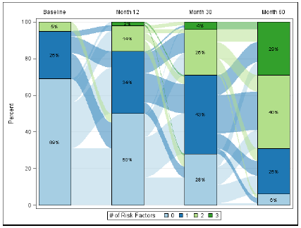 One standout example was the Sankey Bar Chart by Shane Rosanbalm of Rho Inc, a CRO right here in Chapel Hill. The graph shows the the subject disease severity over visits at Baseline, 12, 30 and 60 months. The stacked bars in the graph on the right shows the % occurrence of the disease by severity.
However, Shane also wanted to see the change in the severity over visits. So he came up with this unique custom visual, depicting the severity % by visit and also the flow of subjects from one severity value to another.
 The winner of the Data Visualization presentations was the paper by Creating Sophisticated Graphs using GTL by Kaitlyn McConville and Kristen Much, also of Rho.inc. who presented a paper on building complex graphs using GTL. The authors used a step-by-step method to explain the process, thus de-mystifying the learning curve. It was good to see more and more users turning to GTL to create their graphs, willing to trade a little bit more programming complexity to obtain sophisticated graphs.
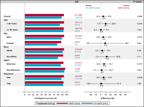 Janette Garner of Gilead Sciences Inc presented an Enhanced Forest Plot macro using SAS. It was gratifying to see some of the material previously presented in this blog taken further and put to use in a real world example. Janette extended the traditional Forest Plot by adding a Bar Chart of the actual values.
Janette used GTL with a Layout Lattice to create the multi-cell layout. She nested another Layout Lattice in the SideBar of the first one to define the graph headers.
 She used the HighLowPlot in different ways to draw many elements of the graph, including the subgroups and labels with indentations on the left, the bar chart itself, the bar labels, the odds ratio and the labels on the right. This truly shows the flexibility of this plot statement.
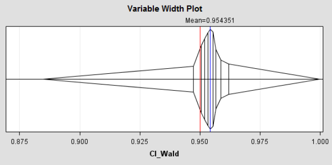
Songtao Jiang displayed a creative usage of the GTL Series Plot to create a Variable Width Plot shown above.
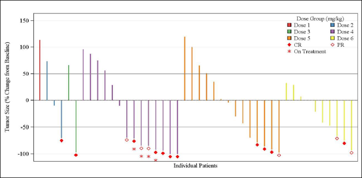 Murali Kanakenahalli and Avani Kaja of Seattle Genetics showed how to create multiple graphs for Oncology Trials using GTL. This included Kaplan-Meier graphs, Waterfall Charts by Dose Group, a Swimmer plot and more.
Here is the link to the data visualization section of the conference proceedings for these and other excellent papers.


4 Comments
The sankey bar chart above looks a lot like the parallel sets chart developed by Robert Kosara. see more about these charts here https://eagereyes.org/parallel-sets
It also somewhat similar in concept to a chart we developed described here:
http://www.biomedcentral.com/1471-2288/14/32
Could you share your SAS code to create the Sankey bar chart?
The Sankey example was by Shane Rosanbalm of Rho Inc.