SAS 9.4 releases today with a ton of new features. As eloquently stated by Craig Rubendall, the driving themes are "Enable. Simplify. Innovate". The same sentiment applies to the ODS Graphics, with a ton of new features for the SG Procedures, GTL and ODS Graphics Designer.
In the next few articles, I will provide more details on specific features for all these graphics tools. Let us highlight some of the new features that will make it easier for you to make the graph you need.
In the category of new statements, we have added the AXISTABLE. This is a versatile new statement that makes it easy to display axis aligned text values in your graph. With Axis table, you can add columns of data on the left, right, bottom or top of any graph. Here is an example:
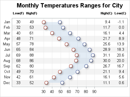
SAS 9.4 SGPLOT Code:
title "Monthly Temperatures Ranges for City"; proc sgplot data=weatherTable2 noautolegend; band y=month lower=low upper=high / transparency=0.6; scatter y=month x=high / markerattrs=graphdata1(symbol=circlefilled size=11) dataskin=sheen filledoutlinedmarkers; scatter y=month x=low / markerattrs=graphdata2(symbol=circlefilled size=11) dataskin=sheen filledoutlinedmarkers; yaxistable low high / label location=inside position=left; yaxistable lowc highc / label location=inside position=right; xaxis display=(nolabel) grid; yaxis display=(nolabel noticks) colorbands=odd colorbandsattrs=(transparency=0.9); run; |
In this graph, we have used the following new features:
- Two YAXISTABLEs, one to place the data column on the left of the graph, and one on the right.
- Each axis table plots two columns from the data set.
- FilledOutlinedMarkers draw markers with a fill and outline.
- Skins are used to make markers glossy.
- Alternate color bands are used on the Y axis to help the eye across the page.
- I have trimmed some options for clarity and you can see the full code in the attached file.
Alternately, we can place all the column headers and axis tick values on one side (say the top) as shown here:
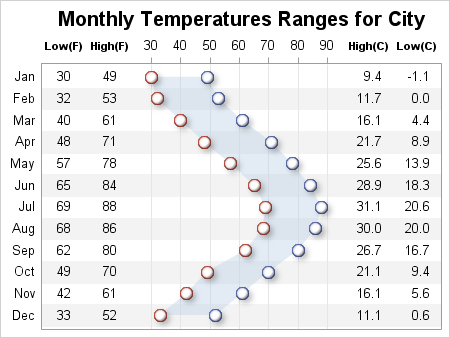
What are the use cases? Think Survival Plots with At-Risk tables, Lipid Profiles or Forest plots. The list is endless.
Another new feature is the ability to split long text values on white space for axis labels, axis tick values, data labels, curve labels, etc. This allows you to create nicer graphs such as the one shown below. Note the tick values on the X axis.
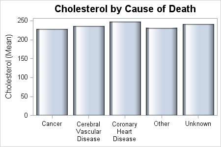
SAS 9.4 SGPLOT code:
title 'Cholesterol by Cause of Death'; proc sgplot data=sashelp.heart; vbar deathcause / response=cholesterol stat=mean dataskin=gloss; xaxis display=(nolabel); run; |
The default tick value fit policy for GTL is ROTATE. So, if the tick value does not fit horizontally, it will be rotated at 45 degree angle. This has not changed. However, GTL has a new tick value fitting policy called SPLITROTATE. This policy will first try to fit the tick value with splitting. If it still does not fit, then it will rotate it. For SGPLOT, we have changed the default tick value fitting policy to SPLITROTATE. So, no new code is really needed to get this graph.
Another popular feature requested by users was JITTER. When X or Y axis is discrete, this option will arrange the markers in a row for observations whose response values fall within a threshold. Jittering can also be done for numeric axes.
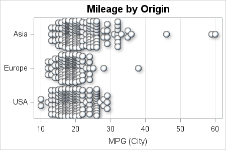
SAS 9.4 SGPLOT code:
proc sgplot data=cars; scatter y=origin x=mpg_city / jitter markerattrs=graphdata1(size=11 symbol=circlefilled) filledoutlinedmarkers markeroutlineattrs=(thickness=0) dataskin=sheen; yaxis display=(nolabel); xaxis grid; run; |
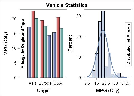
GTL now supports SGANNOTATE. The same data set that is currently used to define annotation for use with SG procedures can also be used with GTL. GTL also supports some extensions, allowing you to place the annotations in one of the layout containers by ID.
In this example, we have a GTL graph having two cells. We want to place specific annotations in each cell. The first cell has the text "Mileage by Origin and Type" rotated on the left side, and the second cell has the text "Distribution of Mileage" rotated on the right side with a border. Here is the graph.
Here is the SGANNO data set:
SAS 9.4 GTL Code:
proc template; define statgraph CarStats; dynamic _min1 _max1 _min2 _max2; begingraph; entrytitle 'Vehicle Statistics'; layout lattice / columns=2; layout overlay / xaxisopts=(offsetmin=_min1 offsetmax=_max1) yaxisopts=(offsetmin=0); barchart x=origin y=mpg_city / stat=mean group=type groupdisplay=cluster dataskin=gloss; annotate / id='Bar'; endlayout; layout overlay / xaxisopts=(offsetmin=_min2 offsetmax=_max2) yaxisopts=(offsetmin=0); histogram mpg_city; densityplot mpg_city; annotate / id='Hist'; endlayout; endlayout; endgraph; end; run; |
Note the two ANNOTATE statements, one in each cell, with two diferent ID values. The annotate data set has two observations, one for each text string, also with ID values. Only the annotate observations with the matching ID values are picked up for each statement. This allows you to define multiple annotation observations in the SGANNO data set, and pick and chose which one goes where. If ID is not used with the ANNOTATE statement, then all the annotation observations are rendered with the ANNOTATE statement.
Summary: SAS 9.4 brings you innovative new features to enable you to create the graphs you need with simpler code. This is a brief glance into some new features. In subsequent articles, we will talk about the graph features released with SAS 9.4 in greater detail.
Full SAS 9.4 code: SAS_94_Highlight


11 Comments
Nice graphs Sanjay! I'm looking forward to trying out SAS 9.4.
Thanks Sanjay!
I'm definitely looking forward to 9.4.
I'm confused about GTL now supporting SGANNOTATE.
In 9.3 when I used SGPLOT with an SGANNO dataset, I assumed SGPLOT was turning that data into GTL code for me. (DRAWTEXT etc). If that was right, then it seems somehow circular for GTL to accept an SGANNOTATE dataset, and then create more GTL from it.
Not that I'm complaining, as I certainly like the idea of storing information in data rather than code. Just curious how it works. i.e. is it being converted into GTL code? Can we see that GTL code?
Also noticed it looks like your blog is not included in http://www.sascommunity.org/planet/ . Might be worth adding it.
Thanks again!
-Q.
The Annotate statement in GTL does not generate any additional DRAW statements. It is handled internally by the new statement. However, it does use the same underlying functions that the various DRAW statements use.
While you can certainly add DRAW statements to your GTL code, if you want to add data driven elements, you will have to put the values into macro variables and then use those in the DRAW statements. For annotations that are data based, it is easier to generate the commands in a data step and save to SGANNO data set. Then you can just use that to add the annotations.
Yes, GTL already provides more options than does SG, so you may not need it as much. But, sometimes there is no statement available to do a specific detail you may need, and in that case annotate is the way out. We are cognizant of the fact that graphs based on Annotate are generally less portable and scalable. So, we will continue to create new statements to make graphing easier and scalable. Like the new AXISTABLE statement, and many new options now available with SAS 9.4.
Makes sense, thanks. I hadn't realized there were things you could do with Annotate that can't be done with GTL. And even if that were not the case, even a macro lover like me can see the benefit of making data-driven code easier. Really happy to see the continued growth of statistical graphics. It's great stuff!
With SAS 9.4M1, we are also releasing the SGANNO macros. These are similar to the ANNOMAC macros for GRAPH annotate. You can use these in data step code to make creating annotations easier. These will be available for download from the Tech Support page soon.
Pingback: Setting Graph Colors is Easier with SAS 9.4 - Graphically Speaking
Pingback: Video says it better - Graphically Speaking
Pingback: Jittering to prevent overplotting in statistical graphics - The DO Loop
Pingback: More symbols, you say? - Graphically Speaking
I have a graph that I created on excel and i would like to try create it on SAS 9.4 as well. Who can I email the picture of the graph from Excel so they can assist if possible.
Pingback: Jittering to prevent overplotting in statistical graphics - The DO Loop