OK, I promise this is the last article on Forest Plots (at least for a while).
In the previous article on Subgrouped Forest Plot with Font Attributes, I discussed how to use bold text for subgroup headings. I mentioned that increasing the font size would not work as it would misalign the subgroup values from the headings.
Clearly, the result shown in the link above is less than ideal, and I have not yet been able to come up with a better way to do this using SAS 9.2. If you have a better solution, I am sure we all would be very interested to hear of it.
But with SAS 9.3, we can do better because we can use the new HighLowPlot statement. This statement supports a LowLabel and/or HighLabel. In this case, the label is drawn starting from the appropriate end of the plot line. So, all the contortions needed for the MarkerCharacter solution with SAS 9.2 above can be avoided.
Forest Plot using SAS 9.3 HighLowPlot. Here is the graph. Click on it for a bigger view:
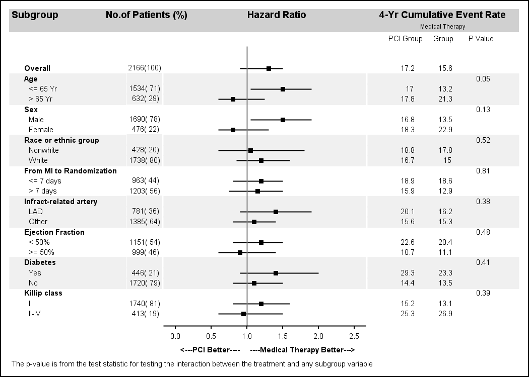
Note the following improvements in this graph:
- The subgroup heading and values use the same font family as the rest of the columns. It is not necessary to use a non-proportional font.
- The subgroup headings use a bigger font size and bold weight.
- The subgroup values are indented.
- The error bars do not have serifs.
In this graph, we have used the HighLowPlot to draw the subgroup headings and values. The actual drawing of the high low line itself is hidden by using line thickness of zero. The other text strings are still drawn using ScatterPlot (with MarkerCharacter), but that too can be changed to HighLowPlot if we need left or right aligned strings. The error bars for the Hazard Ratio are also drawn using the HighLowPlot.
With SAS9.3, the ScatterPlot itself also has a new option to draw DataLabels with DataLabelPosition of LEFT | RIGHT, etc. So, we could have used that for these labels. But there are some interesting interactions with axis offsets that need to be considered. So, at this time, HighLowPlot is preferred.
GTL code snippet for the subgroup labels:
highlowplot y=obsid low=zero high=zero / highlabel=heading
    lineattrs=(thickness=0) labelattrs=(size=7 weight=bold);
highlowplot y=obsid low=zero high=one / highlabel=subgroup
lineattrs=(thickness=0); |
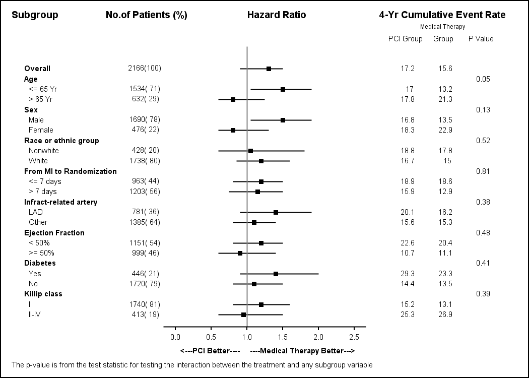
Forest Plot without horizontal bands:
Full SAS 9.3 Code: ForestPlot_93


39 Comments
Hi Sanjay,
At long last a SAS 9 way of making a forest plot with sub-group headers and indentation using a proportional font.
Excellent!
I've been banging my head against a wall trying to get a SG version of this for over a year. I had used PROC REPORT with included graphical elements each created individually, before settling on a much more straightforward PROC GPLOT/ANNOTATE solution.
Now all I've got to do is to wait for SAS 9.3 to be available at my company.
Kind regards
-- Jeff
Hi Sanjay,
Thank you very much for providing the code for the forest plot, its been incredibly useful! I was just wondering if there is any way to make the xaxis label of the plot dynamic so that it is centered around the Hazard ratio of 1 when the Low and High values change. Thanks.
Kind regards,
Anish
At this time you could do this by turning off the display of the axis label and using two DRAWTEXT statement with DRAWSPACE of DATAVALUE and the appropriate anchor point. You could use the unicode symbol for "<-" and "->" for better results.
DRAWTEXT textattrs=(size=7 weight=bold) "<---PCI Better" / drawspace=wallpercent widthunit=percent
x=0 y=-4 width=100 anchor=topleft;
DRAWTEXT textattrs=(size=7 weight=bold) "Medical Therapy Better--->" / drawspace=wallpercent widthunit=percent
x=100 y=-4 width=100 anchor=topright;
I will write up an example in the next blog post. With SAS 9.4, you will be able to use SGAnnotation.
Thanks a lot Sanjay!! Wish my brain worked half as well as yours 😛 . For one of my plots, I have a lower HR of 0.91 and an upper HR of 20 odd which makes the plot "squish" to the left. Would you be able to suggest a way to "unsquish" the plot? Thanks.
Kind regards,
Anish
Hi Sanjay,
I want to create the following plots in SAS 9.3 - Funnel plot, Forest plot, ROC curve. I am doing Metaanalysis on diagnostic tests. THis is just what I need to graduate and I am running out of options as no one in my class knows how to do it. I did SAS in my Biostat class 2 years ago. My former prof has retired. A programmer offered his help but we both couldn't figure out the code. Could you please give me the correct code for the Forest Plot, Funnel Plot and ROC. My data includes author's name, laboratory test, sensitivity and specificity. Thank you so much for your help. -Khay
I have included code for many versions of the FOREST plot in previous posts in this blog. I am sure you can find one that is suitable to your need. Send me examples of the Funnel plot and ROC plot, with data, and I can help you.
Re. Anish's question:
I chose a similar but different approach: I created a second row in the lattice in which I added the two text labels in an entry statement, left and right aligned:
entry textattrs=(family='Arial' size=7pt) halign=left "<---Control better" halign=right "Test better--->";
But what I am wondering is if there is any way to get rid of the vertical white lines that separate the horizontal bands at the column borders? walldisplay=none does not seem to help.
Kind regards,
Juergen
Hi Sanjay,
Thank you for your reply. Below is the sample data which I would like to create the Forest Plot and Funnel Plot in SAS 9.3. I found similar Forest plots from your previous posting but none has the same variables. I hope you can tell me the full code for this example. Thanks, Khay
Author Assay Sensitivity Specificity
Convert, M. et al RT-PCR Roche 1.00 0.855
Chan, K.L. et al RT-PCR Roche 0.45 0.99
Atkins, K.L. e al RT-PCR IDI GBS 0.868 0.952
Davies, D.H. et al RT-PCR IDI GBS 0.939 0.959
Uhl, J.R. et al RT-PCR -LC 1.00 0.969
Uhl, J.R. et al RT-PCR -Compact 0.925 0.991
Goodrich, J.S. et al RT-PCR- LC Roche 1.00 0.959
Goodrich, J.S. et al RT-PCR -BD Cepheid 0.925 0.925
Have implemented the above and got many laudits for an up-market graphic!
However just read Breadhseet et al in Pharmaceutical Statistics (A course in constructing effective displays of data for pharmaceutical research personnel), and they call this a "grable", coz it is more table than graph!
Thanks for the code. It works really well. I was wondering if there is some way to change the colors of the high low plot for the different subgroups. For example a red bar for females and a blue bar for males.
The HIGHLOW plot statemetn has a GROUP role. Assign your gender variable to it, and it should color the highlow plot line using the default GraphData1 and GraphData2 style elements. For LISTING style, that will be Blue and Red color shade. You can also use the DiscreteAttrMap to use the colors you want.
Note, with SAS 9.4 (released last month) this will get even easier as you can use the new AXISTABLE to create the study name list which supports control of indentation and font attributes.
Thanks Sanjay. The line colors changed perfectly, but the default style is now a dashed line for the grey and red, but solid blue. I've tried to change the linestyle to solid but keep getting errors. Any thoughts?
Also I am plotting hazard ratios and wanted a log scale which I was able to do with the following change to the code:
xaxisopts= ( type=log logopts=(base=e) label='Increasing Hazard----->'
Thanks again for your help.
Set this option for the HighLow plot after the '/' LINEATTRS=(PATTERN=solid)
Perfect, thanks again.
Dear Sanjay,
Is it possible to add an option to this template for the central square to be plotted proportional to the sub-group size as commonly seen in meta-analysis ?
Thank you for your articles !
Yes. With SAS 9.3, you can use the marker size role to set the sizes as a response variable.
Sanjay,
Thank you for this blog! It has been my life-saver many times.
I have a question: for the forestplot you show here, is it possible to move the x-axis info at the top of the plot?
Is there some hidden magic in the xaxisopts options?
Thank you in advance!
Sincerely,
Anca.
Yes, you can use X2AXIS instead, which is at the top of the graph. For the HIGHLOW and SCATTER plot statements in the 3rd column, associate each graph with the X2Axis using XAXIS=X2 option. Then, customize the X2Axis using the x2axisopts option on the Layout Overlay. You may need to adjust other things to get it looking right.
Hi Sanjay,
The reference line at x=1 doesn't seem to quite line up with the axis on the bottom. Is there a way to fix this?
Many thanks
When mapping real world values to discrete pixels on the screen, a rounding error of 0.5 pixels can occur. So one item may round to 100 while another to 101. Subpixel rendering can sometimes fix this. For the graphs in the article, it seems very close, but discriminating eyes may disagree. Rendering at a higher resolution may help.
Pingback: Ways to include textual data columns in graphs - Graphically Speaking
Hello Sanjay and everyone!
I have found your blog extremely useful for my studies and work.
I recently submitted a manuscript to a journal that included a forest plot generated from the code you provided here but the reviewers are asking us to shift the hazard ratio plots to the extreme right side of the graph. In other words, they want all text to be on the left side of the hazard ratio plots. I have tried unsuccessfully to manipulate your code to generate such a plot and was wondering if you could kindly assist. Your comments will be heartily appreciated.
Kind regards,
Maca
Hi Sanjay, just wanted to reach out to you once again for being extremely kind in assisting me with the above request. I am deeply appreciative for all your posts on this blog and the hands on assistance you provided me!
Send me your code with data (simulated if necessary) so I can run it to see what is needed. Is this SAS 9.3?
Hi Sanjay,
Thanks for the blog and the plot, it was extremely helpful. I have a question on the plot provided, what happens when the number of subgroups increases? seems like the plot is getting crowded when there are more subgroups. I tried this by splitting data into smaller datasets and feeding them to proc sgrender but seems like tickvalues are changing based on high/low values. Is there any way to fix this.
Thanks
If you break the data into smaller subsets, each axis will be for that subset only. You can set the axis min/max to the values for the full set yourself. Alternatively, you can add another "Page" variable, and put in page values for the observations on same page, say about 8 each. So, you will Page values of 1, 2, 3, etc. Then, you can use the BY variable with procedure options to use uniform scale across all by values.
Hi Sanjay,
Thanks for the blog and the code, it's very helpful. I have a question. How can I turn off the border around the entire graph? Clearly "walldisplay=none" is not for this. Thank you!
The graph border is controlled by the NOBORDER option on the ODS Graphics statement:
ods graphics / reset width=7in height=5in NOBORDER imagename='Forest_HighLow_Band_93';
Thanks for your answer! Another question, how do I control the position of the axis label? Can I show the label under a specific tick? x=1 for example?
With SAS 9.4 you can set the x axis justified Left, Right, Center or DataCenter. To use other specific locations, you can suppress the label, and draw your own using Annotate, which can be placed with reference to axis tick values.
Leading and trailing space are trimmed, but you can use non-breaking spaces ('A0'x) to pad the label to customize it. NBSPs are not trimmed. However, different proportional fonts have different sizes for nbsps, you you may need to experiment a bit or use a non-proportional font.
Hi Sanjay!
As ever, your endeavors on our behalf in the realm of forest plots is appreciated. I have a question for you. I have used your code and modified it to put different values in the 2nd and 4th columns. I kept the following code unchanged:
scatterplot y=obsid x=zero / markercharacter=countpct
markercharacterattrs=graphvaluetext;
I modified my template, which is one we use for rtf, in the manner that you did in your code:
style GraphFonts from GraphFonts
"Fonts used in graph styles" /
'GraphDataFont' = (", ",7pt)
'GraphValueFont' = (", ",7pt)
'GraphLabelFont' = (", ",7pt, bold);
;
What I don't understand is why the font in my 1st column appears to be 7pt, but the font in my 2nd and 4th columns looks a little larger, like 8pt. I tried size=5 and 6 with markercharacterattrs to be sure I was actually causing something to happen. It becomes obvious that something is awry when the last row in the first column does not align at all with the last row in the second column. Thoughts?
The first column specifies font size of '7'. Other columns don't, so they use the default font from the style. This should be '7' as you have set both data and value fonts. So, I can't say if there is some reason for the difference. Did you try forcing the font to '7' in the statements rendering the 2nd and 4th columns?
Pingback: Odds ratio plots with a logarithmic scale in SAS - The DO Loop
Dear Sanjay
Excellent post, and the best one I have seen when it comes to Forest plots in SAS.
One small question, is there a simple way of making the size of the square in the middle of the lines proportional to the subgroup size?
Best regards
The square showing the mean value is drawn using HIGHLOW plot. You can easily set the WIDTH of the marker based on some response value in the data.
Hi all,
it seems i might be the only one with this issue but i would appreciate immediate help with this as it is pretty urgent for me.
In my last column of my forest plot i display HR with CIs. Now it seems that the scatterplot statement i am using is not displaying identical HR with CIs on different rows. It's omitting the last one! So if Age has an HR of 0.92 (0.8, 0.9) and Sex would have exactly the same then the sex HR is simply not shown and no warning or anything in the log. Can anybody help me with this please? Code for that column is below:
/*6th HR column showing HR */
layout overlay / xaxisopts=(display=none) yaxisopts=(reverse=true display=none) walldisplay=none;
scatterplot y=hr x=zero / group=paramn markercharacter=hr markercharacterattrs=(size=7);
endlayout;
Dear Sanjay,
It's the best forest plots in SASthat I have seen. And it is very kind of you and your code is help a lot .
There is a small question when it come to my work. Sometime lower or upper limits for confidence intervals of the HR are too large and will be beyond the plot region using your code.
I try to added arrow for some of the CIs which are way out but failed, how can I make it?
Best regards
Sure, you can adjust the VIEWMIN and VIEWMAX values, or leave them out entirely to get the default view.
Hi Sanjay,
Thank you for the amazing article. I have been working on Forest plots and I seem to have trouble with justifying the text in the plot. Is there any statement or option that I could use to have the text right justified?
Best Regards,
Dinesh.