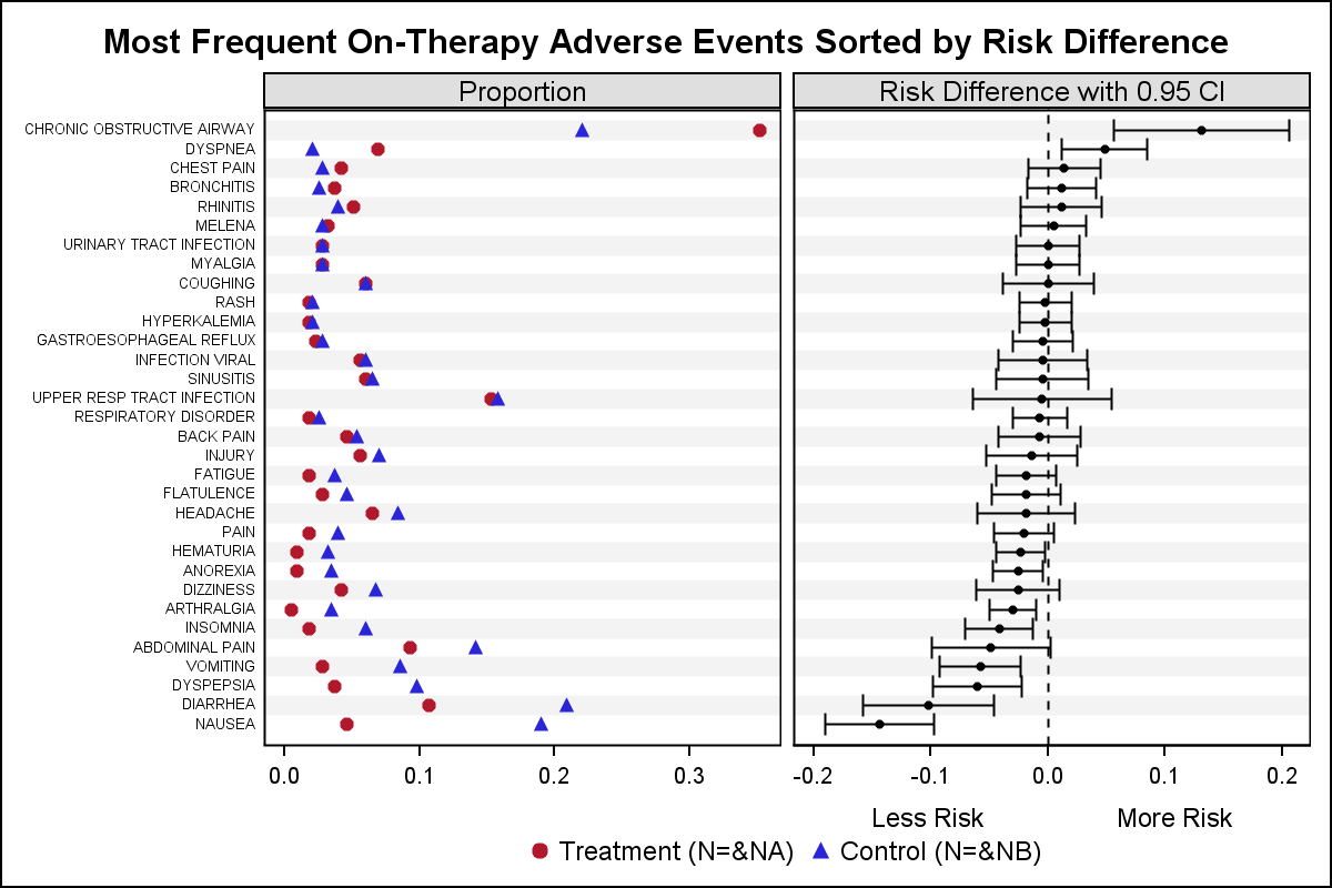
In addition to the Forest Plot with Subgroups, another popular graph in the clinical research space is the Most Frequent Adverse Events Sorted by Relative Risk graph. Recently, I worked with folks from some pharmaceutical companies to contribute SAS code for this graph to the CTSPEDIA resource for statistical graphics.
The data for number of adverse events by preferred name and treatment is shown in the program attached. The proportion for each drug is computed along with the relative risk difference using the following formula:
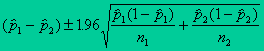
Risk difference: p1-p2; where p1 is the proportion for treatment B and p2 is the proportion for treatment A. n1 and n2 are the total number for treatment B and A respectively (95% CI).
The graph is created using a two cell Layout Lattice as shown here:
This construction of this graph is very simple using SAS 9.2 GTL:
- Use a two column Layout Lattice.
- Define a RowAxes block to set a single common external row axis.
- Populate two scatterplots in the first cell, one for each proportion by AE.
- Populate one scatter plot in second cell, showing LCL, UCL and Mean.
- Add a reference line at x=0.0 in second cell.
- Add title, legend and customize x axis label for second cell.
In the version shown below, I have used my standard technique to add alternate horizontal bands using wide faint reference lines to provide a graph with less clutter.
Full SAS 9.2 GTL program: AEbyRelRisk


4 Comments
Log scale for RR would be preferable
That would work if the equation for the relative risk difference results in all positive values. In such cases, I have seen a log axis used, and it would be easy to set that option. In this case we have negative values, so it is not feasible to use log axis.
Pingback: Two-in-one Graph - Graphically Speaking
Thank you Sanjay for the useful article. It was indeed very helpful. However there is a small correction required in the program: AEbyRelRisk. In the below code lcl and ucl derivation need an update. I believe the derivation need to reverse like current lcl derivation is actually for ucl and vice versa.
/*--Compute Proportions for treatment A & B, Mean and Risk--*/
data ae_risk;
set ae;
keep pref a b mean lcl ucl;
a=na/sna;
b=nb/snb;
factor=1.96*sqrt(a*(1-a)/sna + b*(1-b)/snb);
lcl=a-b+factor;
ucl=a-b-factor;
mean=0.5*(lcl+ucl);
run;
Thanks,
Jagadish