During SAS Global Forum 2012, I had conversations with many SAS users who wanted to create Forest Plots. However, there was one new twist. The study names were subgrouped by categories like 'Age', 'Sex', etc., with multiple entries under each subgroup. The name of each study within the subgrouped was indented to indicate the grouping.
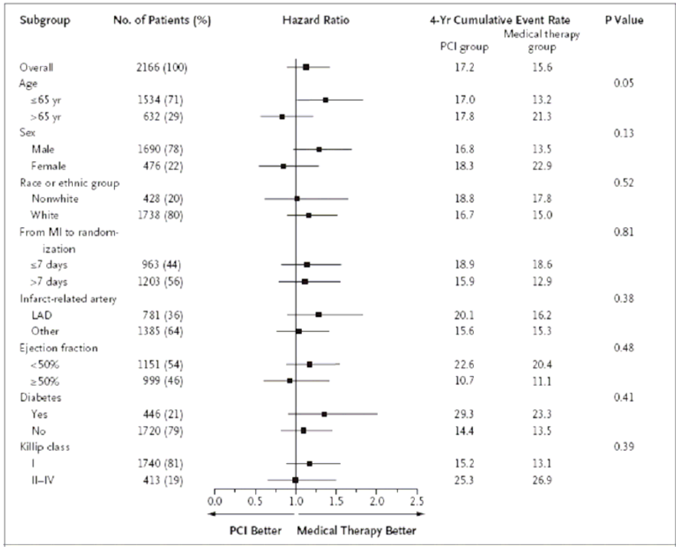
This also came up in a recent discussion with the folks at CTSPedia, who also wanted to create a similar subgrouped forest plot shown below (click on graph for bigger version):
The graph itself can be easily created using GTL, but the main issue was the indentations needed in the subgrouped study names. In GTL and SG Procedures, leading and trailing blanks are removed from the axis tick values and markercharacter strings. So, how do we include the indentations?
Earlier, I discussed using a non breaking space for a simple Forest Plot using SGPLOT procedure. In that article I also provided a sneak preview of this graph. It looks like this nbsp is becoming my good friend.
Here we are using nbsp in place of a regular space for both the leading and trailing blanks. To help get the indentations right in the dataset, I first use a dot for all leading and trailing blanks in the study names. These are easier to see. Then, I simply replaced all dots by an nbsp ('A0'x) using the translate() function. Remember, we have to use a non-proportional font to ensure the all characters have consistent width.
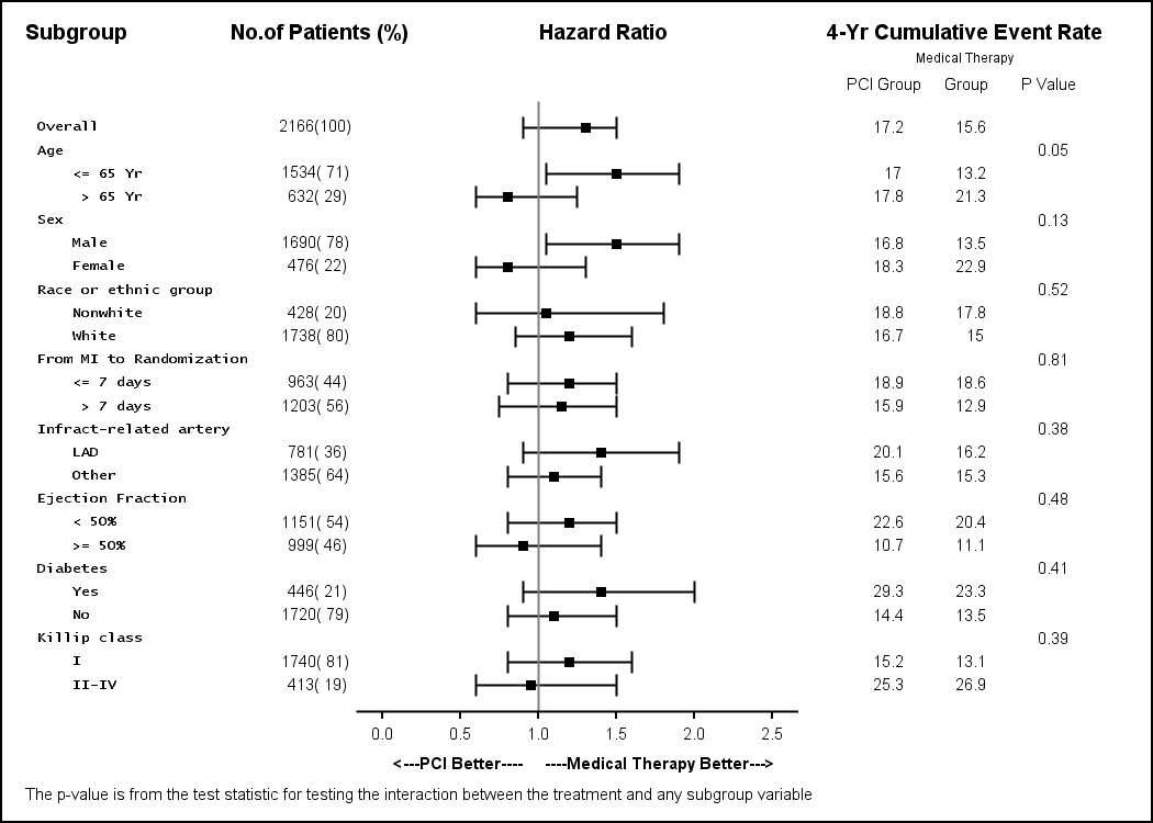
Here is the graph I created using SAS 9.2 release. Note: I did not receive the actual data set for the original graph, so the values for Mean LCL and UCL are eyeballed from the graph above and may not be very accurate. The focus of the exercise is making the graph, given the data.
The code will be familiar to the GTL programmer. Here are the basic steps for the template:
- Use a LAYOUT LATTICE with four columns for the main graph.
- Weights for the columns are (0.23 0.07 0.4 0.3).
- The study names are displayed in the first column using SCATTERPLOT with the MARKERCHARACTER option. A non-proportional font is used to display these strings.
- The number of patients and % are shown in the second column also using the scatter plot with marker character option. In this case, a non-proportional font is not necessary.
- The Hazard Ratio plot is shown in the third column with custom x axis tick values and label.
- PCI, Group and p-values are shown in the last column.
- For arranging the headers correctly, I used another 2x4 lattice, with slightly different weights and populated each cell with the string needed.
In such cases where the plot and data are aligned horizontally across a wide graph, it is helpful to provide a guide to the eye to keep things lined up across the page. Something similar to the old 132 character line printer page with the green bands is helpful. So, I used a trick to draw wide grid lines behind alternate blocks of observations. I also added a background color for the headers. Here is the graph:
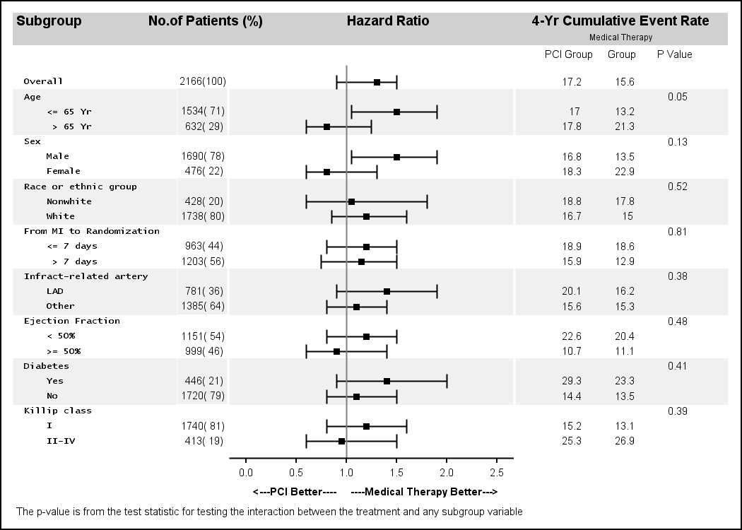
In the graph above, the bands help the eyes track the data across the wide page. In the graph above, I used the scatter plot with the marker character option to do all the textual columns, including the study names on the left. This allowed me to put the shaded bands behind the full width of the graph.
An earlier version of this same Forest Plot is posted on the CTSPedia page. In this graph, the study names are Y axis tick values. The bands (using reference lines) cannot extend under the Y axis tick values.
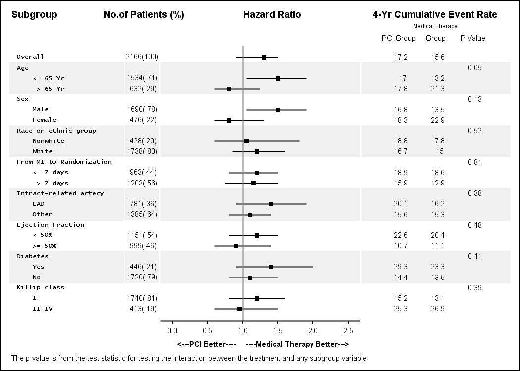
Using SAS 9.3, the serifs for the error bars can be eliminated by using a HIGHLOWPLOT statement to plot the confidence interval.
Full SAS 9.2 program: ForestPlot_92
Full SAS 9.3 program: ForestPlot_93


23 Comments
Thank you Sanjay, this is really helpful!
Kriss
We are frequently looking to create forest graphs for clinical publications and the work you have Sanjay is very helpful. THANKS and keep up the great graphical work you are doing.
Thank you!
I've been looking for a way to indent a forest plot for months!
🙂
Thank you for sharing!!!!
Pingback: Most Frequent AE Sorted by Relative Risk - Graphically Speaking
Pingback: Subgrouped Forest Plot with Font Attributes - Graphically Speaking
Hi Sanjay,
Many thanks for the excellent article.
I have problems though when I want to have two rows with the same subgroup. For example if I twice write yes or no (for different subgroups), then only one is shown. Presumably this is due to the scatter.
Is there any way to solve this?
Many thanks
Hi Stephen, were you able to find a solution for the above defined isuue of overwriting? If not I have one work around. Please let me know if you are interested.
Hi Sirisha,
i'd actually be interested in your workaround for the issue with subgroups disappearing if they have the same name within several groups.
Thanks
Alex
Hello,
I am also interested in your work-around if you wouldn't mind sharing!
Thanks!
Hi Stephen
I am also interested in your solution.
Thanks
Dear Sanjay,
I'd like to plot 3 contiguous (all side by side and separated by one vertical line) subgrouped forest plots (corresponding to 3 methods). They have the same subgroups labels on the left side. Is there a mean to do this ? Thank you very much in advance for your advices.
Best
Dear Sanjay,
Many thanks for sharing your experiences. I particularly appreciate that in your programmes you always provide with a dataset so we can use them as it is and easily understand what we are doing.
I obtained a nice forest plot when I used them with variables with subgroups.
However, when I tried to adapt them with an outcome variable with a few categories (6), the vertical axis (referenceline x=1) is too long towards the top of the forest plot and the baseline horizontal axis is placed to far away from the first plot. So I got an unbalanced forest plot. I hope my description makes senses. If so, do you know the options to use in order to get a balanced one?
Thank you for your help.
Kim
The height of the graph is set externally in the ODS Graphics statement (or default 640x480). You may need to adjust that based on the number of observations.
HI Sanjay,
great help. Thanks!
I got a small issue:
My forest plot has only the general group in a first column (like your "Age") and then the actual subgroups ("> 64" "<64" etc ) in the 2nd column. My issue is that the "Age" text is only nicely aligned for the first group (i.e. it is on the same lines as the first subgroup". However for subsequent group blocks such as region etc. the text in the 1st column seems to be almost randomly aligned and it looks very messy. Any idea how to ensure that the text in the 1st column is ALWAYS aligned with the first subcategory in the 2nd column?
Thanks a lot
Alex
Please attach a picture if you can to better understand what is happening.
So it would look like this (i cannot attach an image due to confidentiality reasons):
Col 1: Col2
Female
Gender Male
I want col1 always to be aligned with the first line of col2 (i.e. Female). In my graph it is all over the place at the moment depending on how many levels my Col2 has. Col2 has different level of subgroups (from 2 levels like above up to 5). Does that cause the issue?
Hope this is a bit clearer. Much appreciate your help !
Thanks
Alex
Sorry i realized it is taking blanks out so i cannot show you exactly how it is supposed to look like but maybe it still is clearer now what my problem exactly is?
So in a nutshell i could say that my horizontal alignment across the 6 columns that i have to display is slightly off in particular from my first column to the 2nd even though i only display text and no statistics.
Hi
i am struggling with something really strange in my forest plot. My first column is an overall category so it would just say "Age" and my second column are the actual subgroups (e.g. Male, Female). Now if i have 2 subgroups with the same value (for different groups) e.g. Yes then the GTL code omits the Yes for the second group. The stats are still displayed in the other columns but the text of "yes" simply disappears. Any ideas why this is happening. It almost seems like a bug to me?
Thank you for posting this, Sanjay!
I'm using SAS 9.4 and it looks like the first column ("Subgroup") is being centered so my indentations aren't aligning. I don't see a way to adjust the alignment of the scatterplot markers. Any suggestions?
Thanks a bunch!!
-Lauren
Thank you for posting this, Sanjay!
I got a small issue:
In my forest plot some varibles has 3 subgroups and another has 4 subgroups ,Any suggestions, please ,thank you .
I think the basic process should still work. Just for the color bands, you may need to do some custom code to set the REF column.
Hi Sanjay,
Thanks for wonderful blog!
Really useful!!
1). I ran your code in my environment (UNIX 9.2). It went through smooth after small change of path. But, output has subgroup "centered" and there is issue with indentation. I see, non-breaking blanks in the dataset and in fact, output (where that space overlaps with next column and hides some of values in next column i.e. No. of Patients). Same problem I face of indentation in my output with my code. Somehow, I am not getting it right?
Is there anything (like options) to keep in mind and change?
2). As you have shown a way to get column header, I could got them right. However, in my case, I have header label running in 2 rows. Like 'PCI' in 1st row and 'Group' in 2nd row in 4th column. Is there a way to wrap the label of X2 Axis (I read your answer in one of blog saying we can not wrap axis label, if correctly understood), or to manage this other way?
Thanks a lot for all your blogs and answers !!
Kamlesh