ODS Graphics components like GTL and SG procedures are designed to work with Styles to create graphs that are effective in the delivery of information and aesthetically pleasing out of the box. You no longer have to tweak the colors to ensure a nice graph. The graph derives all the visual attributes from the active style of the open destination.
Each ODS destination has a default style, and SAS ships many styles that can be used for your graphs. For analytical graphs, the recommended styles are Listing, Analysis, Statistical, Journal, Journal2 and Default.
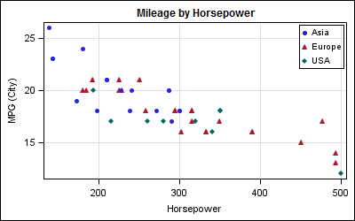
With SAS 9.3 additional styles are available such as HTMLBlue. These styles have been carefully designed by experts to ensure the result is aesthetically pleasing, the graph colors are distince, yet balanced. Here is a common graph created using the LISTING style.

SAS 9.2 Code:
ods listing style=listing; title "Mileage by Horsepower"; proc sgplot data=sashelp.cars(where=(type='Sports')); scatter x=horsepower y=mpg_city / group=origin; keylegend / location=inside position=topright across=1; xaxis grid; yaxis grid; run; |
Normally, when a group variable is not used, the visual attributes of a plot are derived from the GraphDataDefault style element. Also, visual attributes can be easily changed by using the MarkerAttr option.
In this graph, we have assigned GROUP=origin. When a group variable is in effect, the visual attributes for each group are derived from the GraphData1 - GraphData12 elements. By default, 12 elements are defined in most styles, but you can define more or less elements. In this case, there is no option in SAS 9.2 SG procedures or GTL to change the list of colors or marker symbols that are used with each group value.
If you have the need to use specific marker shapes or colors for each group in your graph, you have to create a new style that specifies these values in the style. While you can certainly edit a style, one way to quickly and painlessly create a style with custom marker shapes, colors, etc. is to use the MODSTYLE macro.
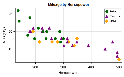
In the following example, we want to use the LISTING style, but want to use the CircleFilled, TriangleFilled and DiamondFilled symbols for the group values.
SAS 9.2 Code:
%modstyle(name=markers, parent=listing, type=CLM, markers=circlefilled trianglefilled diamondfilled); ods listing style=markers; title "Mileage by Horsepower"; proc sgplot data=sashelp.cars(where=(type='Sports')); scatter x=horsepower y=mpg_city / group=origin; keylegend / location=inside position=topright across=1; xaxis grid; yaxis grid; run; |
Here we use the MODSTYLE macro to derive a new style named 'Markers' from the LISTING style, with the three markers specified. Other details of the style are unchanged. Then, we use the new style "Markers" as the style for the LISTING destination.
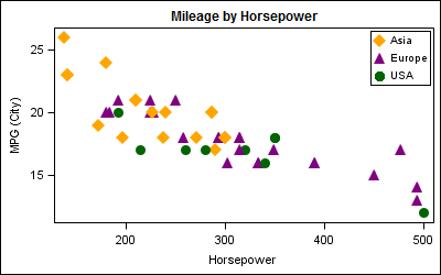
In the following graph, we have modified both the marker symbols and the marker colors. Note, in the ODS Styles, the marker and lines use the "ContrastColor" attribute in the style element. The macro parameter "Color" sets this contrast color in the style. The macro parameter "FillColor" sets the "Color" attribute in the style element, used for coloring filled areas such as bars, histograms and bands. We have also increased the size of each marker using the MarkerAttrs option.
SAS 9.2 Code:
%modstyle(name=colors, parent=listing, type=CLM, markers=circlefilled trianglefilled diamondfilled, colors=darkgreen purple orange); ods listing style=colors gpath=&gpath image_dpi=&dpi; title "Mileage by Horsepower"; proc sgplot data=sashelp.cars(where=(type='Sports')); scatter x=horsepower y=mpg_city / group=origin markerattrs=(size=11); keylegend / location=inside position=topright across=1; xaxis grid; yaxis grid; run; |
Using a custom style by itself does not ensure that specific group values you want will be mapped to specific markers in the graph. The assignment of group colors 1-N is done in the order the observations are encountered in the data. One way of ensuring the assignment order in SAS 9.2 is by using the GTL option INDEX. The index is a value 1-N that directly maps to one of the group style elements.
In this case, we have created a new column in the data called "Index". we have specifically assigned index the values 1, 2 and 3 for Origin values of "USA", "Europe" and "Asia". Note, "Asia" is still encountered first in the data and is shown first in the legend, but now has the orange diamond symbol. The green circle is assigned to "USA". The INDEX option is not available in SG procedures, so you have to use GTL.
SAS 9.2 GTL Code:
/*--Template for color by index--*/ proc template; define statgraph index; begingraph; entrytitle 'Mileage by Horsepower'; layout overlay; scatterplot x=horsepower y=mpg_city / group=origin index=index markerattrs=(size=11) name='a'; discretelegend 'a' / location=inside halign=right valign=top across=1; endlayout; endgraph; end; run; /*--Create graph with assigned group index--*/ ods listing style=colors gpath=&gpath image_dpi=&dpi; proc sgrender data=cars template=index; run; |
Note: A new feature called "Attribute Map" has been added with SAS 9.3 to deterministically assign group attributes to data values.
Full SAS Code: SAS92_Code


10 Comments
Hi Sanjay,
I tried your code but get an error of the macro %modstyle is not being resolved. Is this a system maro or a custom macro ? Where can I find this macro or activates it ? I am using PC/SAS 9.3 in a Window x64 environment.
Thanks
Kwok
It is in the autocall library and shipped with STAT. If you cannot find it, we can send it to you. Let me know.
Can you send me a copy ?
Hi Sanjay,
I tried to fix the color in black but it does not work in the rtf output. Is there anything wrong in my code below?
thanks!
%modstyle(name=linestyle, parent=statistical, type=CbyLM,
colors=black black black,
linestyles=Solid LongDash Dot,
markers=circlefilled trianglefilled diamondfilled);
ods listing style=linestyle ;
title "Mileage by Horsepower";
ods graphics on /ANTIALIASMAX=700;
ods rtf file="C:\test\f_test.rtf" ;
proc sgplot data=sashelp.cars(where=(type='Sports'));
scatter x=horsepower y=mpg_city / group=origin;
*markerattrs=(size=11);
loess x=horsepower y=mpg_city / group=origin;
keylegend / location=inside position=topright across=1;
xaxis grid;
yaxis grid;
run;
You will have to use your new style for the rtf destination too:
ods rtf style=linestyle file="...";
Note: If you always want black color, you can just set the color to black in the scatter plot and loess statement:
scatter x=horsepower y=mpg_city / group=origin markerattrs=(color=black);
loess x=horsepower y=mpg_city / group=origin lineattrs=(color=black);;
Now, the groups will still get different marker symbols and line patterns, but they all will be black. This will happen regardless of the style in use.
Pingback: Setting Graph Colors is Easier with SAS 9.4 - Graphically Speaking
Hi there,
Today I tried to run the code (provided above in this blog) in sas and it didn't work for me. There was no error as such but output had default marker as circle for all the groups. Just that the colors were changing but line and symbols were the same for everything(Symbol:circle line-solid). I tried using the linestyle attribute to change the line styles but it still wouldn't change. Do you have any suggestions why I might be facing this issue even though there is no error. :
The code used:
%modstyle(name=markers, parent=listing, type=CLM,
markers=circlefilled trianglefilled diamondfilled);
ods listing style=markers;
title "Mileage by Horsepower";
proc sgplot data=sashelp.cars(where=(type='Sports'));
scatter x=horsepower y=mpg_city / group=origin;
keylegend / location=inside position=topright across=1;
xaxis grid;
yaxis grid;
run;
Hi
Is it possible to not only make the markers different shapes and colors but also different sizes?
Sizes specified in the style for GraphData1-12 are not honored. I am not sure if MODSTYLE lets you change it. You can Google for doc: http://support.sas.com/rnd/app/ODSGraphics/papers/modtmplt.pdf
Pingback: Getting Started with SGPLOT - Part 1 - Scatter Plot - Graphically Speaking