In a previous article we discussed how to add axis aligned statistics table to a Lipid graph using GTL. Other graphs such as the Survival Plot also utilize the same technique to display the "at risk" statistics aligned by time or visits along the X axis.
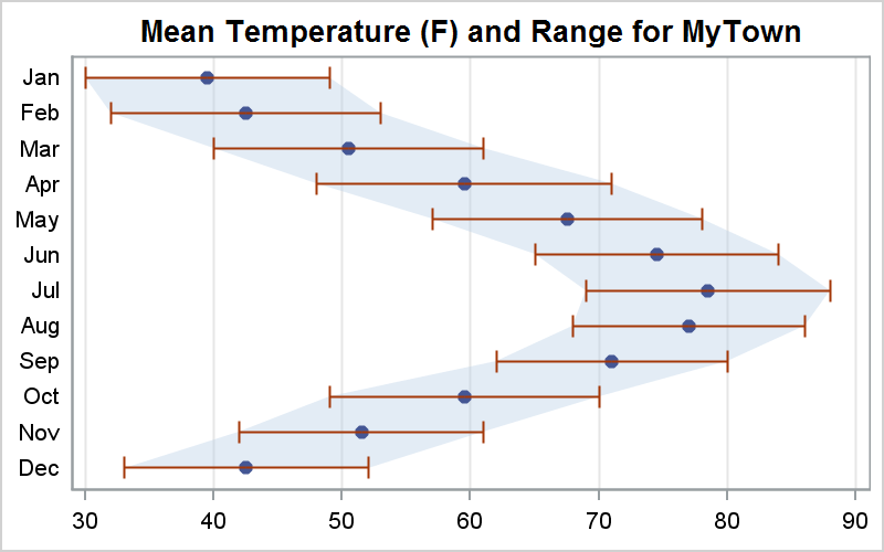
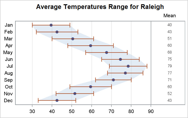
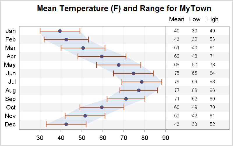
Often, we also need to display columns of statistics aligned with the Y axis values as shown below.

This kind of graph is very easy to create using the SAS 9.2 SGPLOT procedure, without the need for any annotation. The key features used to create this graph are described below.
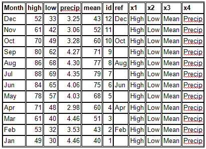
The data for this graph is shown below. Each observation contains the high, low and mean temperature for each month. The id column was used to sort the data. The X1 - X3 character data columns along with the corresponding numeric data columns are used to display the statistics columns as you will see in steps 2 & 3. The ref column contains the name of the month with alternate observations missing. This is used to draw the alternating bands.

Step 1: The basic graph is created using a simple overlay of a band plot and a scatter plot as shown in the program and graph below.
title "Mean Temperature (F) and Range for MyTown"; proc sgplot data=weather2 noautolegend; band y=month lower=low upper=high / transparency=0.6; scatter y=month x=mean / markerattrs=(symbol=circlefilled) transparency=0 xerrorlower=low xerrorupper=high; xaxis display=(nolabel) grid; yaxis display=(nolabel noticks) offsetmin=0.05 offsetmax=0.05; run; |
Step 2: Now, we restrict the plots to the lower 80% of the graph area by setting the x-axis OFFSETMAX=0.2. This tells the x-axis to NOT use the higher 20% of the width of the graph. We add a scatter plot to draw the data values using the MARKERCHAR option, using the X2 axis. Also, we restrict the X2 axis to use the upper 10% of the width of the graph by setting OFFSETMIN=0.9. You can adjust these values till you get the right spacing you need. The REFLINE is used to draw a separator between the graph and the statistics column.
title "Mean Temperature (F) and Range for MyTown"; proc sgplot data=weather2 noautolegend; refline 90 / axis=x; band y=month lower=low upper=high / transparency=0.6; scatter y=month x=mean / markerattrs=(symbol=circlefilled) transparency=0 xerrorlower=low xerrorupper=high; scatter y=month x=x3 / markerchar=mean x2axis; xaxis display=(nolabel) grid offsetmin=0.1 offsetmax=0.2; x2axis display=(noticks nolabel) offsetmin=0.9 offsetmax=0.08; yaxis display=(nolabel noticks) offsetmin=0.05 offsetmax=0.05; run; |
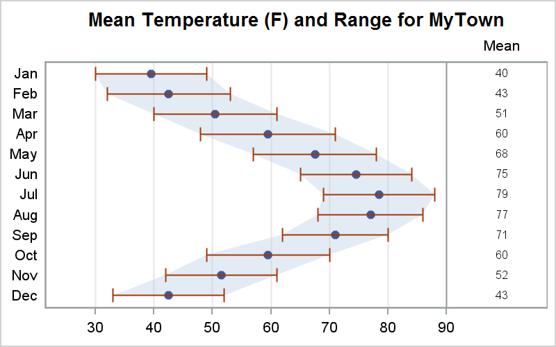
Step 3: We include the additional statistics columns by merely adding more scatter statements on the X2 axis, one for each statiatics column. We adjusted the offsets to provide more space for the additional columns. We have used a horizontal refline statement ot draw the alternating bands to help line up the data with the months.
Note: Here we have used the UNICODE character for degree in the title. See Dan's post The Power of Unicode for more details.
ods escapechar='~'; title "Mean Temperature (~{unicode '00b0'x}F) and Range for MyTown"; proc sgplot data=weather2 noautolegend; refline 90 / axis=x; refline ref / lineattrs=(thickness=18) transparency=0.9; band y=month lower=low upper=high / transparency=0.6; scatter y=month x=mean / markerattrs=(symbol=circlefilled) transparency=0 xerrorlower=low xerrorupper=high; scatter y=month x=x3 / markerchar=mean x2axis; scatter y=month x=x2 / markerchar=low x2axis; scatter y=month x=x1 / markerchar=high x2axis; xaxis display=(nolabel) grid offsetmin=0.1 offsetmax=0.3; x2axis display=(noticks nolabel) offsetmin=0.75 offsetmax=0.08; yaxis display=(nolabel noticks) offsetmin=0.05 offsetmax=0.05; run; |

The complete code can be seen here: SAS Code For Y axis aligned table


7 Comments
This is very helpful.
I needed this not long ago but had to use GTL to get the same result.
The documentation does not do offsetmax justice.
Yes, you can create a similar graph with GTL using the Layout Lattice with multiple columns. This is indeed the most flexible way, as you can mix statistics and graph columns as you need. The benefit of using SGPLOT in this way is 1) it is very easy and 2) the multiple columns of data get spaced automatically. All you have to do is assign an overall width for the all the columns together. Of course, you can only create two regions, one with X and one with X2.
Pingback: Panel graph with axis-aligned statistics - Graphically Speaking
Hello,
I have started using sgplot and i think it's so much easier to make figures now. I have one problem. How do i plot a mean curve of body weight over time if i want one yaxis to be in kg and the otherwww yaxis to be in pound ? I only want 1 line.
Thank you for your help.
Best regards
Soren
SGPLOT allows you to layer multiple curves to create the graph you need. In this case, you HAVE to use two series statements, one using pounds are response associated with the Y axis and one using Kg associated with Y2 to see both the Y and Y2 axes. You can make one of the curves invisible by setting TRANSPARENCY=1. However, you do need to ensure the two axes are correctly aligned.
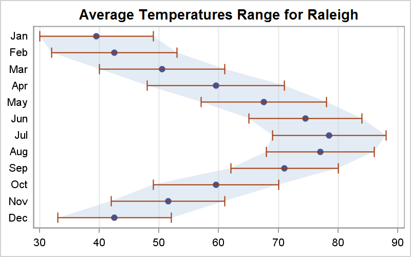
See the example on aligning axis with Farenheit and Celcius data in this article. You can use the same idea with Pounds and Kg.
http://blogs.sas.com/content/graphicallyspeaking/2014/03/01/axes-synchronization/
Nice example, Sanjay. And as mentioned in comments, GTL allows the most flexible.
So a comparison would provide good guidance. I'd like to see SGPLOT and GTL examples of the same display. Since you've already provided this horizontal example, what about a vertical example with the summary stats below the graph along the horizontal (time) axis?
If you look through the articles in the blog, I am sure you will find many with statistics on the horizontal axis.