In parts one and two of this blog posting series, we introduced machine learning models and the complexity that comes along with their extraordinary predictive abilities. Following this, we defined interpretability within machine learning, made the case for why we need it, and where it applies.
In part three of this series, we will share practitioner perspectives on:
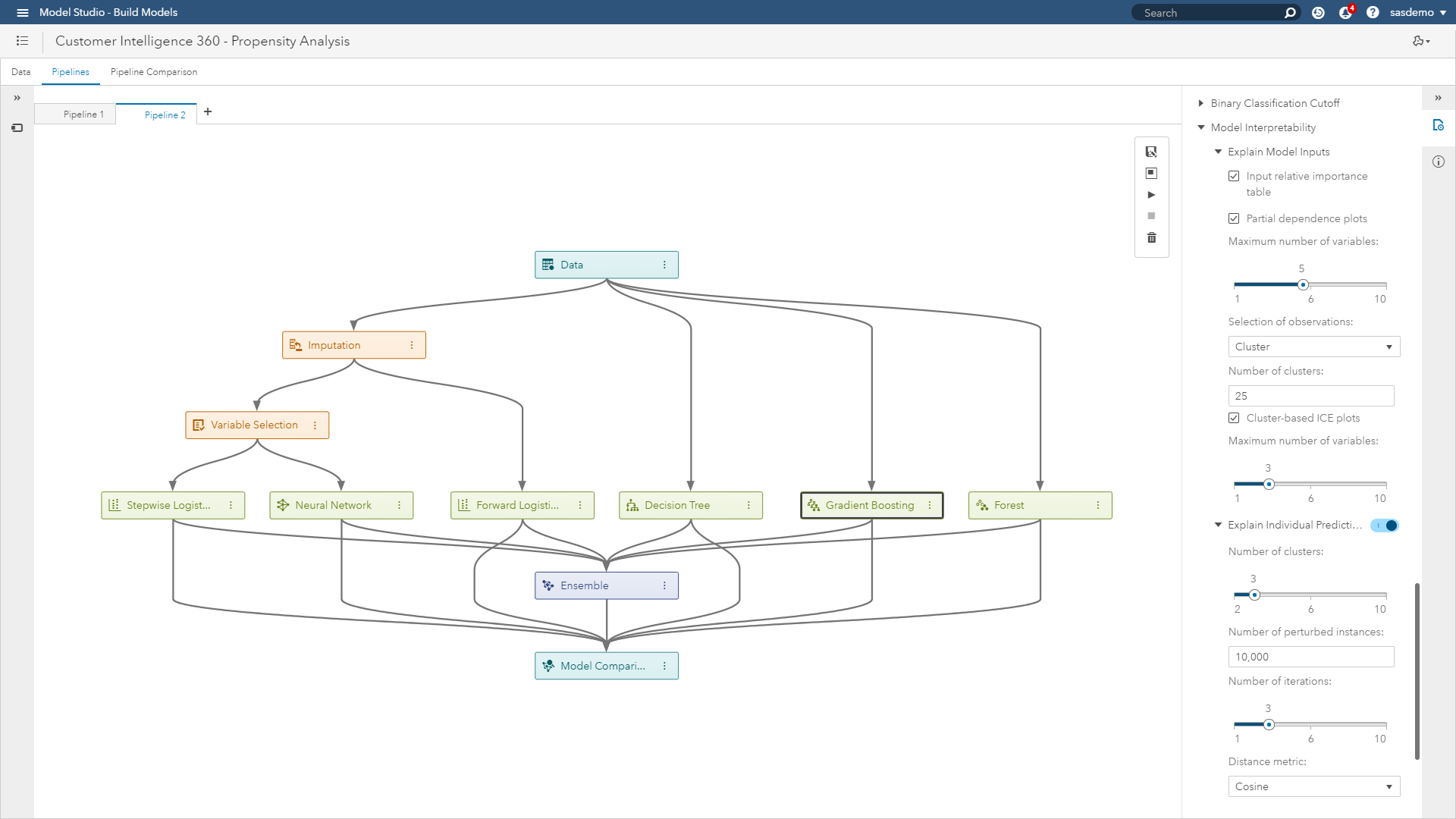
- Interpretability techniques within SAS Customer Intelligence 360 using SAS Visual Data Mining and Machine Learning
- Proxy methods
- Post-modeling diagnostics
Interpretability techniques
Using data captured by SAS Customer Intelligence 360 from our website, sas.com, let’s discuss techniques that dig deeper into this interpretability obstacle. Anyone who has ever used machine learning in a real application can attest that metrics such as misclassification rate or average square error, and plots like lift curves and ROC charts are helpful but can be misleading if used without additional diagnostics.

Why? Sometimes data that shouldn't be available accidentally leaks into the training and validation data of the analysis. Sometimes the model makes mistakes that are unacceptable to the business. These and other tricky problems underline the importance of understanding the model's predictions when deciding if it is trustworthy or not, because humans often have good intuition that is hard to capture in traditional evaluation metrics. Practical approaches worth highlighting are:
Proxy methods
Surrogate model approach: Interpretable models used as a proxy to explain complex models. For example, fit a machine learning (black box) model to your training data. Then train a traditional, interpretable (white box) model on the original training data, but instead of using the actual target in the training data, use the predictions of the more complex algorithm as the target for this interpretable model.
Machine learning as benchmark: Use a complex model to set the goal for potential accuracy metrics (like misclassification rate) that could be achieved, then use that as the standard against which you compare the outputs of more interpretable model types.
Machine learning for feature creation: Use a machine learning model to extract the features, then use those transformed predictors as inputs to a more explainable model type. This method is an ongoing topic of research by SAS to continue improving interpretability.
Post-modeling diagnostics
Variable importance: This visualization (see figure below) assists with answering the question: “What are the top inputs of my model?” Importance is calculated as the sum of the decrease in error when split by a variable. The more influential the feature, the higher it rises.
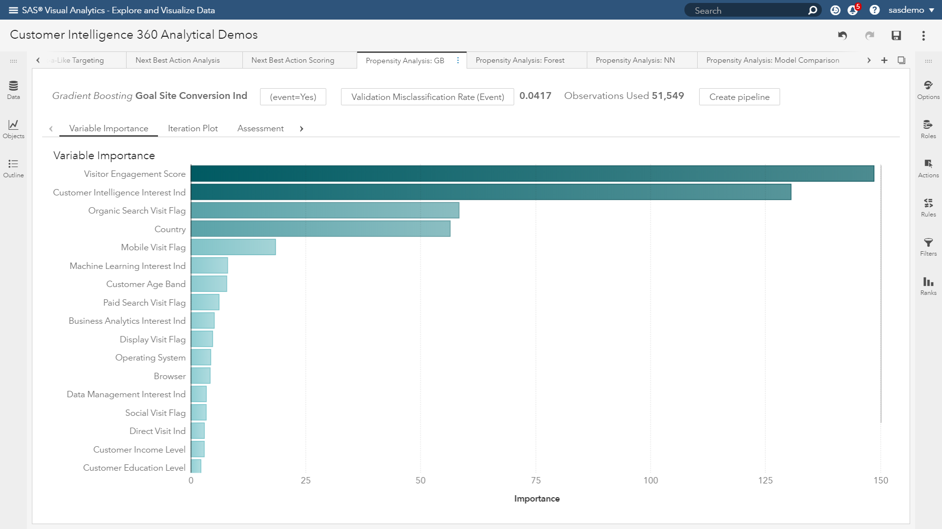
(Image 2: SAS Customer Intelligence 360 & SAS Visual Data Mining and Machine Learning - Variable importance plot)
In the figure above, the variable importance plot of a gradient boosting analysis focused on visitor conversion propensity quickly shows you what to pay attention to and what is noise. Attributes like visitor engagement, viewing the SAS Customer Intelligence solution page, originating from organic search, visitor location and interactions from mobile devices are topping the list.
Partial dependence (PD) plots: Illustrate the relationships between one or more input variables and the predictions of a black-box model. It is considered a visual, model-agnostic technique applicable to a variety of machine learning algorithms. By depicting how the predictions depend (in part) on values of the input variables of interest, PD plots look at the variable of interest across a specified range. At each value of the variable, the model is evaluated for all observations of the other model inputs, and the output is then averaged.
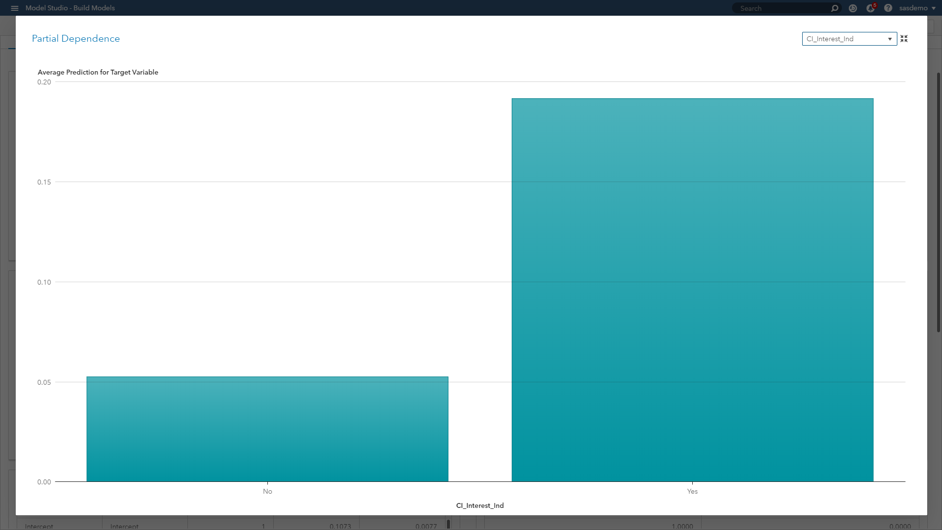
In the figure above, the PD plot shows that the probability of a conversion event on sas.com increases when a visitor views the SAS Customer Intelligence product page, as opposed to not viewing it along a journey. In the case of numeric features, PD plots can also show the type of relationship through step functions, curvilinear, linear and more.
Individual conditional expectation (ICE) plots: Also considered a visual, model-agnostic technique, they enable you to drill down to the level of individual observations and segments. ICE plots help explore individual differences, identify subgroups and detect interactions between model inputs. You can think of ICE as a simulation that shows what would happen to the model’s prediction if you varied one characteristic of a particular observation.
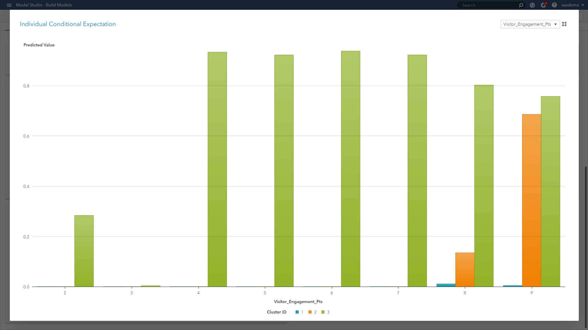 (Image 4: SAS Customer Intelligence 360 & SAS Visual Data Mining and Machine Learning - ICE plot)
When we look at the ICE plot above, it presents the relationship across three clustered segments with respect to engagement behavior on sas.com. The plot showcases that engagement scores of four or higher are strong predictive signals for Segment 3, scores less than nine are weak predictors of Segment 2, and engagement as a predictor overall is useless for Segment 1. ICE plots separate the PD function (which, after all, is an average) to reveal localized interactions and unique differences by segment.
To avoid visualization overload, ICE plots only show one feature at a time. If you want efficiency for larger data, you might need to make some adjustments. For example, you can bin numeric variables, or you can sample or cluster your data set. These techniques can give you reasonable approximations of the actual plots when dealing with voluminous data.
For those readers who would like a more technical SAS resource for PD and ICE plots, check out this fantastic white paper by Ray Wright.
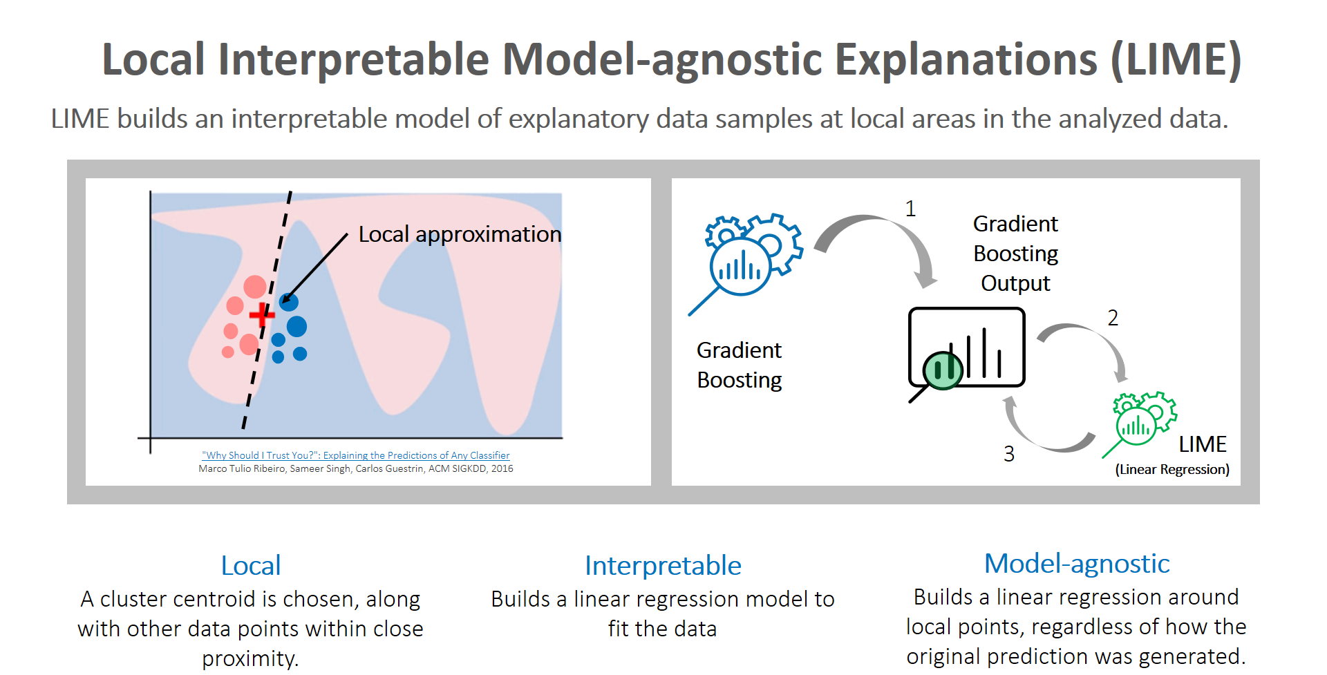
Local interpretable model-agnostic explanations (LIME): Global and localized views are critical topics that analysts must focus on to tell clearer stories about predictions made by machine learning models. Although surrogate models are a reasonable proxy method to consider, they can cause analysts anxiety because they are highly approximated. However, LIME builds an interpretable model of explanatory data samples at local areas in the analyzed data. Here is a great video primer on LIME. Caught your attention? Now let me steer you to the accompanying article diving deeper into the subject.
The key reason to use LIME is that it is much easier to approximate a black-box model by using a simple model locally (in the neighborhood of the prediction you want to explain), as opposed to trying to approximate a model globally.
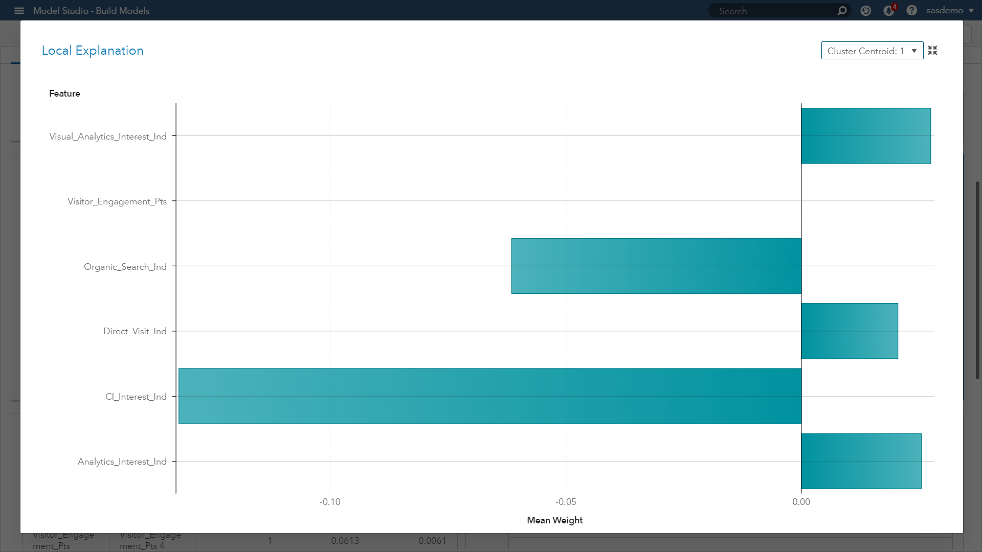
Look at the LIME plot above. It presents a butterfly visual plot summarizing the positive and negative impacts of predictors related to visitor goal conversion behavior of a given cluster centroid (Cluster 1). The LIME graph represents the coefficients for the parameter estimates of the localized linear regression model.
The ICE plot creates the localized model around a particular observation based on perturbed sample sets of the input data. That is, near the observation of interest, a sample set of data is created. This data set is based on the distribution of the original input data. The sample set is scored by the original model and sample observations are weighted based on proximity to the observation of interest. Next, variable selection is performed using the LASSO technique. Finally, a linear regression is created to explain the relationship between the perturbed input data and the perturbed target variable.
The final result is an easily interpreted linear regression model that is valid near the observation of interest. Our takeaway from Image 5 is showing which predictors have those positive and negative estimates within the localized sample. Now let’s look at a second LIME plot for another cluster within our model.
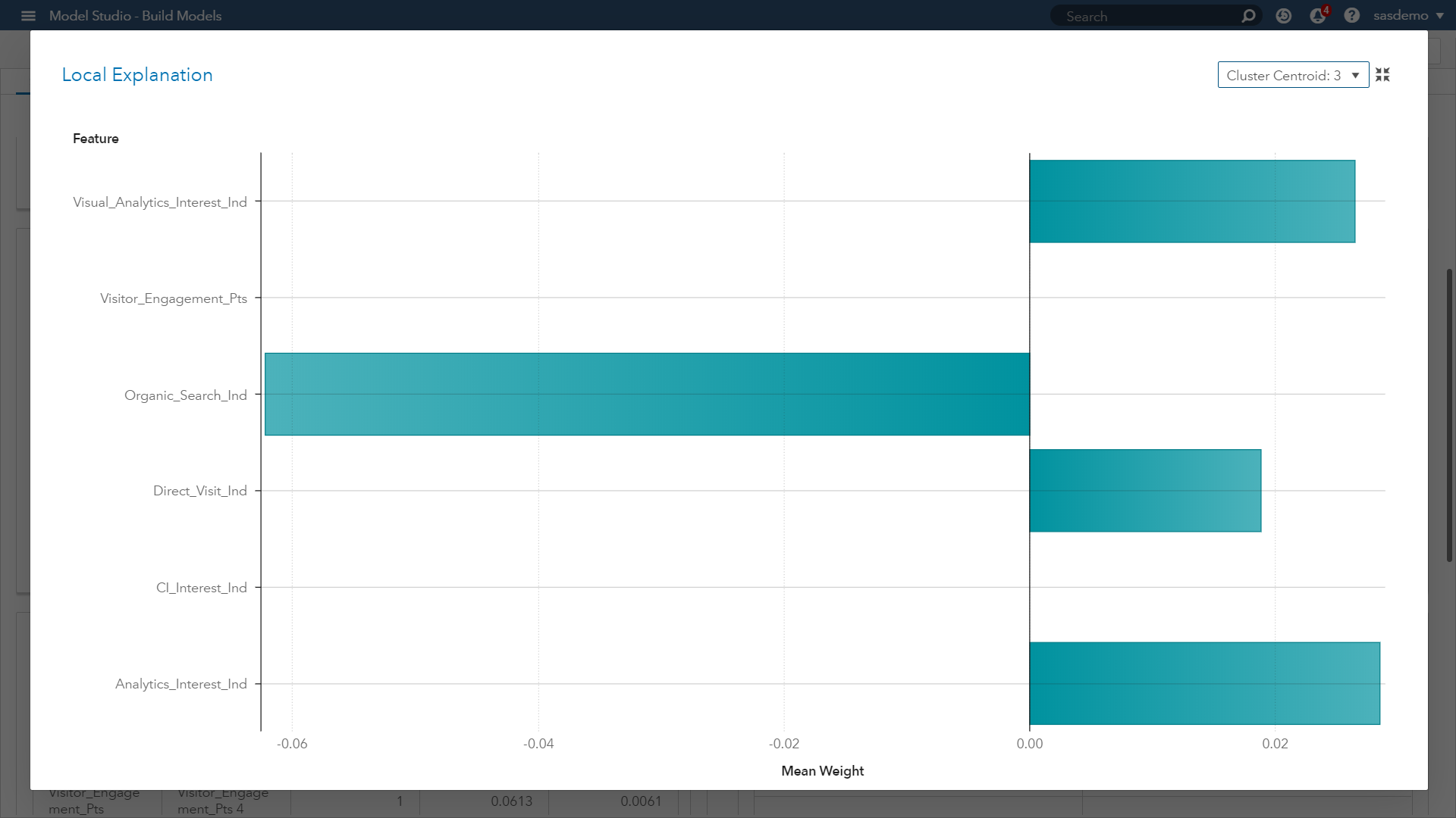
When comparing with Image 5, this new plot in Image 7 provides you:
- Confidence that similar prediction trends across the parameter estimates are occurring by segment, except for one feature.
- The viewing of the SAS Customer Intelligence web page across a visitor journey at sas.com had a negative weight for Cluster 1, but not for Cluster 3.
- As an analyst, investigating this feature and seeking a stronger understanding of its influence will only help in your assessment, developing model trust, and communicating accurate insights.
If you would like to learn more about LIME within SAS Viya, please check out this article, as well as on-demand webinar.
Unraveling the opaque black box of machine learning will continue to be an area of focus and research across every industry’s machine learning use cases. As the digital experience of consumers continues to rise in importance, let’s maximize AI’s potential in this world of voluminous data and actionable analytics without recklessly trusting intuition. SAS Customer Intelligence 360 with SAS Viya provides the mechanisms and visual diagnostics to help address this challenge.