Get the right information, with visual impact, to the people who need it

Building clinical data and insight visually

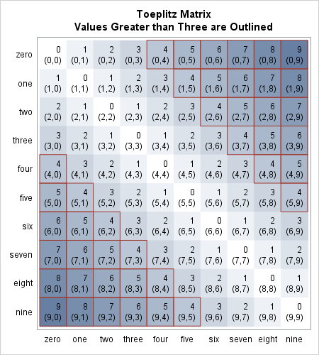
Have you ever been involved in executing an exploratory analysis based on an integrated clinical trial database? If so, you've probably experienced firsthand how elaborate the initial phase of data access and data processing can be. Market analysts estimate the ratio for preparing the data, compared to actually analyzing the information,