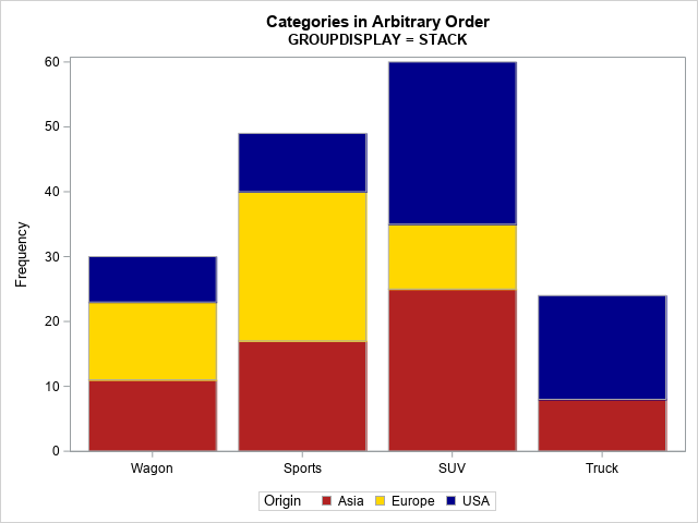
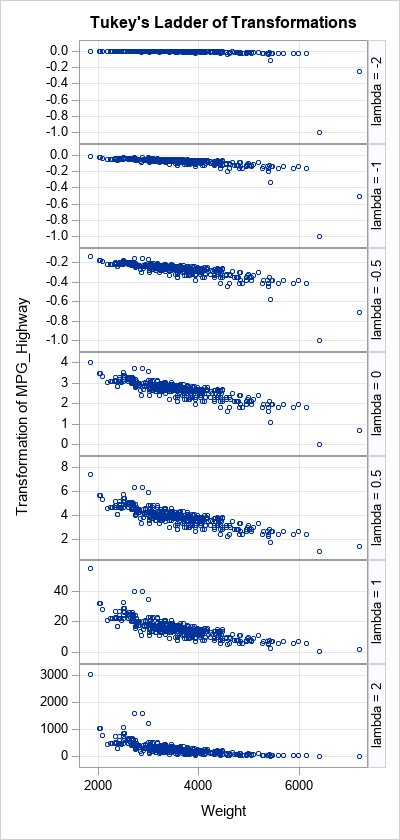
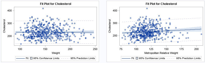
Get the right information, with visual impact, to the people who need it
Moving SAS and its data to the cloud (AKA Viya): Making those tricky data decisions

Let's look at the wider landscape and the direction of our customers, partners and SAS as we move SAS applications to be cloud-native in Viya 4.