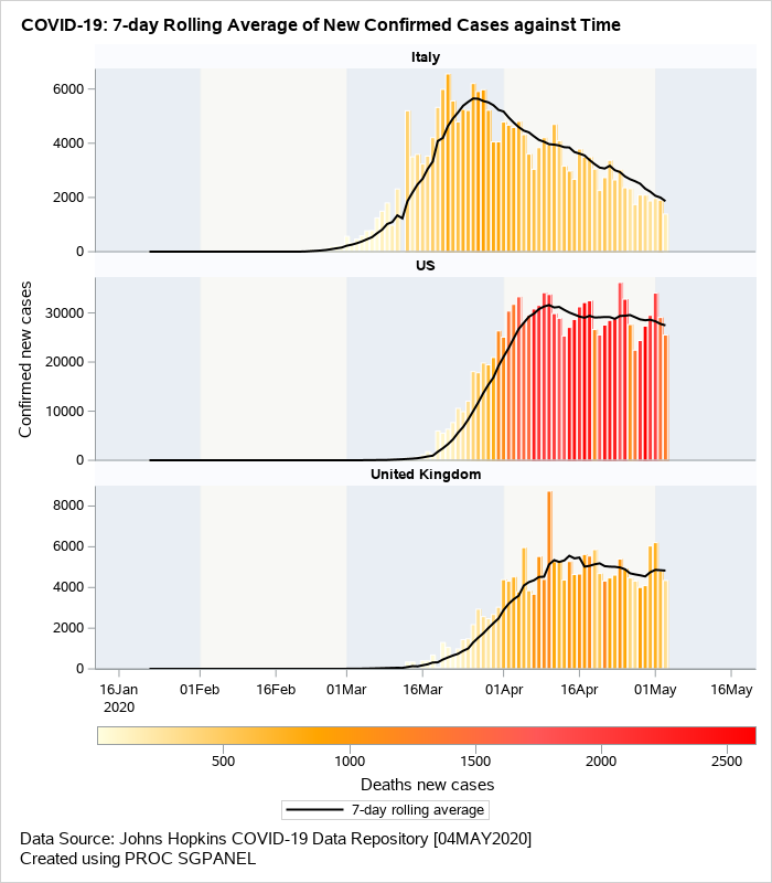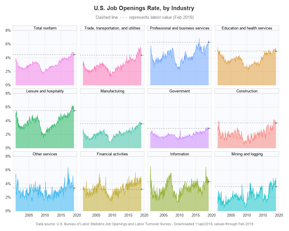
SAS graphs for R programmers - paneled graphs

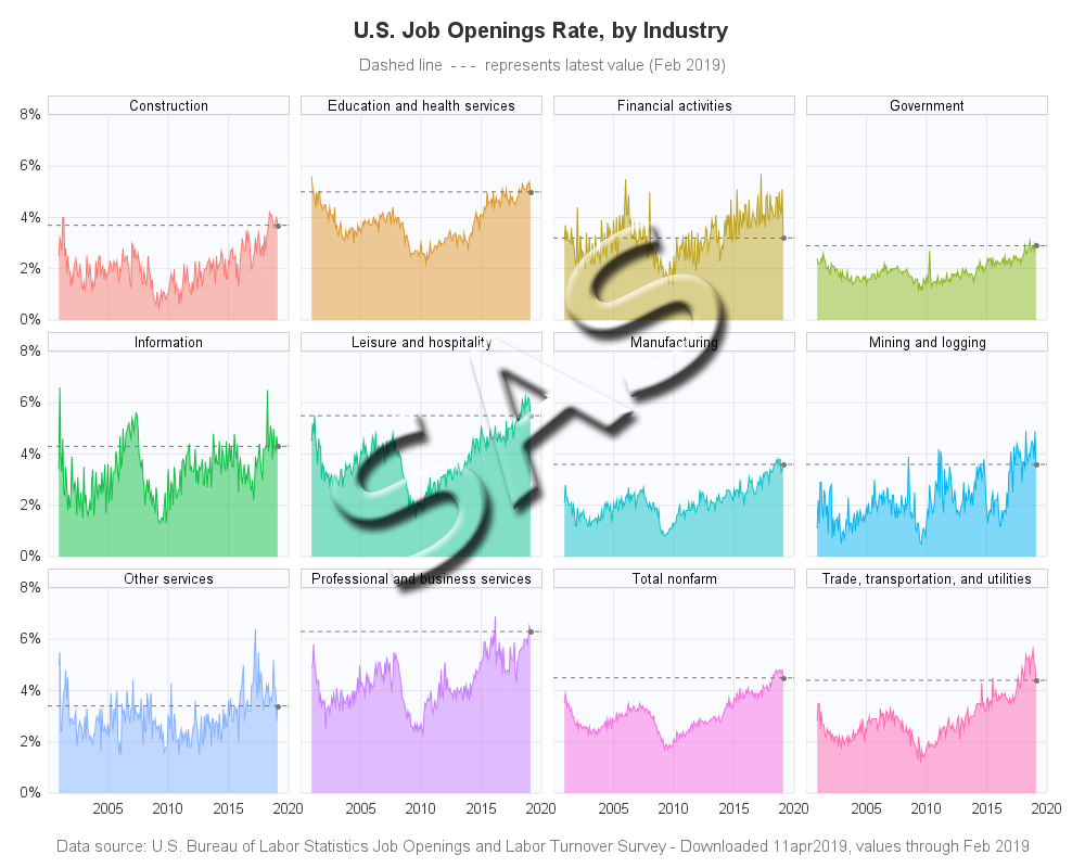
This is another in my series of blogs where I take a deep dive into converting customized R graphs into SAS graphs. Today I show how to combine several graphs with shared axes, which we'll call paneled graphs. This time I'll be plotting the Job Openings Rate by Industry, similar