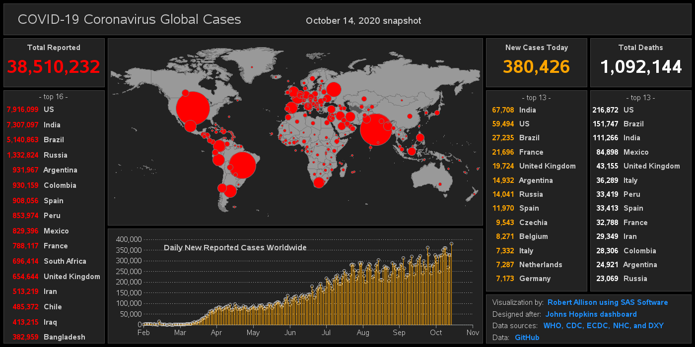
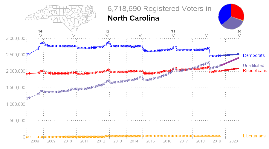
When an election is on the horizon, I always feel compelled to plot some data! And this time I'm plotting North Carolina's voter registration data! State Data For this graph, I downloaded several of the data snapshots from the NC State Board of Elections' website, and plotted a line showing
Tag: greplay
The COVID-19 Coronavirus outbreak has been in the news a lot lately, and everyone is probably looking for a quick/easy way to see the data. The best visualization I've seen so far is this dashboard by Johns Hopkins. Here's a screen-capture: But before we dive into the data analysis, let's
North Carolina is one of those key "swing states" that might possibly decide a national presidential election. And with such an election coming up next year (2020), I thought I would have a look at the voter registration data to see how it has changed since the previous presidential election
Here's an example that shows SAS is more than just a tool to create analytic graphics - it can also be used to create 'cute' infographics! :) An infographic that recently caught my eye had a fleet of airplanes stretching from overhead out to the horizon, along with some interesting