 With fall comes cooler weather and, of course, football. Lots of football. Often times there will be two NFL games on that my husband wants to watch at the same time. Instead of flipping back and forth between two television stations, he can watch both games simultaneously, thanks to the picture-in-picture feature that we have on our television. This same concept works for SAS® ODS Graphics.
Have you ever been viewing two graphs across pages, flipping back and forth between the two and wishing you could see them together? Now you can. The Graph Template Language (GTL) and PROC SGRENDER enable you to produce a graph inside of a graph, similar to the picture-in-picture feature on your television.
The Game Plan
In this example, we are going to create a graph in the upper right corner of the axis area of a larger graph. When we define the GTL, we always start with the same GTL wrapper, as is shown below. In the wrapper below, INSET is the name of the GTL definition:
proc template; define statgraph inset; begingraph; /* insert the code that produces the graphics output */ endgraph; end; run; |
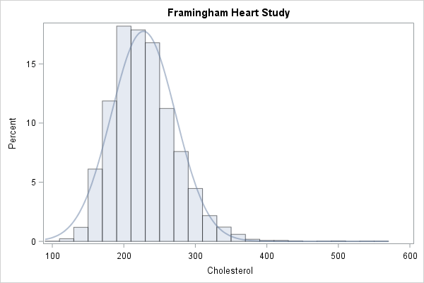
For demonstration purposes, we are going to use the SAS data set Sashelp.Heart and we are going to plot the variable CHOLESTEROL. The ENTRYTITLE statement defines the title for the graph. This statement is valid within the BEGINGRAPH block or after the last ENDLAYOUT statement. The plotting statements are contained within a LAYOUT block. In our example, we have enclosed the HISTOGRAM and DENSITYPLOT plotting statements inside a LAYOUT OVERLAY block. A standard axis is displayed with the BINAXIS=FALSE option in the HISTOGRAM statement. In the PROC SGRENDER statement, we point to the template definition, INSET, using the TEMPLATE option.
proc template; define statgraph inset; begingraph; entrytitle 'Framingham Heart Study'; layout overlay; histogram cholesterol / binaxis=false datatransparency=0.5; densityplot cholesterol / datatransparency=0.5; endlayout; endgraph; end; run; proc sgrender data=sashelp.heart template=inset; run; |
The results are shown in Figure 1.
Special Play
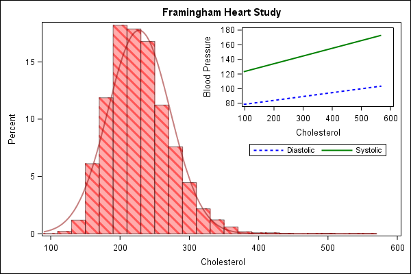
Once we have produced the graph in Figure 1, we can see that we have room to display a second graph in it, in the upper right corner of the axis area. We can insert the graph inside the axis by placing the plotting statements inside of a LAYOUT OVERLAY block within a LAYOUT GRIDDED block. Here are the details.
In the following LAYOUT GRIDDED statement, which is located after the DENSITYPLOT statement, we define the size of the graph using the options WIDTH=300px and HEIGHT=200px. And the options HALIGN=RIGHT and VALIGN=TOP place the graph in the top right corner.
layout gridded / width=300px height=200px halign=right valign=top; |
The inset graph contains two regression lines, one for Cholesterol by Diastolic, which is a dashed blue line. The solid green regression line represents Cholesterol by Systolic. The NAME option is added to each of the REGRESSIONPLOT statements in order to produce a legend. The DISCRETELEGEND specifies that the legend be drawn for both SYSTOLIC and DIASTOLIC with the NAME option. The NAME values are case sensitive. I specify the Y axis label with the LABEL option within the YAXISOPTS option in the LAYOUT OVERLAY statement. I also specify THRESHOLDMAX=1 within the LINEAROPTS option within both YAXISOPTS and XAXISOPTS to ensure that the last tick mark value includes the highest value in the data.
I added a red fill pattern of L3 to the larger graph to make it stand out more. In addition to specifying the fill pattern with the PATTERN option within the FILLPATTERNATTRS option, you must also specify FILLPATTERN within the DISPLAY option. Valid values for the PATTERN option within the FILLPATTERNATTRS option are L1-L5, R1-R5, and X1-X5.
Note: The FILLPATTERN option and DISPLAY option FILLPATTERN are available beginning in SAS® 9.4 TS1M1. If you are running an older version of SAS, you need to remove this syntax from the program shown below.
proc template; define statgraph inset; begingraph; entrytitle 'Framingham Heart Study'; layout overlay; histogram cholesterol / binaxis=false datatransparency=0.5 display=(fillpattern outline fill) fillattrs=(color=lightred) fillpatternattrs=(pattern=l3 color=red); densityplot cholesterol / datatransparency=0.5 lineattrs=(color=darkred); layout gridded / width=300px height=200px halign=right valign=top; layout overlay / yaxisopts=(label='Blood Pressure' linearopts=(thresholdmax=1)) xaxisopts=(linearopts=(thresholdmax=1)); regressionplot x=cholesterol y=diastolic / lineattrs=(color=blue pattern=2) name='Diastolic'; regressionplot x=cholesterol y=systolic / lineattrs=(color=green) name='Systolic'; discretelegend 'Diastolic' 'Systolic' / across=2; endlayout; endlayout; endlayout; endgraph; end; run; proc sgrender data=sashelp.heart template=inset; run; |
The results are displayed in Figure 2.
Now you have the tools you need to display a graph within a graph. For other tips on creating graphs with ODS Graphics and the SG procedures, check out Sanjay Matange’s blog series, Graphically Speaking, https://blogs.sas.com/content/graphicallyspeaking/.

1 Comment
For embedded graphics, legends, and insets, I like to use the BORDER=TRUE option on the LAYOUT GRIDDED statement to put a box around the inner picture. If you add a border, you might also want to use the PAD=5 option to add a little padding to the plot area. Lastly,
I like to use the OPAQUE=TRUE option so that the inside image obscurs any grid lines or reference lines in the main graph.