This happens to me often. I read an abstract and then cannot wait to attend the presentation. However, about five minutes into presentation, I realize it's going to be Death by PowerPoint. If you have experienced this situation, it can feel like a prison!
Instead of learning a cool new technique, I find myself making To Do lists on the conference brochure or working on my Angry Birds score. Let’s face it, some of the topics we discuss lean toward the dry side. However, the SAS Global Forum is full of colleagues who think these dry topics are interesting! So how do you deliver a presentation that keeps interest?
Create Mystery
We all like puzzles or little mysteries to solve. You may think – how can I make a mystery about SAS code? You type the code and run it - nothing that requires Sherlock Holmes. Remember not all mysteries require a dead body; some are more subtle but still have the same impact.
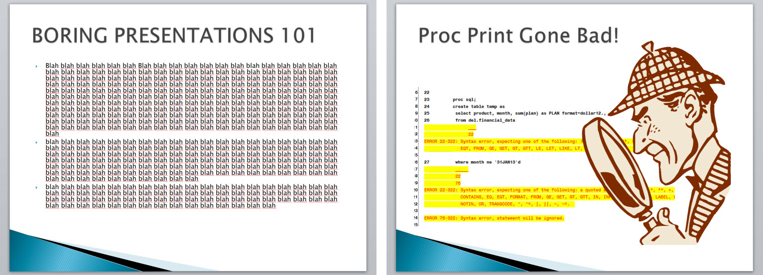
So, let’s figure out how to add mystery to your topic. If your paper is about writing efficient code, how about starting the presentation with a picture of an impatient person? You could introduce your subject matter that way instead of just cutting-and-pasting the abstract in the slide. If your topic is about troubleshooting techniques, you could have a log with the error and begin your presentation. This is one example of how using a picture introduces mystery. The audience wants to know more – why is the person impatient? What’s wrong with the log? Ah, elementary my dear Holmes!
A presentation is about demonstrating expertise on the subject matter. Think about what happens when the audience sees the slide on the left. First, they start reading the text. They can read faster than you can speak so the audience already knows what you are going to say!
You might be thinking – how is that problem for me? Well, at some point someone will think, “I need to bounce. I don’t need this joker to read his paper to me.” My point is this - your audience wants to hear your explanation and learn more about what the paper did not discuss. Keep your talk at the summary level and create some mystery.
Communicate Key Concepts
Garr Reynolds, author of Presentation Zen, has excellent ideas on organizing your information so it is effective and interesting. One tip is “Start with the End in Mind” – what is the purpose of your presentation? What do you want the audience to walk away knowing? Don’t say “transfer knowledge”-you can accomplish this goal by publishing your paper.
Ask yourself - what is unique about my topic/method or what three things do I most want to communicate from my paper? You can build your presentation around those three points using as many slides as you need. Possibly, you want to consider a demonstration of the method.
Use the 7x7 Rule to Start
A common suggestion for slide preparation is the “7 x 7” rule - limit each slide to seven lines of seven words each. However, that is still a lot of text. Consider the following slides, which follow the rule, but the one on the left uses the rule I like – limit yourself to six words and limit the bullet points.

Again – it is about you connecting with your audience. [More tips from Garr]
Other Resources
Here are books that discuss preparing topics for presentation:
- How To Deliver A TED Talk: Secrets Of The World's Most Inspiring Presentations by Jeremey Donovan
- slide:ology: The Art and Science of Creating Great Presentations by Nancy Duarte
- Presentation Zen Design: Simple Design Principles and Techniques to Enhance Your Presentations by Garr Reynolds
Here are some other resources from around the Web:
- Pimp my PowerPoint – eight PowerPoint presentation tips!
- Presentation Zen Tips from Garr Reynolds
- Presentation Tips
- How to Present Technical Information Effectively

9 Comments
great post from Tricia. always appreciate your helpful comments Ron on my presentations, and I'm taking keen notes on your pointers here as well!
I personally feel that, for designing a high class presentation, we require more targeted approach, I have seen people are creating slides just full of the content they don't even care about user point of view. they just put all the content they want to include in their presentation, and in last that become more so unclear and cluttered that they message we are looking to pass through slide won't come out.
the solutions for this kind of issue as Tricia said use 7*7 strategy, I think this will be able give better user experience in our slide.
I agree with Tricia.
I have made numerous presentations to varying audiences over the past two decades.
The rules I swear by are:
1) Don't give the answer away until the last slide on the topic - keep your audience curious
2) Invite a SMALL amount of audience participation
3) Audiences LOVE stories - share a personal learning experience or something humorous to make a point. Use puns but no jokes. Take care not to put down any person or class of person or where somebody may originate from.
4) Show each slide a MINIMUM of one minute - give the audience time to read everything, study diagrams and take in what is visually displayed
5) Show each slide for a MAXIMUM of five minutes - after that people start getting bored (and your 20 or 50 minutes are running out!)
6) Always illustrate a point with a simple example (use SAS code where it will help)
7) Follow the order Begin, Introduce, Explain and Reveal, Summarize, End. in short:
"Tell 'em what you're gonna tell 'em"
"Tell 'em"
"Tell 'em what you've told 'em"
>Tim
Pingback: When bad things happen to good speakers - SAS Users Groups
I agree there is a fine line. You sometimes have to present the information several times to figure out what needs to be said and shown. And to figure out where to add some graphics to recapture the interest.
There is a fine line to walk.
For a technical paper where content of code or coding technique is the point, then the trick is to distill out of the real code, the essence of what you are trying to show. The detail of particular syntax might be the point, so focus on that, and not presenting a piece of code that will acually run if you cut and pasted it into a code window for execution.
The actual "real" code can be referenced in the paper, but pseudo code is often better for presentation.
I personally find that clipart distracts more often than it contributes because I start thinking about the relevance of the art to the point being made, not about the point itself. We have enough metadata alrady.
That is not to say I'm oposed to "graphics" or "InfoGraphics" in a presentation, but it takes skill to present on the key points that need to be distilled out of one.
Information transmission is fundamenatally down to the signal to noise ratio. Look at the slide in relation to what you will say while it is up on the screen from that point of view. The content of the slide should support or enhance the presentation point being made, not add noise that distracts from it being detected.
As for judging, I guess that depends on what the point of the judging is. Is the judging panel clear about that? It is hard not to let bias enter the process. personal bias, subject matter expertise, age, culture...
Ron,
I, too, agree with Tricia and with most of what you said, except for the part about judging papers.
As you mentioned, the purpose of the presentation is to get people to want to read the paper. I think the key evaluators are the members of the audience and that the two principal questions the "ratings" should be trying to answer are: (1) "Did the audience like the presentation?" and (2) "After the presentation, how many members of the audience indicated that they intend to read the paper?"
Sometimes in our haste to present - we forget about the presentations that we liked and kept our attention the most.
Great thoughts Ron. You're not "second place" in my book. 😉
I thoroughly agree!
Let's look at what it takes to publish, and present.
1. good title
2. a good abstract, written about five months in advance
3. oh, the paper!
4. designing the advertisement for the paper, the slides
5. the delivery.
We all remember the difference between theory and practice, right?
In Theory, there isn't any!
However, in Practice, it takes a lot!
I was asked to judge papers several years back and was sitting with another SAS-L regular
who is also a successful author and presenter. We were comparing notes at the end of the session and he said: "You don't take prisoners, do you?!" On several lines I had marked zeros.
* more than 7*7 words per slide
* turned back on audience to read slides
* opened a SAS session to show How This Works
A Gentle Reminder: only you and the people on the front row
--- are there any? ---
can read what's on the screen.
From the second row on back it's all 4-point type == Unreadable.
And I wonder why I haven't been invited back to judge!
I was present when a famous SAS press author, whose initials translate to Master,
turned around after reading his 10th slide and found over half his audience had walked out!
I agree with Ms Aanderud:
* buy the new books about presentation goodness; and practice
* get a subscription to http://www.stockphotos.com/; and practice
* get comfortable with the advertising pitch explained on each of your slides.
* and practice, without reading your notes,
until you can deliver your speech three times in the same amount of time.
Ron Fehd SUG author