The BACtrack mobile breathalyzer company recently published a report purporting that "most alcohol consumed during winter months." I wondered if the data would tell the same story, after a slightly different interrogation ...
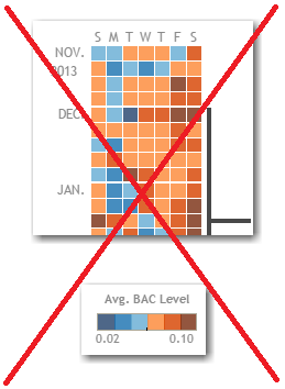
Here's a portion of BACtrack's calendar chart of BAC levels (click it to see the full-size version). They used a tall up/down orientation (going from Nov 2013 at the top, to Dec 2014 at the bottom), and a 2-color scheme where shades of blue represented the lower BAC levels, and shades of brown represented the higher values.
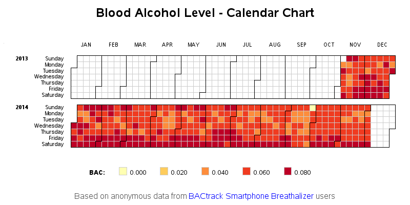
I think a calendar chart is great for this sort of data, and I used the same type of chart in my SAS analysis. But instead of using a tall vertical orientation, I used a horizontal calendar (with a separate row for each year of data). This allows the chart to be easily seen all at once, with no scrolling. It also allows you to more easily compare one year to another. And rather than a 2-color scheme, I went with shades of a single color (which I think is more appropriate and easier to visually grasp).
I experimented with several different ways to do the color/legend binning, and discovered something interesting - a suspect-bad value in the data. Using "choro bac / levels=5 midpoints=old" I got the following chart, which shows that Sept 28, 2014 has a much lower value than any other day. That day had a BAC value of 0.000 (zero) ... which I think is highly suspect/unlikely.
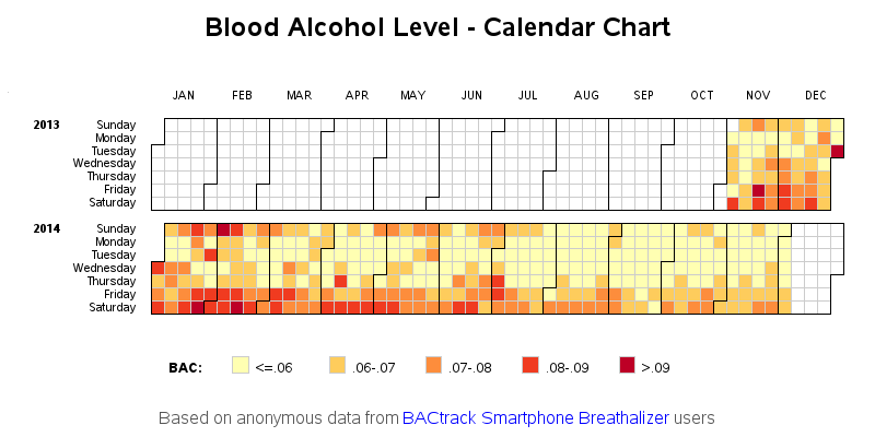
For my final chart, I decided to go with custom legend-ranges. Anything below 0.06 would go into the lowest/lightest shade, and each increase in color shade represents an increase of 0.01 in BAC.
At first glance, the winter months do seem to have higher BAC levels. But upon closer examination, I think there might be other factors at work... If you look closely at the November values, you'll notice that November 2014 had much lower values than November 2013. So perhaps the more recent (non-winter) months don't have lower values because they're non-winter, but because they're more recent?
One possible explanation for the decreasing BAC values in more recent months might be that the BACtrack users are training themselves to stay below the drunk-driving limit. Another possible explanation might be that when the BACtrack app first came out, people were playing with the device and intentionally trying to see how high a BAC value they could blow (a neat "frat party trick" to impress your friends?) - and maybe now that the novelty has worn off people just use it to monitor their normal drinking.
Now it's your turn! - What other factors might be affecting this analysis? What further analyses do you recommend, and what do you think the data would say?


4 Comments
Hi Robert, that´s a good way to visualize daily data. Can you let us know which sas procedure/ code you use?
Btw, I like the fact that it seems there are less alcoholized drivers on the streets around christmas :)
Here's a link to the SAS code: http://www.robslink.com/SAS/democd75/alcohol_level_info.htm
The code is also explained in great detail, in my book SAS/Graph: Beyond The Basics! :)
(example 17)
Difficult to say,but there seems to be a trend...
On the other hand, the data comes from people who actually bought the the BACtrack product, which suggest these are people with responsible, and possibly different drinking habits.
To conclude on a seasonality based on 1 year data is quite light.... But the viz' is a good introduction to the data.
The modified heatmap certainly provides a clearer understanding !