I recently found some very interesting data - a numeric Corruption Perceptions Index for each country. And of course I just had to try and create my own SAS version...
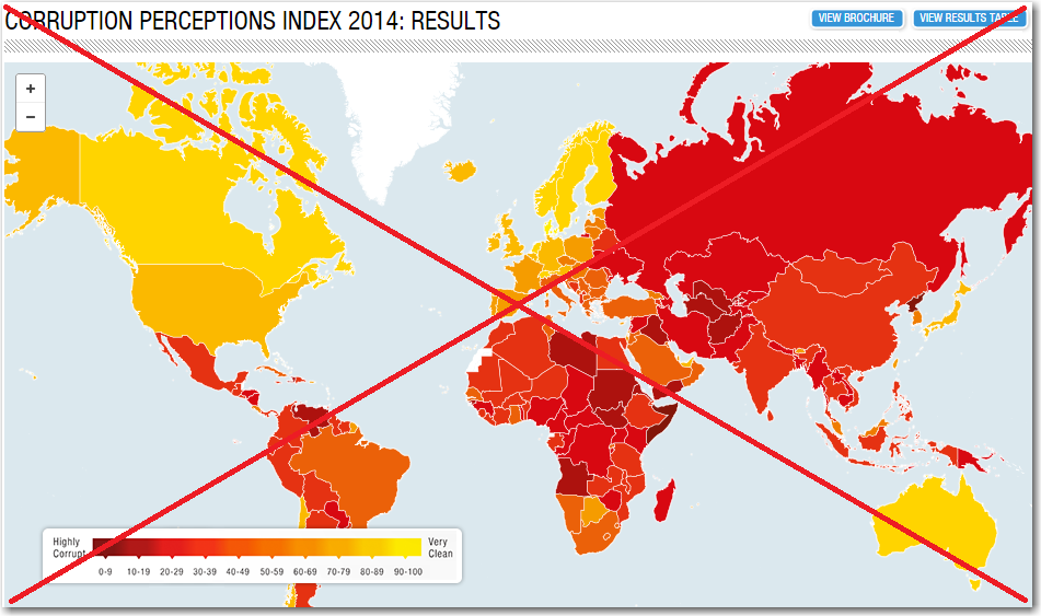
First, here's the original map on the transparency.org site. They mapped all the values using a yellow-orange-red gradient, the map had hover-text for each country, and you could zoom and pan the map. I didn't really like the color gradient, because it was difficult trying to visually match a country's shade to the continuous legend. Also, all the colors in the gradient seemed to represent bad/caution (ie, the countries with a 'good' score still looked 'bad' on the map). The pan & zoom capability seemed nice at first, but in practice the features seemed to get in the way more often than they were useful. And the way the hover-text was laid out, and also having different font sizes for different pieces of text, made it difficult to quickly read. Here's a screen-capture of the original map (click it to see the full size interactive version):
To create my own version, I first had to get the data. I could click the 'Download Info Package' button and it contained a spreadsheet of the data, but that was only for 1 year - whereas I was more interested in the 3 years of data they showed in their table. So I copy-n-pasted their table into a text file. But rather than a country's values (rank, country, and 3 years' scores) all being on one line, each cell in the table came out on a separate line, such as:
1
Denmark
92
91
90
Being very flexible, SAS can handle that! Rather than the usual single input statement, I simply used 5 input statements per each observation:
data my_data; length idname $80; infile datafile lrecl=80 pad; input rank; input idname $ 1-80; input score_2014; input score_2013; input score_2012; output; run; |
Then, to make my data a little more manageable, I wanted to have 1 variable for score, with separate values for each year (rather than a separate variable for each year's score). There are a couple of ways to accomplish this (such as proc transpose), but I took the simple brute force method using a data step:
data plot_data; set my_data; year=2012; score=score_2012; output; year=2013; score=score_2013; output; year=2014; score=score_2014; output; run; |
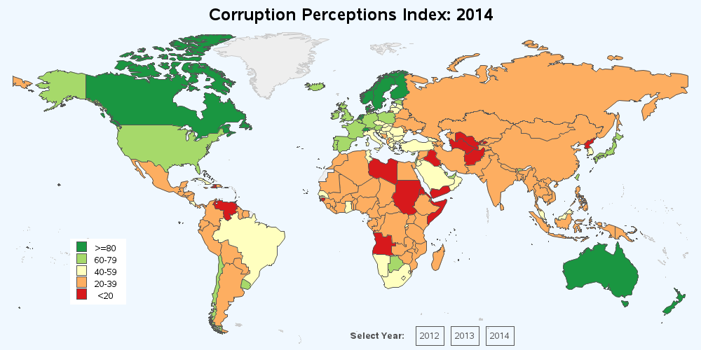
Now for the tough decision - how to color my map. I first tried the Proc Gmap default of quantile binning (where 1/5 of the countries were assigned to each color bin), but I didn't really like how the bins changed from year to year. So I decided to manually set which scores went into which color bin. I didn't really know what scores were considered 'good' and 'bad', but after a bit of experimentation I decided to go with 5 evenly-spaced bins, with a range of 20 in each. I used a data step to assign each country to one of these 5 bins (or buckets), and then used a user-defined format to make those bins (1-5) show up as the desired text in the legend:
proc format; value ranges 1 = 'ge 80' 2 = '60-79' 3 = '40-59' 4 = '20-39' 5 = 'lt 20' ; run; data plot_data; set plot_data; format bucket ranges.; if score ge 80 then bucket=1; else if score ge 60 then bucket=2; else if score ge 40 then bucket=3; else if score ge 20 then bucket=4; else bucket=5; run; |
I then wrote a macro that created a plot for each year (with the _year being part of the filename), and used the note statement to print the 'year' buttons at the bottom of the page, allowing users to easily select the desired year:
note move=(50,3) font='albany amt/bold' "Select Year:"; note move=(60,3) link='corruption_perceptions_2012.htm' box=1 "2012"; note move=(65,3) link='corruption_perceptions_2013.htm' box=1 "2013"; note move=(70,3) link='corruption_perceptions_2014.htm' box=1 "2014"; |
Here's my final map (click the image below to see the interactive map, with html hover-text over each country, and buttons/links to select the desired year):
Feel free to download the full SAS code, and experiment with it!
Have you visited or done business with any of the orange or red countries? Do you think the perception of these countries is fair? Or do your experiences lead you to feel otherwise?


2 Comments
Hello Robert,
Interesting map!
Could you adjust it so that hovering over the years changes the colors. In that way you can see development of the index.
Regards,
Eric
Hi Eric - Interesting idea! But with simple png & html output, I don't know of a way to change the color of the map areas on-the-fly like that. I think it would require something that renders the map on-the-fly, such as SVG, Java, or Flash.