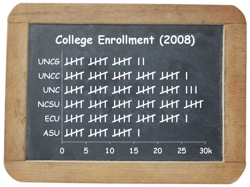
Being that today is a Throwback Thursday, I decided to re-create one of my favorite events from elementary school -- show-and-tell! And of course I'll be showing and telling you about a graph ... using school data!
OK - that SAS graph (above) is definitely "Throwback" but it's not the one I'm going to show-and-tell today! LOL
The end of August is the traditional time for all the kids to head back to school in the US, and I saw an interesting graph in a Pew Research article about the racial/ethnic composition of US public schools. This fall, for the first time, the combined minority students will outnumber white students.
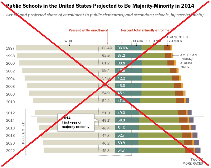
Pew's graph was interesting, but there were a few things about it that I didn't like. For example, they only showed bars for ever other year (even numbered years), except for the first two bars (1997 and 1998). Also, the "percent total minority enrollment" numbers were placed on the "black" bar segment, which could be misleading (unless you carefully read the labeling). There were also a lot of labels on the graph - for example they scattered labels around the graph showing what colors represented what racial/ethnic group, rather than using a color legend.
I decided to try to create my own version of the graph using SAS, to see if I could "clean it up" and make things a little more straightforward.
I did some checking and found a table of the data (p. 33) in a paper published by the National Center for Education Statistics (NCES). I copy-n-pasted it into the datalines section of my SAS program, and then used Proc Transpose to rearrange the data so it would be easier to work with. I used Proc Gchart's subgroup option so that each race was represented by a bar segment with a different color (using the exact same colors as the Pew graph). The bar segments would normally be ordered alphabetically, therefore I manually assigned numeric values in the data to produce the desired order, and then created a user-defined-format so that the numbers would print in the legend as the desired text.
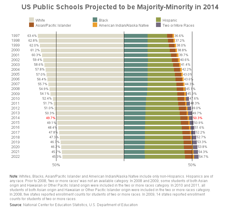
I made several changes from the original. Since there was data for every year, I plotted all the data (rather than just the even years). I show the total majority and minority percent values to the extreme left and right, rather than in the middle (highlighting the 2014 values in red, since they are the important ones). I added reference lines at 50% since that is the important/transition value the graph was created to show. And if you click my graph (above) to see the full-size interactive version, you'll notice it has html hover-text for each bar segment, in case you want to see the exact values.
What do you think of the new graph? Any suggestions to make it even better? :)


2 Comments
Hello Robert. very cool graph! Is there a link to the SAS code in the posting? If not, could you please post the code in a reply? Thanks.
Here you go!... http://robslink.com/SAS/democd73/public_school_ethnicity_info.htm