"Trending" is one of those words that's trending these days, as we verbify everything. And if you understood that, then you'll probably love this blog! :-)
For those of you not hip to the lingo ('hip' meaning 'knowing about and following the newest styles, fashions, etc.'), dictionary.com defines trending as "to emerge as a popular trend; be currently popular."
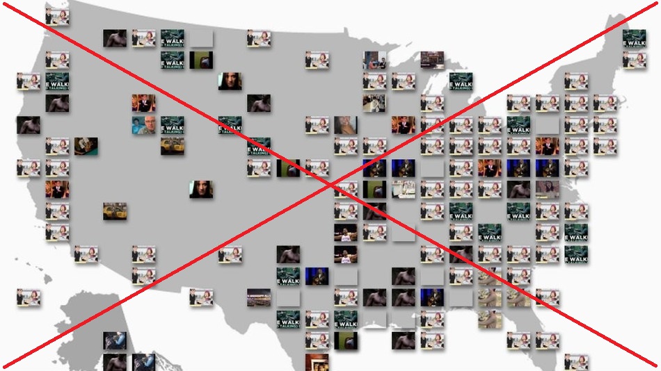
I recently ran across an article describing a new map that shows which YouTube videos are trending in various parts of the US. The map interface allows you to select things like gender and age, to see what videos are most popular (or trending) with that demographic. It's really cool - give it a try! ... but please come back to read the rest of the blog, so you can learn how to create such maps in SAS!
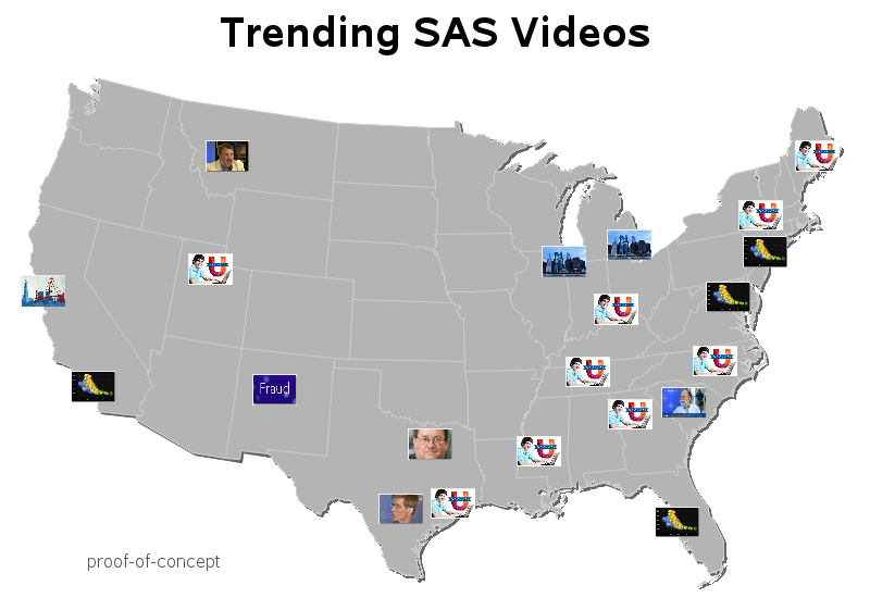
Like I do with most cool maps & graphs, I decided to come up with a way to create a similar map using SAS! I don't have access to the YouTube viewership data, so I took the liberty of creating some 'plausibly real' data showing what SAS-related YouTube videos are trending in various cities. And whereas the original map appears to use pre-determined cities (arranged in neat rows and columns by hand), I will set mine up so the city locations are data-driven.
I used Proc Geocode to determine the latitude and longitude of each city (note that if you had IP addresses of the viewers rather than city, Proc Geocode can also be used on IP addresses!) I then created an annotate dataset encoding commands to move to each lat/long coordinate, and then switch to a relative-percent coordinate system and then move a certain percentage down and to the left of the center coordinate, and then draw an image icon that extends the same percentage distance up and to the right of the center coordinate. Here's a link to the actual code.
And here's my SAS version of the map! Note that the data is fabricated (not real), but the videos that the icons link to are real.
Now that you know how to create such a map in SAS, what data might you have that would be interesting to plot in this way, with little image/icons? Share your ideas in the comments section!