"We been through every kind of rain there is. Little bitty stingin' rain, and big ol' fat rain, rain that flew in sideways, and sometimes rain even seemed to come straight up from underneath." Was that a quote from the Forrest Gump movie, or something said regarding Hurricane Florence? Could be either one!
Hurricane Florence recently came through our area. Luckily it lost a bit of strength before it came ashore, and didn't hit us as a category 4 storm. But what it lacked in strength, it made up for in rainfall. The hurricane moved very slowly, spending 4 or 5 days over our state as its rotation picked up moisture from the ocean and dropped it on the land.
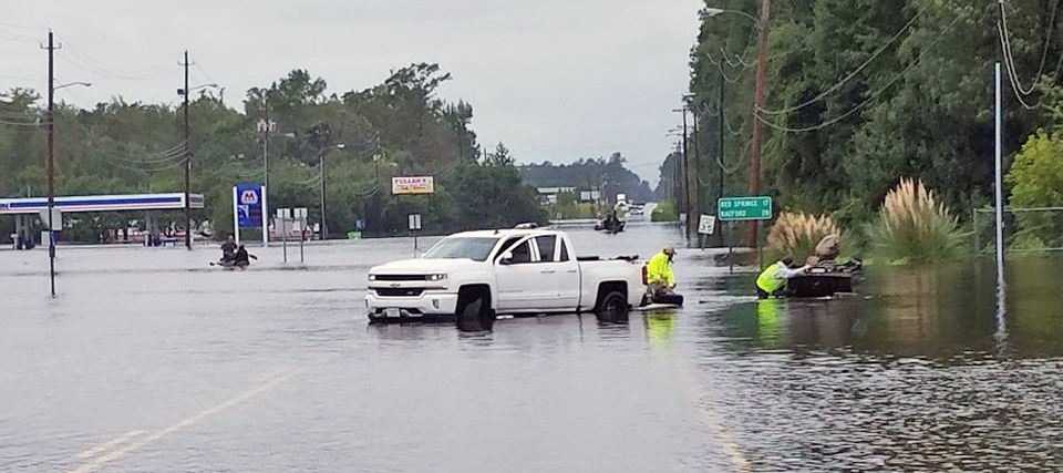
Here's a photo from my friend Paul, showing an example of the flooding:
Fortune reported that the storm could drop 10 trillion gallons of water on NC (that's enough to fill 15 million Olympic-sized swimming pools, or enough for everyone on Earth to take 69 10-minute showers). So, which cities got the most rain, and how much did they get? Seems like the perfect challenge for The Graph Guy!
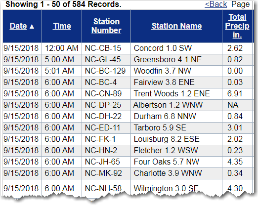
I did a bit of Web searching, and found the very cool cocorahs.org website, where volunteer weather observers report the daily rainfall in their area, and submit it to a database. They have an interface that lets you select a state and date, it it provides you with a table. Here's a snapshot of some of the rain gauge readings for NC:
You could also view a map of the rainfall data on their website. Here's an example:
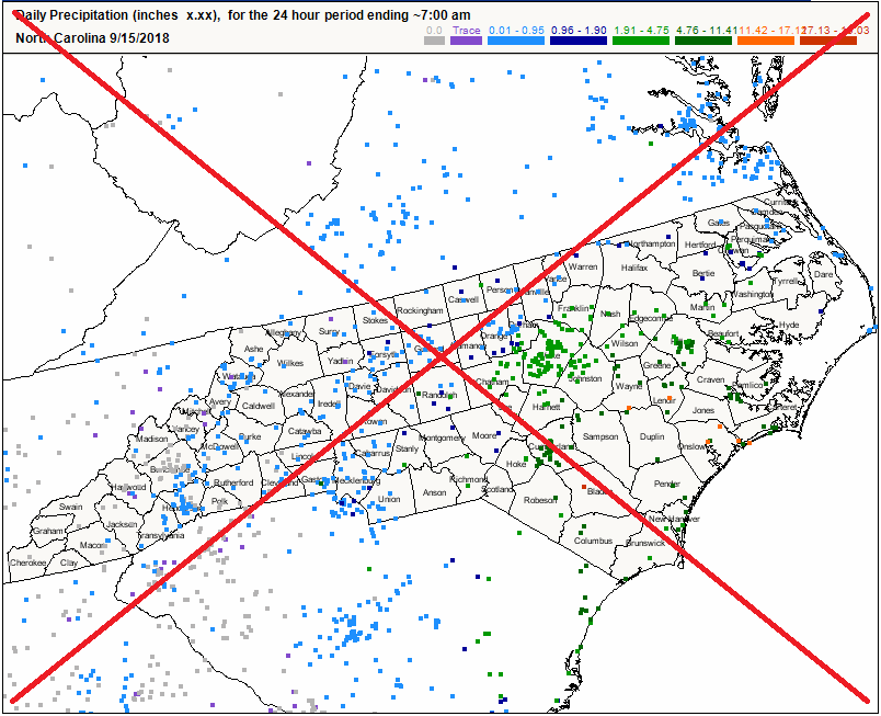
It was interesting seeing the data plotted on the map, but the hurricane rainfall amounts didn't really convey to me and say "We just had a flood of biblical proportions!" The county outlines and names seemed to jump out more than the data values (colored dots). Therefore I decided to see what I could do in the form of a make-over...
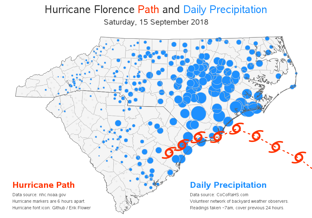
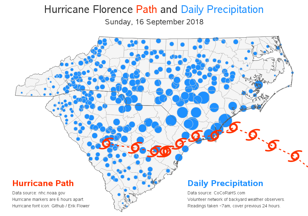
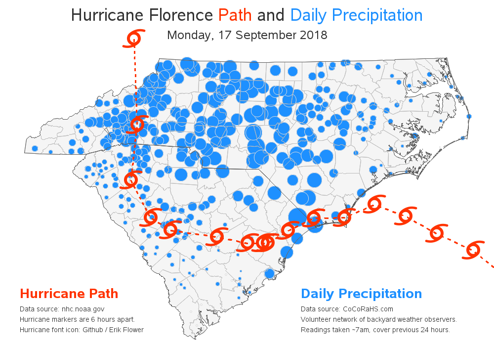
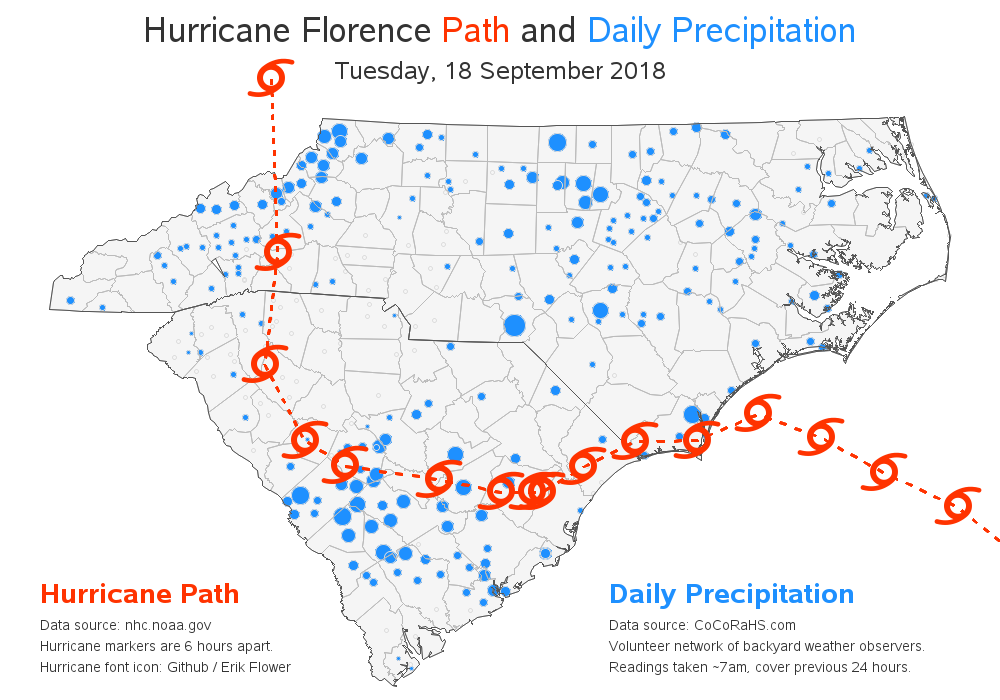
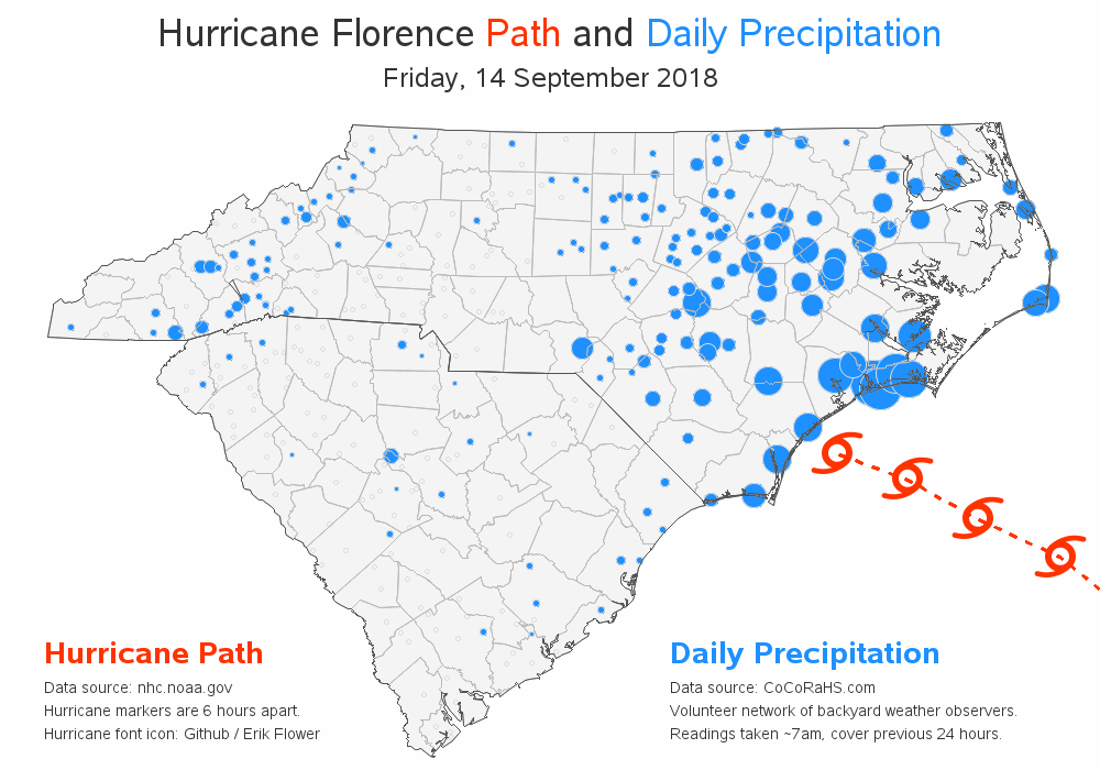
Daily Maps
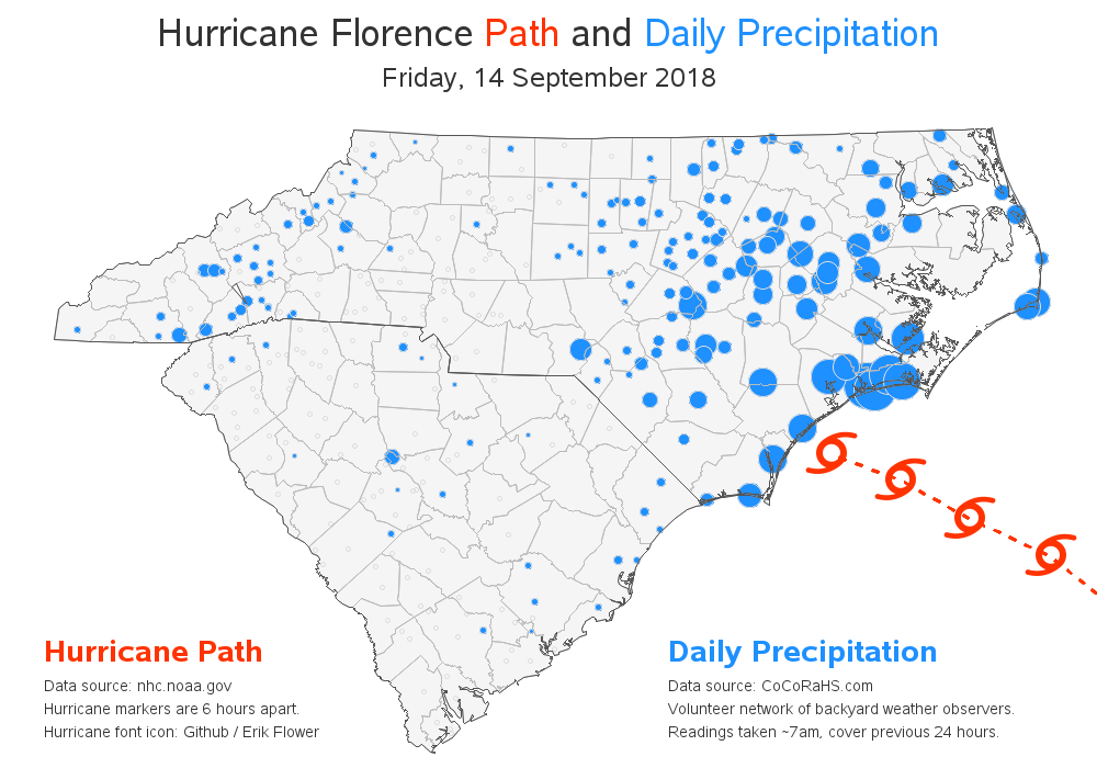
I didn't see an easy way to download their data from the table, therefore I paged through the dozens of table pages, and copy-n-pasted them one page at a time into a text file, and then wrote a bit of SAS code to import the text. Since there were multiple gauges in many of the cities, I calculated an average value for each city. I then used Proc Geocode to estimate the latitude/longitude center of the cities, and plotted the data on a map using blue bubbles (with the area of the bubble proportional to the amount of rain that day). And to add a bit of context and timing, I added the path of the hurricane (in red).
Here are the maps for each of the 5 days the hurricane was moving across the Carolinas. You can click the images to see the interactive maps, with HTML mouse-over text showing details for each of the blue bubbles:
Animated Map
Having the five separate maps is great if you're wanting to scrutinize each map and mouse-over the cities to see the detailed data for each day ... but it sure would be nice to have an easy way to see all the maps without having to do any work (such as scrolling and clicking). Therefore I added one more line of SAS code to turn the maps into a GIF animation!
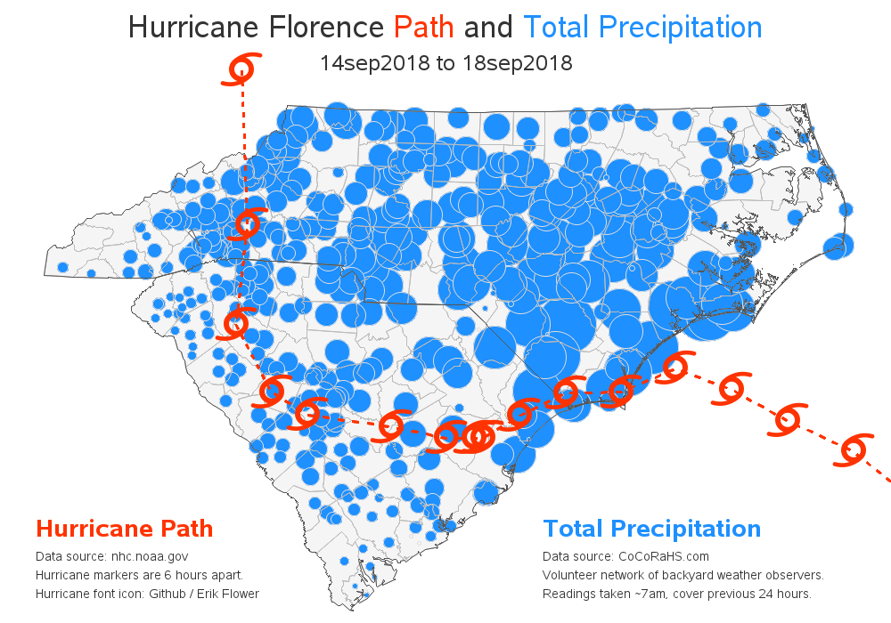
Total Rainfall Map
Most storms only last a few hours, and a daily rainfall value is usually adequate. But in this case the storm lasted several days, therefore it would be nice to also see the grand total rainfall for each city. To help provide this final/overall picture, I created one final map showing the total rainfall in each city. Click the map below to see the interactive version, and mouse-over the blue bubbles - what's the city with the maximum rainfall you can find? (feel free to leave your guess and discussion in the comments section!)
How'd He Do That?
If you're a SAS programmer, and curious what tricks I used to create these maps, here's a short summary. Notice that I'm emphasizing the new (or fairly new) Procs, options, and datasets.
- I used the new mapsgfk.us_counties map dataset (which ships with SAS/Graph) as my base map.
- I subset the map to just North and South Carolina, and used Proc Gproject to project it (so the subset looks 'straight' - notice how the cocorahs map above, with the red 'X' across it, looks crooked). I used the new latlong option so I wouldn't have to rename the variables to Y and X, and I used the new degrees option so I wouldn't have to convert the degrees to radians.
- I used Proc SQL to calculate the average daily rainfall for each city.
- I used the new Proc Geocode to estimate the latitude/longitude centroid for each city, using sashelp.zipcode as the lookup table (this dataset is updated with fresh data in each new SAS release).
- When I projected the map, I saved the projection parameters (using the new parmout option), and I projected the city latitude/longitudes using the same parameters (using the parmin option), so they would line up correctly with the map.
- I annotated the city rain values on the map using annotate's pie function (a 360-degree pie looks like a bubble), and used the html variable in the dataset to encode the tags for the HTML mouse-over text.
- I downloaded a weather font, and used the new Proc Fontreg to register the font so that SAS could use it. I then annotated the hurricane symbol on the map using style='Weather Icons/unicode', angle=-45, text='f073'x.
- I used the following new 1-line syntax to convert the individual maps into a GIF animation: options dev=sasprtc printerpath=gif animduration=1.2 animloop=0
animoverlay=no animate=start;

8 Comments
I have shared this article on Facebook (twice).
I need to study what you have done.
In scanning what you provided, I loved the gif that you made and the one line of SAS code which you provided.
Thank you for helping folks (including me) understand more about this horrible event in The Carolinas.
Robert, as always, you did a great job!
Each map is very helpful, especially being able to clink on the map and get to a web-enabled version where one can display mouse-over text for city, state, and rainfall amount.
Animations are nice, but a more helpful deliverable would be to put the five daily maps plus the total map into a WIDE posting that would accommodate all six in a 3 (wide) X 2 (high) array. Since this blog frame is too narrow, that could be provided via a link to an image that would be, perhaps 1800 pixels X 900 pixels. With a laptop set to 1920 X 1080, any space taken up by one's web browser framing (including possible optional tool bars), that would work just fine. The current scrollable blog posting makes it impossible to simultaneous compare day to day, and animation is no help, because each day is a fleeting display. If one wanted a better view of any of the six panels, each panel could contain a link to a standalone display of that map (likewise in a 1800 X 900 image).
Lots of good ideas and observations, as usual!
Nice! But I would like to see the animation with cumulative total rainfall amounts.
Data point: I had about 9 total inches of rain at my house (east Raleigh), with almost exactly half coming before Saturday morning, and the other half between then and Monday evening.
Hmm ... I might have to also create that version!
That's what I was hoping for, too!
Wow! Amazing to quickly see where the most rain was. We were so lucky in the Piedmont . . . although there was some flooding in parts of Rowan County. Thanks for the hours you spend simplifying data.