Robots - everyone has probably been fascinated by the idea of robots at one time or another. From the early science fiction robots (such as Klaatu's robot Gort) to the mid-1980s movie robots (like Johnny 5), they have been portrayed in many different ways in fiction. These days, with the advent of computers, various kinds of robots have become a reality. In this blog post, the "robot invasion" we'll be mapping out is the proliferation of robots used in manufacturing (Sorry Doctor Who Cybermen fans - it's not that kind of invasion! Maybe I'll work on that kind in a future blog post!)
But before we get to the data analytics, let's check out a random robot photo... I asked all my friends if they had made any robot photos I could use in my blog. I figured some of my textile/manufacturing buddies might come up with a robotic arm, or my computer-geek friends might have pictures of a human-like toy robot. But my favorite turned out to be Margie's robot necklace. LOL I guess robots have truly become ubiquitous when they're even used as jewelry. I take this as a sign that the invasion is almost complete!

Now, for some serious robot-talk! Below is the map that got me interested in this topic. It's a map that Brookings created, using International Federation of Robotics data. It was an interesting map that caught my attention, but as I studied it I noticed several problems:
- By trying to represent two different things with the bubbles' size & color, neither of those things are represented well.
- Since many of the bubbles overlap, many of them are obscured or blend in together.
- The larger bubbles extend well outside of the MSAs they represent.
- There is no easy way to determine the city name & data values for the bubbles.
- And the legend/color levels seem a bit arbitrary (for example, the darkest legend color is labeled for 20+ ... but yet the two MSAs mapped to that color actually have values of 35+).
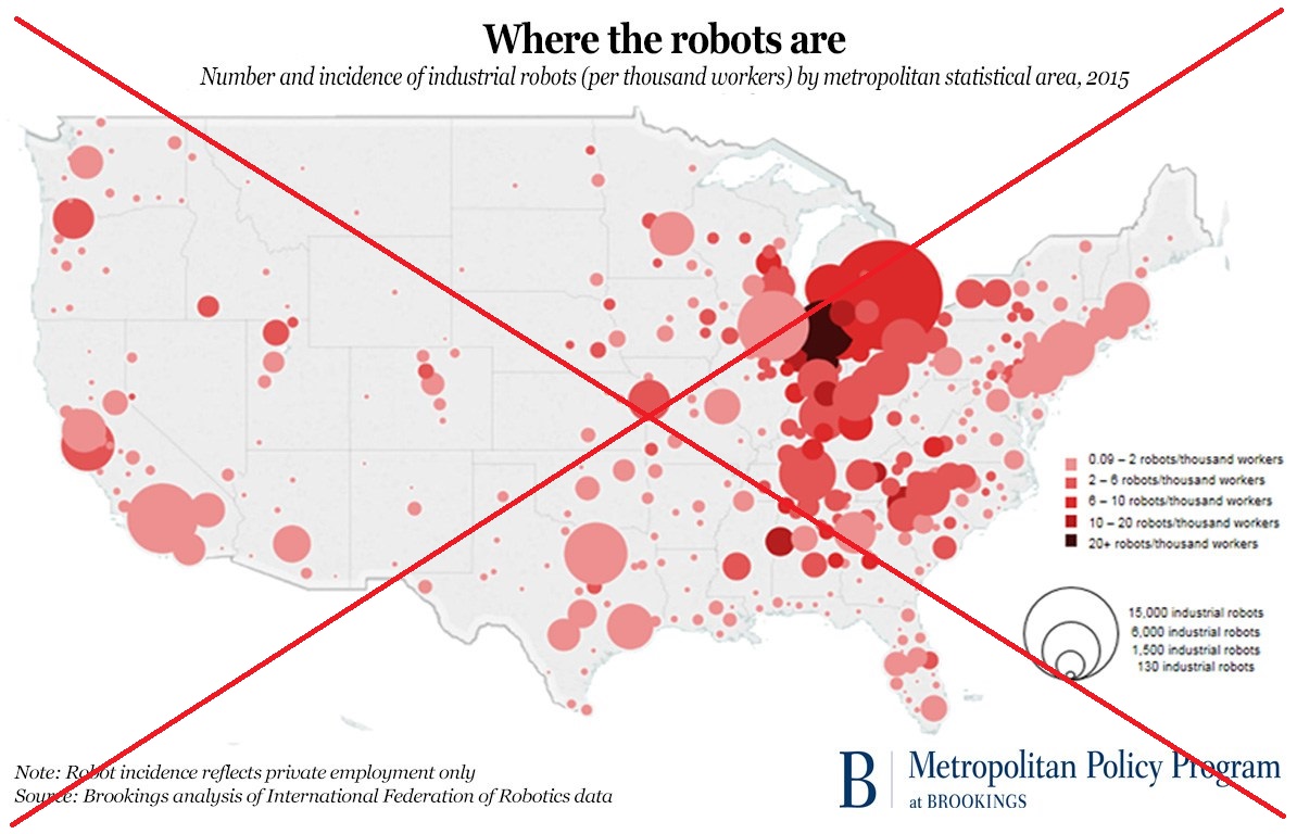
Although I like the idea of bubble maps in general, they just don't seem to work well in this particular case. So I decided to create my own map, using something other than bubbles ...
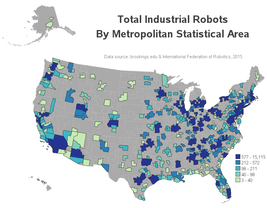
After mulling it over a bit, I decided to go with a good old traditional choropleth map, where I color the whole metropolitan statistical areas (MSAs), rather than placing a colored bubble at the centroid of the MSA. I use quantile binning, so each color represents about 20% of the MSAs. And rather than trying to represent both pieces of data simultaneously, I create a separate map for each one.
First I created a map where the color represents the total number of industrial robots per MSA (this number was represented by the bubble size in the previous map).
And next I created a map where the color represents the number of robots per 100,000 workers (this was the variable represented as the color, in the bubble map). I think this one is probably my favorite of my two maps - it seems to show an interesting geographical trend in the data.
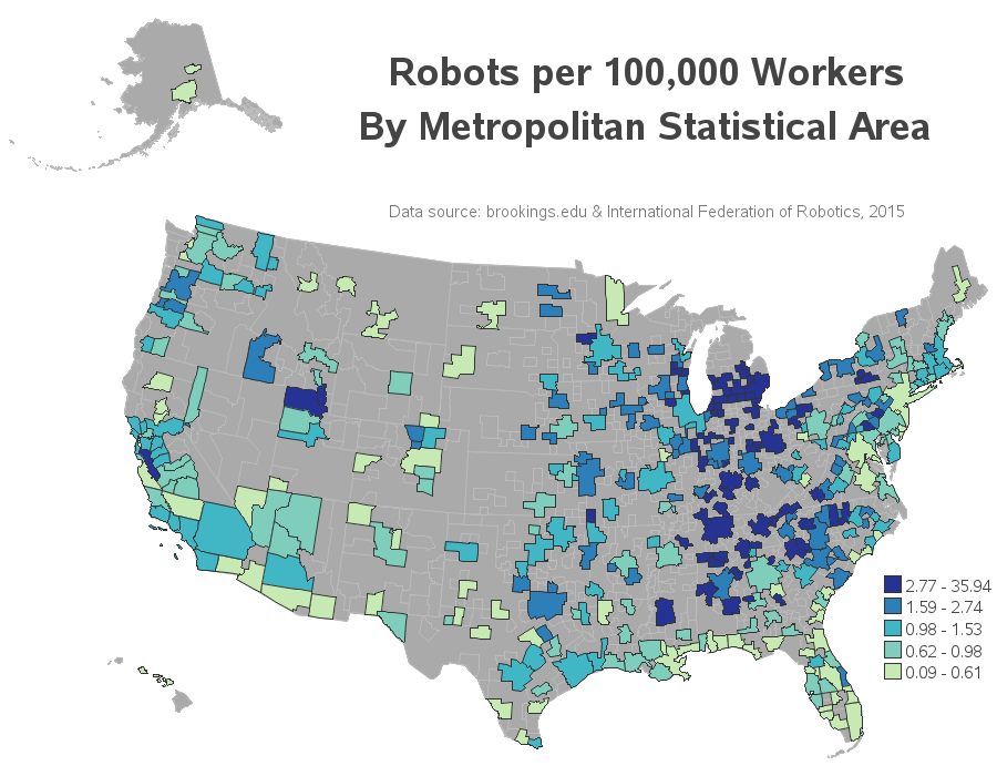
You can click on both of my maps above to see the interactive version with HTML mouse-over text that will allow you to see the MSA names and data values.
So, what's your opinion on robots? Are they taking away jobs (by replacing humans), or are they making factories more efficient and creating new/different jobs? Do you have any robot stories you'd like to share? :-)

3 Comments
Where did you get he GIS file that had the MSA data> I see the County and City data that comes with SAS GIS. But I don't see MSA or DMA level data. Thanks!
I downloaded the shapefile from:
https://www.census.gov/geo/maps-data/data/cbf/cbf_msa.html
And then used Proc MapImport to import it into a SAS dataset.
Such an interesting thought and lovely map!