When it comes to economic activity, a handful of the largest metropolitan areas in the US account for lion's share. In 2013, the top 23 Metropolitan Statistical Areas (MSAs) accounted for 50% of the total US Gross Domestic Product (GDP). I recently came across a map created by Alexandr Trubetskoy that visually demonstrates this - his map showed the top 23 MSAs in orange, and the rest of the country in blue. It's hard to believe that the tiny orange areas have as much economic activity as all the blue area, eh!?!
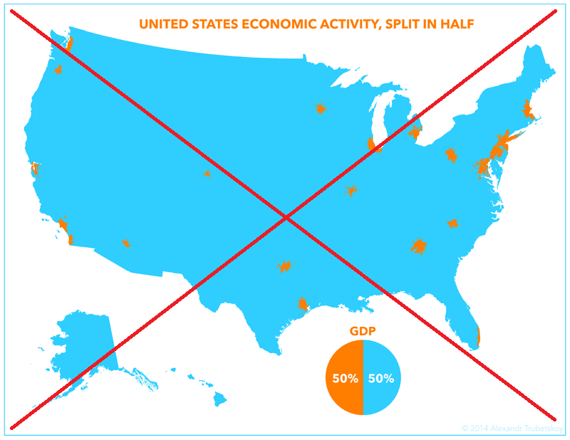
Alexandr's map was interesting and caught my attention, but it didn't quite leave me "analytically satisfied". I wasn't quite sure exactly what cities were represented in the MSAs, and the orange MSA areas looked a bit oddly-shaped. Also, I had to read the article to find out what year's data was used in the map, and I had no clue what the actual GDP values were.
So I decided to create my own version... In my map, I use the MSA polygons from the Census, which appear visually more well-defined than the ones in Alexandr's map. I identify the data source in a footnote below the title, and if you click on the image below you can view the interactive version with html mouse-over text for the orange MSA areas (this will show you the cities in each MSA, the GDP value, and the MSA rank).
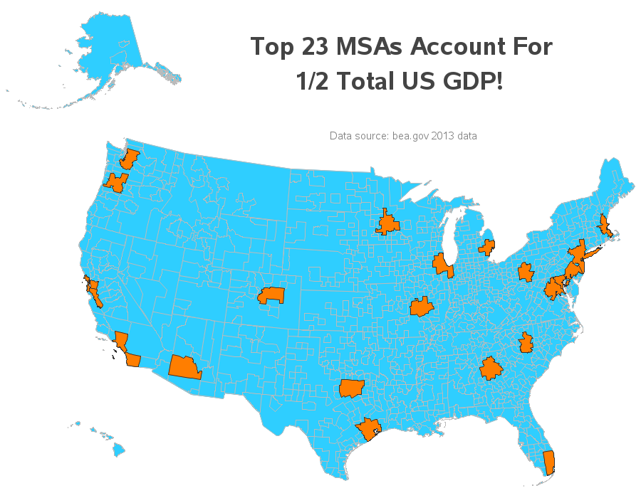
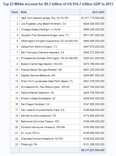
I even followed the map by a table, so you can see the actual values...
-------------------------------------------------------------------------------------------------------
If you're curious about what went on behind the scenes, here are the nitty-gritty details ...
Getting the Data
Thankfully Alexandr provided a link to the data source in his article. I followed the link to the Bureau of Economic Analysis (BEA) webpage, and found that the data was in a table in a pdf file. Pdf files aren't the most analytics-friendly format, so I used pdftables.com to convert it into an Excel spreadsheet. I cleaned up the spreadsheet a little by hand (deleting the rows that weren't part of the table), and then imported the spreadsheet into SAS using Proc Import with dbms=xls.
Creating the Map
For the MSA map, I went to the Census webpage, and downloaded the 2013 map (so it would match up with the 2013 GDP data). The download was a zip file, which I unzipped to reveal the Esri shapefile. I then used SAS' Proc Mapimport to import the shapefile into a SAS map dataset describing the MSA polygons. Note that the Census map only contained the polygons for the MSAs (not the rest of the US), therefore I combined the Census MSA map with the US map we ship in SAS, such that I have the US state map as the background behind the MSA polygons. I split this combined map into 3 pieces (Alaska, Hawaii, and the rest of the US), projected them separately, resized & moved Alaska and Hawaii, and them combined them into one map again. For the US state polygons, I used the 2-character statecode as the map ID, and for the MSA polygons, I used the MSA name as the ID.
When I plotted the final map, I only used the data for the top 23 MSAs, and left all the other map polygons with no data. I controlled the color of the top 23 with the pattern statement (for fill color) and the coutline GMap option (for outline color), and controlled the color of all the other polygons using the cdefault (for fill) and cempty (for outline) GMap options.
Here's a link to the complete SAS code I used - enjoy!


1 Comment
Well done! My company purchased a PDF/XPS converter, Nuance PDF converter, but it is good to know there is a free alternative. I particularly like the (multiple) tips about rebuilding the US map with Alaska and Hawaii in viewable (if not geographically accurate) areas - this is very handy. It's also pretty amazing that such a small area (geographically) of the country produces so much. It would be interested to see the GDP numbers broken down by different industries (i.e. farming, technology) etc. and mapped as well.