Employment - that's been a hot topic here in the US lately. Many of the manufacturing jobs we had in past decades are gone now, and it would be great if there was a crystal ball to predict which jobs might be at risk of disappearing in the future. The researchers at Ball State University (BSU) have been working on just that - in the form of a map! And being a graph guy, I couldn't help but try to make a few little changes and improvements...
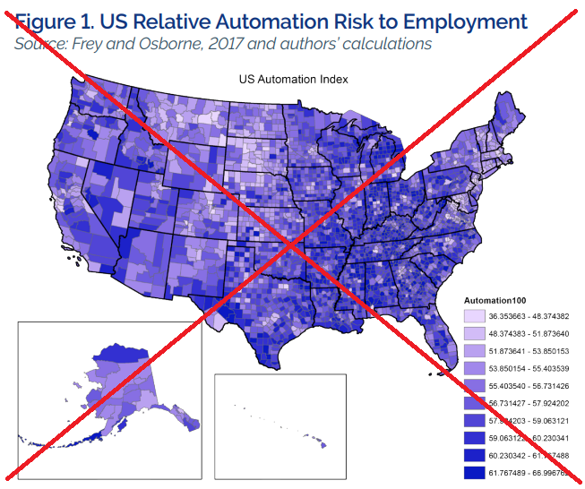
BSU set up a web page where they published the results of their study. They provide a paper, an executive summary, an appendix with the maps, and a spreadsheet of their data. Here's a snapshot of one of their maps:
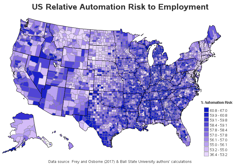
It was an OK map, but I noticed several things I would like to change about it. Here is a list of my changes, followed by my new SAS version of their map:
- The legend would be easier to read if only 1 decimal place is shown.
- The legend would be more intuitive with the larger values at the top, rather than at the bottom.
- I prefer the 'footnote' at the bottom of the map.
- I only shade the land areas - not the water in the Great Lakes.
- I label the legend using the more descriptive text that was in the spreadsheet.
- I use a % sign in the legend label, so people can quickly tell the values show percent.
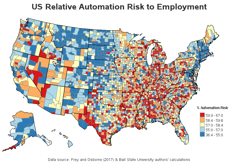
I thought my version was an improvement, but it still just didn't quite feel right. With the 10 gradient shades of color, it was just too difficult to look at a county's shade and know where it fit into the legend scale. So I decided to go through one more round of changes. Rather than dividing the data into 10 bins and gradient shading, I used 5 bins (quintiles) and a diverging color scale. Now you could quickly tell which quintile (riskiest 20%, safest 20%, etc) each of the counties is in. You can also click the images below to see the interactive versions, with html mouse-over text for each county!
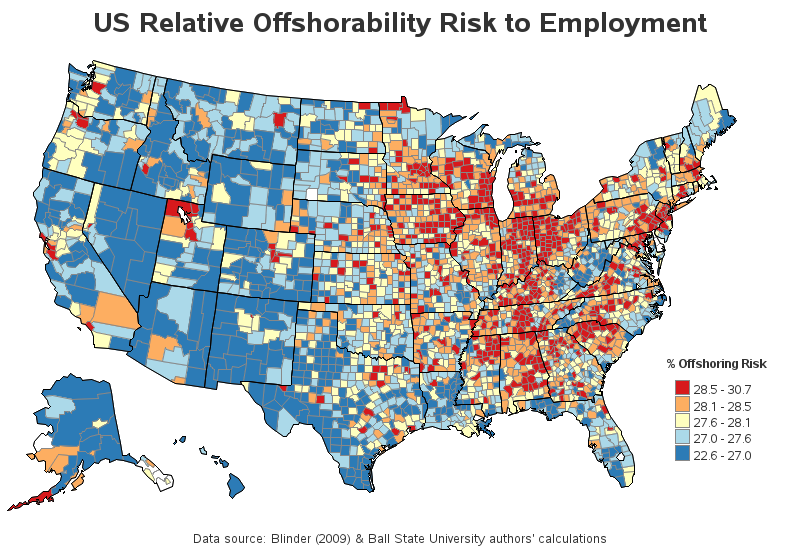
And similarly, here's my SAS version of their map showing counties at risk of losing jobs to offshoring.
How did your county fare in this map? Do you have any special insight into this data you could share? Do you like the changes from the original map, or would you have done it some other way? Feel free to leave a comment...


4 Comments
No quetion the improvement is enormous!
Without reading their report, I have difficulty in understanding the implications. In general, maps showing % figures are difficult to interpret since the denominators are not shown.
Loved all the changes you made. It gives the message much quickly and clearly.
You're a genius.
Those are indeed great improvements. If we can show this to customers, they will love it.