Choosing great colors for a graph is sometimes the most difficult part. And here is yet another thing you need to worry about ... sometimes colors represent different things in different cultures! In this blog post, I improve a graphic to help you get a grasp on those color-to-culture relationships.
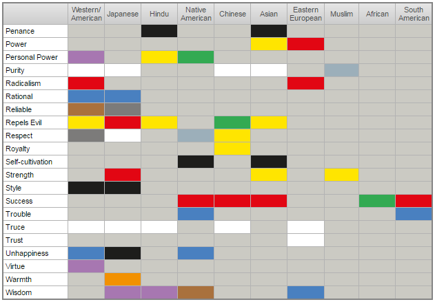
If you're into data visualization, you've probably seen some of the "information is beautiful" examples. Their graphs are usually striking and attention-grabbing, but I often find it difficult to actually make sense of the information they are trying to represent. Below is an example of their color wheel that shows what various colors represent in different cultures. For each color chip, you have to determine which spoke number 1-84 it's on (to determine the word), and which ring A-J it's on (to determine the culture). Can you quickly determine the number and letter, and look them both up in the legend/key (which I show below their graph)? Probably not!
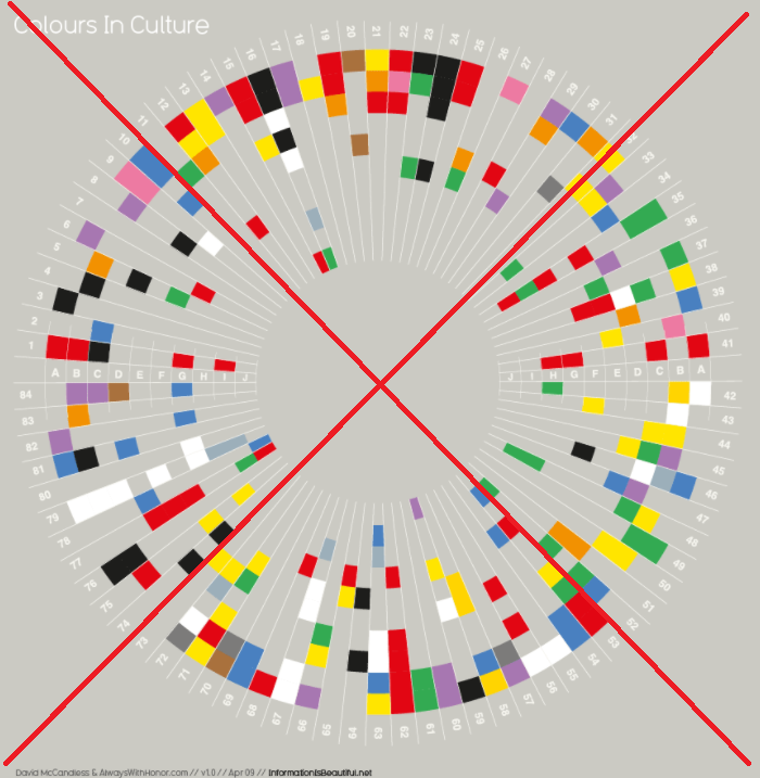

Here is a list of the main problems that jump out at me:
- Determining the number and letter, and then looking them up in a legend/key is time-consuming and error-prone.
- White text on a light gray background is difficult to read.
- It's difficult to determine the exact number and letter, since the color chips aren't always outlined by a border color.
- If you're interested in all the colors for a given culture, it's difficult to follow that culture around the circular wheel.
- One must have good color vision to discern the colors.
- There is no easy way to get the hex color code, to use in your other graphs.
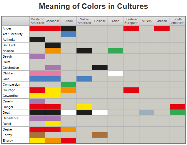
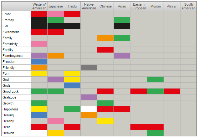
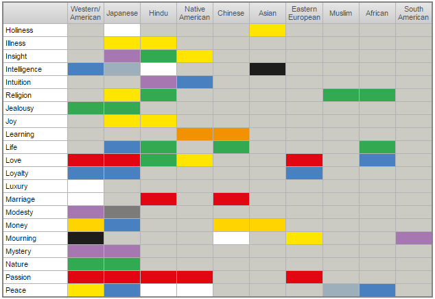
I decided to create my own visualization, and try to improve their problem areas. Here is a list of improvements in my version, and a link to my SAS code.
- Rather than a wheel, I use a simple table.
- I use dark text on light background, which is easier to read.
- It is easy to determine the word & culture in the table (no legend/color-key lookup).
- It is easy to see all the colors for a word or culture, by following the row or column in the table.
- I break the table into 4 pieces, so the culture names are always easy to see.
- You can copy-n-paste the color boxes in my table, to get the hex code (below are just screen-captures ... click here to see the interactive HTML version of the table you can copy-n-paste from).
- If you're colorblind, you can use your mouse and highlight the table, to see the hex color codes in each cell (again, this is in the interactive HTML version).
Were there any 'surprises' in this data? Did you notice any colors that you might not want to use in your graphs for certain cultures/countries? Do you know of other colors that might be useful to add to this table? Feel free to share your thoughts in a comment!


11 Comments
Don’t see the point of reinventing the wheel. So what if it’s harder to use? And color blind people probably have already adjusted the settings on their device so that the colors are not really to bright or anything.
I really like this representation of colors and their meanings around the world! It's interesting to note which meanings are represented the most consistently across cultures -- passion (red) and truce (white) stand out.
This is a great re-imagining of the classic World Color Survey data. It DOES take several screens to view, however, but the advantage in clarity is worth it! I like your HTML version. It would be nice to have an option to turn on the hex values for all the colors. It would also be interesting to sort by color to see, at a glance, which colors connote which constellation of emotions for which countries. Or, a network representation that grouped the emotions semantically, with their colors, to see if there were some simplifying principles. For example, purity, truce are related semantically and reliably white, and anger, excitement and passion related emotionally and are reliably red.
Great suggestions!
Interesting the Japanese color for both courage and cowardice is yellow.
Yes - seems 'odd'. I would be interested in seeing the data/background-info that they used to determine what the different colors stood for in different countries.
Yesterday we (the Work/Life staff) were just talking about colors representing different things in different cultures and I was looking for a resource. What amazing timing! Thanks so much for this!
Glad I could help! (I might be a little bit psychic, you know!) ;)
I'm a big fan of David McCandless' Information is Beautiful book. It's fun to flip through for inspiration and contemplation. Your visualization here is definitely more effective.
I've learned that companies with industrial factories abroad have to consider colors for things like buttons and signs; while red here raises warning and means "stop", it doesn't necessarily communicate the same thing everywhere you go.
I love how you make visualizations easier to interpret! As you point out whilst the color wheel visual is striking, it is difficult to interpret with having to flick to the legend. A two-way look up is really easy in a cross-tab and I really like how you can scroll down your visualization and "see" the colors of interest - they pop out! Made me smile to see the colour orange has a meaning of flamoyance in Japanese culture. :-)
I guess "what's your favorite color" isn't just small talk any more, eh!?! :)