If countries have a similar median age, does that mean they are also similar in other ways? My best guess at an answer is - probably. Perhaps if we plot the data on a map, we'll be able to see the answer more clearly.
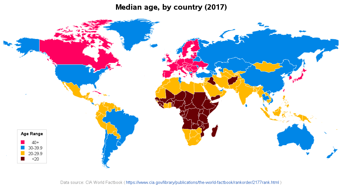
I first started thinking about this topic when I saw the following map on reddit. It was a nice simple map of some interesting data. How could it not capture my attention.

But the more I studied the map, the more problems I noticed.
- Since the map is only an image, there is no mouse-over text, and no way to easily find the names of the countries.
- The orange color indicates that Sri Lanka (large island just off the southern tip of India) has a median population in the 'Twenties (20-29)', but the CIA World Factbook data says Sri Lanka's median age is 32.5.
- Puerto Rico's median age is 39.5, but they colored it orange 'Twenties (20-29)' in their map.
- Their footnote cites the CIA World Factbook, but they don't say whether it is the source of the map itself, or just the source of the data used in the map.
- When a country had multiple segments, their map was joining them with a line (creating the visual effect of a 'land bridge'). For example, see the line between Alaska & the lower-48 states, and the line between the main part of Australia & the island of Tasmania just south of it. (This kind of problem might imply that they're just using normal plotting software, rather than mapping software.)
- The values in their legend are whole numbers, therefore it's a little ambiguous whether a value of 29.5 would fall into the 20-29 bucket, or the 30-39 bucket.
- Their maximum legend color bucket is Forties (40-49), but yet there is at least one datavalue higher than that (Monaco's median age is 52.4).
- The legend colors are arranged left-to-right from maximum to minimum (seems like it would be more intuitive to arrange them minimum to maximum).
Of course, it would be poor form to just complain about a map ... so I set about creating my own version. First I looked up the raw data (thankful they showed the exact url in their footnote). I then wrote some SAS code to import the text data, and set up some 'if' statements to resolve country name differences between their data, and the GfK maps that are used in SAS. For example: if country_name="Gambia, The" then country_name="Gambia";
My first map was very similar to theirs, but with the problems fixed:
My new map was better, but I still wasn't quite satisfied with it. I decided to create another version, using more of the traditional SAS defaults. For example, I used quantile binning to split the countries into 5 groups (with approximately equal number of countries in each group) - this way, I can easily tell which 1/5th the countries are in (the top 1/5th, the middle 1/5th, etc). By specifying 'levels=5' SAS splits the data into quintiles, and automatically shows the exact range of values for each color in the legend. I like to use a diverging gradient color scheme with quintile binning, rather than using discrete colors. Here's my final version of the map (you can click it to see the interactive version, with html mouse-over text):
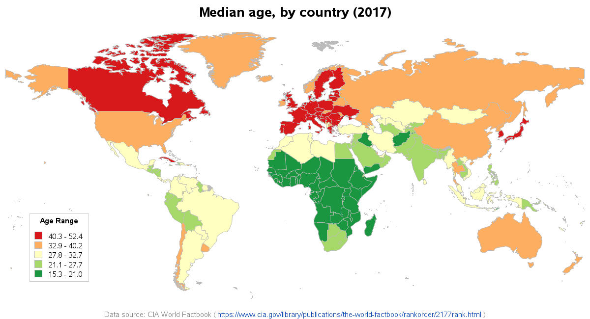
Do similar countries have similar median ages? It looks like many of the EU countries & Canada are all red; and the U.S., Russia, China, and Australia are all orange; and most of sub-Saharan countries in Africa are dark green. So, it does appear the median age could help group similar countries.
And now for some food for thought... What are the advantages of a younger, or older, median age? Have the advantages changed in the past 100 years? (or 50, or 500 years?) Assuming it's possible to control or influence things like this, what median age would be the most desirable (let's say, for looking out 100 years into the future).


6 Comments
Robert, is there any chance that you could link to the code you developed?
Thanks!
There's a link on the word 'code' in the blog, but I'm also happy to give it again! :)
http://robslink.com/SAS/democd93/world_age_2017_info.htm
Thank you very much. Sorry for not spotting it.
Excellent. Simple examples like these help a big deal and give ideas of what can be done. Please, keep posting.
The diverging color scheme make your map so much more informative. Not sure how you picked your colors, but some of your readers might be interested in looking at the Color Brewer page ... http://colorbrewer2.org/ ... to check out other types of schemes.
Colorbrewer is a great page - especially for picking colors for maps (and only slightly less helpful in picking colors for other graphs). Yes, I highly recommend users checking it out! :)