This past weekend, I was a volunteer helping with an Ironman 70.3 race. I was really impressed & inspired by the athletes ... I was also excited about the quantity and variety of data generated by this type of race (compared to a regular marathon). And as a 'graph guy' I just had to try my hand at visualizing that data!
Here's the basic race course ... They started early in the morning at Jordan Lake (west of Raleigh), where the athletes swam a 1.2 mile triangle starting and ending at Vista Point. Next, they hopped on their bicycles, and biked down to Shearon Harris Reservoir (where the nuclear power plant is, southwest of Raleigh), then east by Lake Wheeler (which is south of Raleigh), and finally headed north to downtown Raleigh (a total of 56 miles). For the last leg of the Ironman, they ran west from downtown along Hillsborough St., almost to the edge of town, and then looped back to downtown ... they ran that loop twice, racking up 13.1 miles (yes, basically a half-marathon ... in 90 degree heat, with some gnarly hills along the way).
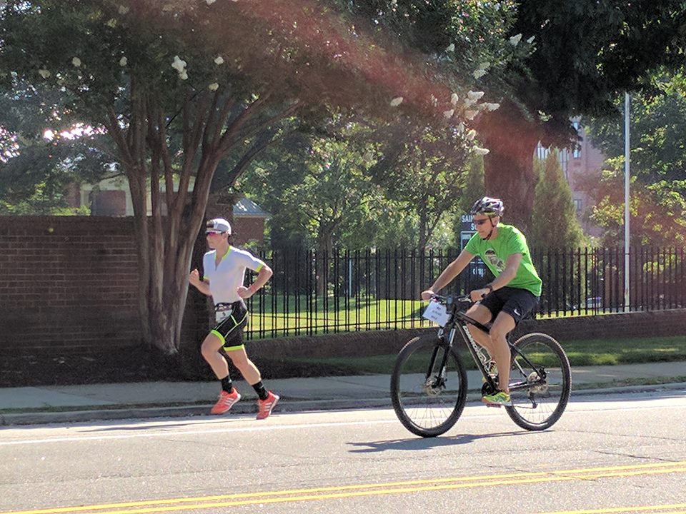
About a dozen members of our dragon boat paddling team volunteered to help with the race. Here's a picture our club president Alicia took of one of the elite athletes at the front of the pack, running past her station near downtown Raleigh:
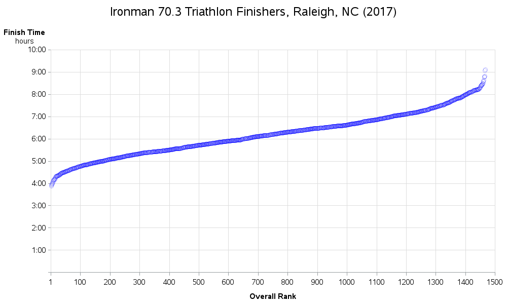
Soon after the race, I found the results on the Ironman website. There didn't appear to be an easy way to download it, so I copy-n-pasted all 88 pages into a text file, and then wrote some SAS code to import it. I then created a simple scatter plot of the almost 1,500 who completed the race, to see how their finish-times compared. The graph definitely shows that there were a handful of elite athletes who finished well ahead of everyone else (these are at the left side of the graph below).
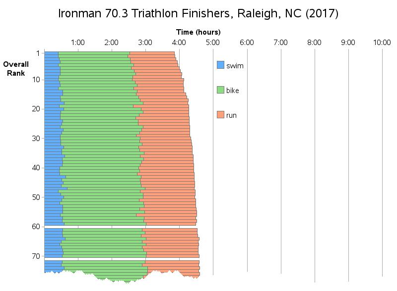
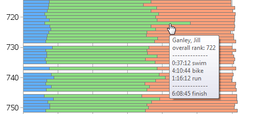
Next, I wanted to see a little more detail about each racer. I wondered if the times for the swim/bike/run were fairly consistent from athlete to athlete, or if certain athletes were faster in one and slower in another. For this, I used a stacked bar chart. Below is the top portion of the bar chart, to show you how I organized it. I tried to make things very logical, for example with the swim/bike/run bar segments stacked in the order the events occurred (rather than alphabetical order). Click the image below to see the full-size interactive version of my chart - you can then scroll up/down to see all ~1,500 athletes (the graph is 9000 pixels up/down), and the bars have mouse-over text so you can see each runner's name and time data:
A few things about the data jumped out at me in the graph - as a 'data guy,' and not an Ironman/race guy, I'm not sure whether these things are data problems, or just aspects of the race that I don't understand. Perhaps some of you athletes out there can help with this part! (feel free to give your thoughts, or provide extra insight, in the comments)...
There are some 'gaps' in the bar chart. For example, there is a gap at overall_rank=60. Does that mean there was nobody in the race with overall_rank=60, or was that person maybe disqualified? I double-checked the Ironman website, and their data jumps from 59 to 61. Here's a screen-capture:
![]()
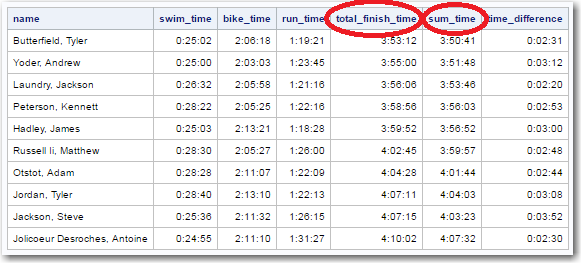
Another 'oddity' - the swim+bike+run times don't sum up to the 'finish time'. I guess maybe there's some time between these 3 activities, and that time gets counted in their total 'finish time'? Here's the data for the top 10 finishers.
Also, there were a few cases where the bar segments didn't line up consistently with the athletes having a similar overall rank. For example, Jill Ganley's biking segment of the race seems to have been really slow, compared to her swim & run. Perhaps her bike had a mechanical problem, or she had to repair a flat tire? Or perhaps she's just a very fast runner, and a slow biker?
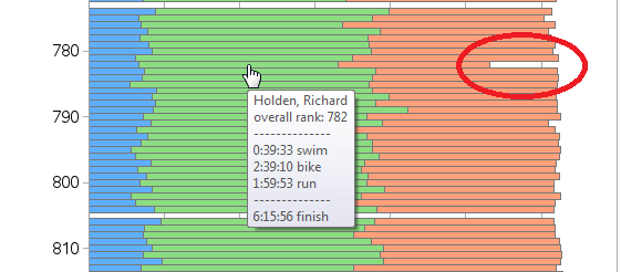
Another example that looks odd in the chart - Richard Holden seems to have completed the running portion of the race much faster than the other runners in the upper-700s overall rank. The Ironman website data says his run time was less than 2 hours, which is as fast as people with overall rank of ~300. Perhaps he's a very fast runner, and slower biker (or had problems with his bike), or maybe there was an error in recording his data?
Anyway, this was fun data to try to visually analyze, and it was an interesting challenge to try to plot all the data so you could see the data for each of the individual ~1,500 runners who finished the race. I used quite a few tricks in my SAS code to get the graph "just so," and here's a link if you'd like to see the code.
Update:
Based on some helpful feedback from actual triathletes, it appears that the table on the Ironman website leaves out the data fields for the 'transition' times (between swimming/biking, and biking/running), when the athletes change shoes, etc. It would be ideal to have the data values for both of the transition times separately, but since that data is not available in the table I have calculated a single value for the total transition time. I added this to the bar chart as a single gray bar segment on the end of each bar.
Here's a snapshot of the top portion of the new/improved graph. You can click it to see the full chart:
![]()


9 Comments
Thanks a lot, Robert! To be honest whenever I look for something related to SAS graph I always prefer The Graph Guy's post!
Thanks so much for volunteering Robert! We would be in poor shape without folks like you there to help us out!
There were a number of broken bikes out on the bike course, actually heard about a guy whose bike broke (completely, couldn't even push it) about 7mi before the bike finish. He ran - in his bike shoes - and made it to the T2 just minutes before they closed the bike course. Then he preceded to run the 13.1 and finish the whole race. These odd situations definitely occur and the data will look off, but this just shows how stubborn us triathletes really are :)
Ahh - that kind of scenario certainly could make for some odd-looking data!
This is great shtuff!
Your question regarding time differences: A triathlon actually has 5-timed segments (I wish IronMan would report all 5): SWIM - T1 - BIKE - T2 - RUN
T1 - Transition One. How fast can you get ready to ride after coming out of the water
T2 - Transition Two. How fast can you get ready to run once you've made it off the bike.
You can't calculate the numbers from the data that IronMan gives; You get a TT time (Transition Total) which is interesting; though I find not nearly as useful as the breakout.
The outliers in data for a particular person are not that uncommon. There are people that are incredible runners that are not nearly as good on the bike portion. The bike is where a good portion of time is spent; though good runners have a great shot of making up a lot of time. Take a look at past IronMan Kona (the championship race) to see which athlete usually wins it all: The better swimmer; biker; or runner!
Thank you for the great data analysis!
PS- What the data doesn't show is that the longer you were on the course, the darned hotter it got. Trust me on that one! (*SMILE*)
Ahh! - Good stuff! Thanks!
Richard Holden might have had very long transition times. Perhaps he couldn't find his individual spot or didn't have his bag organized. Without the T1 and T2 times, we just can't be sure.
I looked at the Ironman site for the results and I found his time in transitions.
00:39:33 Swim
00:02:55 Swim to Bike T1
02:39:10 Bike
00:54:25 Bike to Run T2 (This is extraordinarily long)
01:59:53 Run
06:15:56 Finish
05:18:36 Total time active
So we still don't know if he had an equipment problem or a timing chip issue or maybe he pushed it too hard on the bike and needed time to recover before the run.
-Rob W
Ahh - good detective work!
Hey Robert,
Several SAS folks participated in the Raleigh IronMan. Looking at your data, the difference in finish time and the sum of the swim, bike and run is probably the transition times. I'm surprised they didn't report on T1 and T2. Some triathlons do show those numbers. Those are pretty fast transition times though. I know it takes me longer than three minutes to go from biking to running!
The blank bars, I have no idea. The Richard Holden example, his times are much faster than his placement. So, yeah, I'm thinking glitch in recording data somewhere.
Those elite athlete times are just amazing! Thanks for visualizing this data. Always interesting to see how an event you're immersed in looks from the outside.
-Kevin
Thanks for the info!