Have you ever seen a map that just didn't look right to you? Perhaps the map area seemed squished or stretched? Perhaps this was because they used a different map projection than you were accustomed to. Or maybe the map coordinates weren't projected at all. In this blog post I share my second tip on mapping tools available in SAS - the basics of projecting maps.
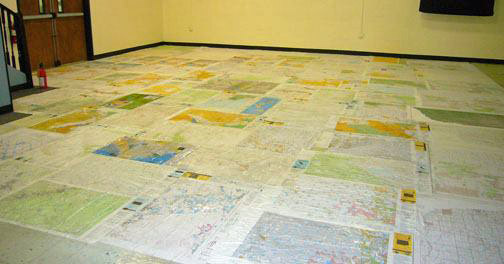
Projecting a map is basically taking the spherical lat/long coordinates from a globe, and transforming them to look good on a flat surface. And just for fun, here's a photo of a bunch of maps on a flat surface ... My friend Sara works at The Scrap Exchange (creative reuse arts center) in Durham, where they're always doing something artsy & imaginative, with things people might have otherwise thrown away. This time they collected all kinds of maps (national geographic maps, atlases, city guides, road maps, etc) and used them to tile the floor. What will they think of next!?!
And now, on to the SAS tips. In SAS, you can basically use Proc GProject to do two things - project a map, and clip out a rectangular region of a map. Below are a few simple examples to demonstrate...
Projecting Lat/Long Coordinates
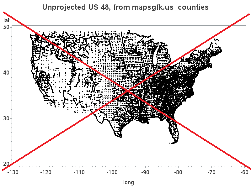
Below is a scatter plot of the lat/long coordinates along the borders in the US county map. Notice how it looks a bit distorted, and isn't in the shape you usually see the US map. That's because these are the unprojected lat/long coordinates.
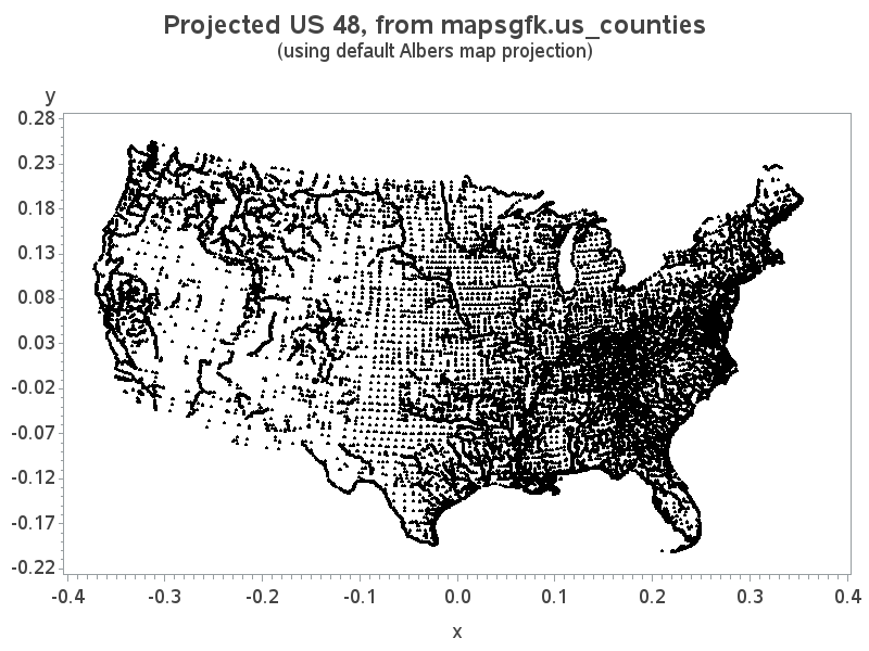
You can use Proc GProject on the map dataset, and transform the lat/long coordinates into something more visually pleasing, and the map you're accustomed to seeing. The projected lat goes into the Y variable, and the projected long goes into the X variable. Here's the code to project the map, followed by a scatter plot of the projected X/Y points:
data my_map; set mapsgfk.us_counties
(where=(density<=2 and statecode not in ('AK' 'HI')) drop=x y resolution);
run;
proc gproject data=my_map out=my_map latlong eastlong degrees;
id id;
run;
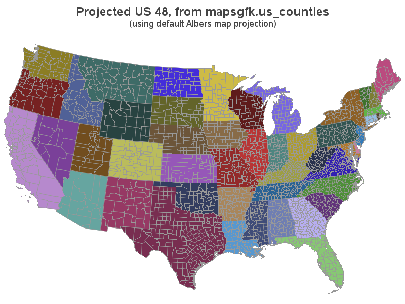
Of course, the above scatter plot of the points isn't how we typically visualize a map - instead we connect the points, and draw polygons (and sometimes fill the polygons with colors). Below are the polygons plotted using Proc Gmap.
proc gmap map=my_map data=mapsgfk.us_counties_attr;
id id;
choro id1name / nolegend coutline=gray99;
run;
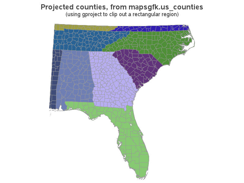
Using GProject to Clip a Rectangular Region
For the savvy map-maker, there's some additional functionality hidden in Proc GProject. You can also use it to clip out a rectangular region of a map. For example, below I show how to clip out a rectangular region of the southeast US:
proc gproject data=my_map out=my_map latlong eastlong degrees
longmin=-89 longmax=-75 latmin=25 latmax=37;
id id;
There you have it - Proc GProject, in a nutshell. Now, what maps are you planning to create with this newfound knowledge? :-)
Click here to see all my tips about mapping tools!