Have you been using the SAS/Graph Gmap procedure to plot your data on maps for years, but never knew you could add roads to your maps?!? Follow along in this blog post, and I'll teach you how...

But before we get started, here's a picture of a nice aerial view of a road that my friend Eva took (on one of her many trips). There - now doesn't that get you into the right mindset for wanting to add roads to your maps!?!
Now, let's get to work. You probably already know that you can use Gmap to create choropleth maps. And if you've been reading my blog posts, you've probably figured out that you can also add dots, bubbles, markers, pies, etc to your maps at specific latitude/longitude coordinates using data-driven annotate. Well, you can also use annotate to add lines to a map, that represent roads. The roads are often good reference points, that help people viewing the map know where certain areas located in relation to the roads - for example, cities often have a beltline road around them, and by adding roads to a map, you can easily see if something is inside or outside of the beltline.
Here's a map of Wake county, North Carolina (where I live, and where the SAS headquarters is located). Note that unless you're very familiar with this area, it is difficult to tell where the city of Raleigh might be, and in particular which area of this map is 'inside the beltline' (ITB).
![]()
So let's annotate some roads on the map, including the famous I-440 beltline which goes around Raleigh. In order to do that, we'll need the lat/long coordinates of points along the roads. Fortunately, our tax dollars are hard at work, and we can download this type of road data for free from the Census website. Basically, go to their index page, select year and 'Roads', select a state for 'Primary and Secondary Roads', download & unzip it. You'll now have several files for your state (note that the '37' in the filename below is the FIPS code for North Carolina), including a .shp file. Now, use Proc Mapimport to read the shapefile data and convert it into a SAS dataset.
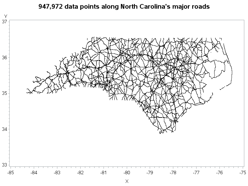
Once you have the data in SAS, you can use Proc Gplot to give it a sanity check, and see what you've got. Note that the plot below might look like it contains squiggly lines, but they are actually very densely packed points - almost 1 million densely packed points!
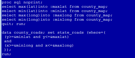
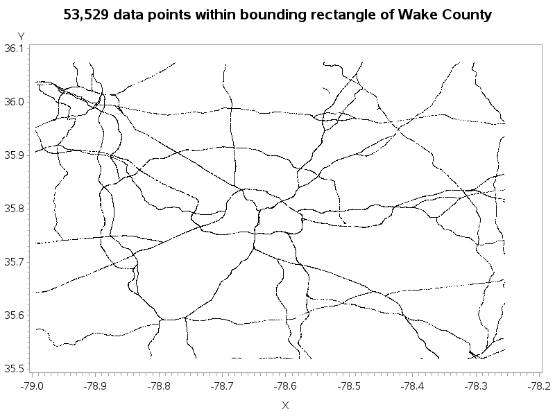
We don't really want or need all the NC roads on our county map, so let's subset it. If I find the min & max lat & long values in Wake county, I can then use those values to get a rectangular subset of the road values.
Now we're down from about a million data points, to about 50,000. That will be a lot easier to work with.
I can convert those points to lines using simple annotate commands. If it's the first point of a road segment, do the annotate 'move' command (to start a new line), and if it's not the first point then do the annotate 'draw' command (which draws a line from the previous point to the current point). You can also control the color and thickness of the lines. I make the major roads a little thicker and darker.
Now when I display the annotate dataset on the map, I get the following map. The dark inner circle in the center of the map is the I-440 beltline.
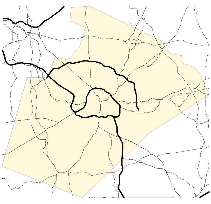
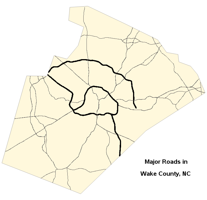
The previous map was OK, but I don't really want the roads outside of Wake county - I only want the roads that are inside. But how can I programmatically determine which points along the roads are 'inside' of Wake county? Luckily SAS/Graph has Proc Ginside which provides exactly that capability! So I used Proc Ginside to subset the road data, and now I have the desired map, showing Wake county and the major roads inside of Wake county. Keep an eye out for a future blog post, where I will use roads in combination with annotated demographic data!
Here's a link to my SAS code for this map. I started with an official Tech Support example, but made lots of changes to simplify & streamline the code, and hopefully make it easier to re-use. I would be interested in hearing whether or not you are able to re-use this code with your county! :-)


4 Comments
I've seen several individual state/county examples where the major roads or highways are projected onto the map. However, I have yet to see a good example of this for the entire lower 48 states. I've found SAS is incapable of doing this -- perhaps I'm using too detailed of a shapefile (https://catalog.data.gov/dataset/2015-roads-national-geodatabase).
To your knowledge are there any examples of this?
I've never done that ... but it should be do-able. Does your computer run out of RAM/memory, or does it crash, or just never finish? You might try reducing the number of points in your map (using proc greduce, and then subsetting based on density), and/or reducing the number of roads you're annotating. Maybe start small, and then work your way up to the full map you're wanting.
I'm more intrigued by what _isn't_ on your map than what _is_. It seems you only have I/US/NC numbered roads (so the freeway section of Wade Avenue is noticeably missing), which isn't too surprising. But your wider lines only apply to Interstates [except I-495(!)] but not other limited-access freeways like US1S, US64/264E, and all of NC540 and NC147. I suppose "limited access freeway" is not in the census data?
I guess your next blog will stick numbered shields and NC diamonds all over the map? :-)
So many ideas, so little disk space to write my SAS code! ... Oh wait - disk space is *cheap* these days, and practically unlimited! Perhaps I'll see what I can do! ;)