Are your friends passing around clever memes (supposedly) featuring something your favorite actor said, or sharing news articles that you think might be "fake news"? If there's even a hint of data analyst in you, then you probably check the actual data, and confirm or disprove the supposed facts yourself. I recently had quite a time trying to check some 'facts' about voter registration data, and I thought you might like to see the data-tricks I used to overcome the challenges...
There are many different ways people register to vote in North Carolina. For example, when you get a driver's license at the DMV, they ask if you'd like to register. I've also seen voter registration drives, and heard that people can register to vote when they apply for welfare. I imagined there were also many other ways to register - but I didn't know what they all were, and I wasn't sure which were the most prevalent.
I saw a graph in an article that focused on the number of people who registered in certain ways, and therefore I knew the data was publicly available ... somewhere. After a bit of targeted keyword searching against the North Carolina State Board of Elections (ncsbe.gov) website, I found a page where you can download files with the voter registration data for each month!
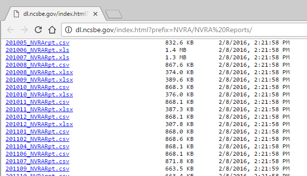
But I noticed the files were in several different formats - and as my friend John likes to say, this was the start of my journey down the rabbit hole! Speaking of rabbits, here's a picture of a rabbit that my old college buddy Rich took, in his front yard:

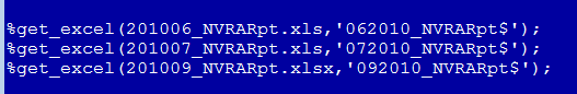
For some months, there was only an Excel spreadsheet file available. For those, I had to download a copy of the file to allow SAS to import it. I ran DMS SAS, and ran the File->Import wizard, and had it write the SAS Proc Import code to a file so I could add it to my SAS program. I wrote a macro around the import code, so I could call it by passing in a filename (and the sheet name, since they were different in each spreadsheet). There were three of the monthly data files only available in Excel format ... but one of them was an xlsx file, rather than the (older) xls file format. Fortunately, the same SAS import code was able to import both the old and the new!
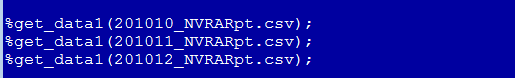
Some of the months had both an Excel and a csv (comma separated text value) version of the data. Knowing that my SAS job can directly read the csv file over the Internet (without downloading/saving the file locally), I opted for using the csv instead of the Excel spreadsheet in those cases. In order to write my code to import the csv, I 'cheated' a little. I temporarily downloaded one of the csv files, and used the File->Import wizard to generate Proc Import code to read the csv. I then ran the Proc Import, and looked in the SAS log to see what code it actually used to define the variables and read them in, etc. I copied that generated SAS code from the SAS log (and stripped out the log file line numbers), and wrote a macro around it to make it easy to re-use the same code on all the csv files.
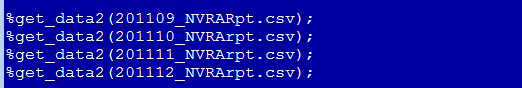
I thought I was all set, and I got a list of all the csv filenames, and had my SAS job try to read them all ... but noooo!!!! Some of them got errors. After closer inspection, I found that the way the csv data files were written had changed in in the Sept 2011 data. For example, the start_dt was previously a datetime value, whereas now it's a date value (with no time) ... therefore I need to import it differently in my SAS code. So now I needed yet another version of my import code. Let's call it %get_data2(). Turns out there were 9 csv files in the first format, and 58 in the second format.
And sometime between when I started down this rabbit hole and now, the way they put their files on their website changed (and became trickier), which caused me to have to use different pathnames to read in the data. Whereas I used to be able to just refer to the csv files in the web folder url that they looked like they were in, there's now a level of indirection to go through. If you look in the ncsbe.gov folder, right-click on the files and 'copy link address', then *that* is the url where the file is actually located. For example, what looks like a file called 201210_NVRA_monthly_report.csv, is actually an href link to:
https://s3.amazonaws.com/dl.ncsbe.gov/NVRA/NVRA%20Reports/201210_NVRA_monthly_report.csv
Reading in the 60+ monthly data files takes a few minutes, and I didn't want to re-read them all each time I ran my SAS job. Therefore after reading them all in once, I saved the dataset to disk (ie, saved it to a permanent libname). Now we're ready to plot the data, right?!? ... Well, maybe.
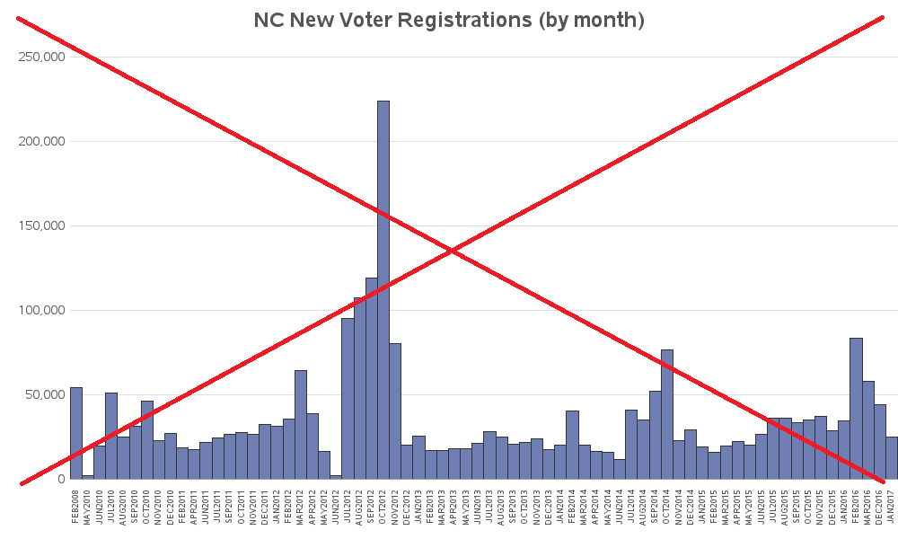
Here's an initial plot of the data, with 1 bar for each month. It looked good at first glance, but upon closer inspection I noticed that it didn't have the 'gaps' I was expecting (when I was first setting up the code to read in the data, I had noticed that there were certain months that didn't have a data file). By default, bar SAS bar charts just show a bar for each midpoint value (in this case month) that has data - if there's no data, there is no bar. But in this case, that's not a good way to show the data. And since this is a bad/misleading graph, I've drawn a red 'X' across it (so nobody mistakenly thinks it's a good graph!)
But don't be disheartened - creating good graphs is almost always an iterative process! You start with the defaults, and then you keep making changes as-needed until you get the graph you want. In the next iteration I override the default axis, and specify for it to create a bar (or a blank space) for each month, from the minimum to the maximum date in the data. Now the bars are proportionally spaced, and I can see the 'gaps' for the months with no data. But why is there such a big gap after the first bar? Why is the first bar at Feb 2008? I thought my first data was supposed to start at May 2010.
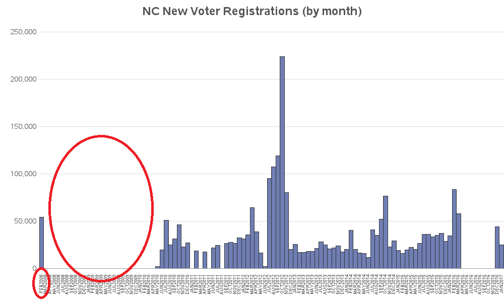
After quite a bit of checking and double-checking, I discovered the cause of the problem. Somehow the Jan 2011 csv file on the ncsbe website contained Feb 2008 data! Since the date in the filename didn't match the date in the data, I decided to just not use that file (better to discard 1 month of data, than take a risk of making the wrong assumption about which date is correct!) And here's a plot of the good data I'm left with:
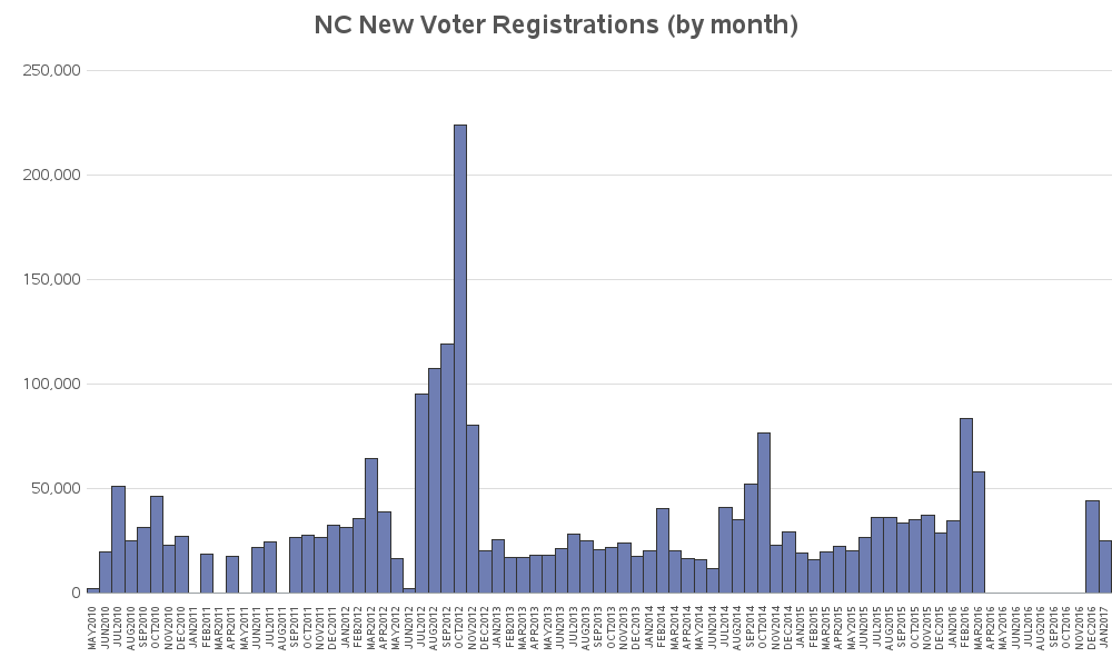
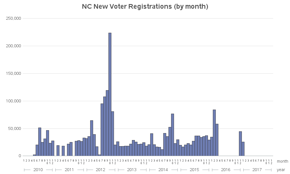
The bars & spacing are looking good, but what about those dates along the axis? They sure seem crowded, and there is a lot of repetition, with the year being repeated in all 12 months. Instead of plotting the bars by the monthly date values, let's group by year, and then plot the bars by numeric month (1-12). This will reduce a lot of clutter, and make the axis a lot easier to read.
Up until now, I've just been plotting the total number of voter registrations per month. But what I really want to know is where the voter registrations came from. So let's use the subgroup= option, and create a stacked bar chart where each source of voter registrations is a different color in the stacked bar. As this chart got more detailed, I had to make it wider - therefore you might need to click the image below and view the full size graph, to read the text, etc. There are quite a few too many items in the legend to easily match to the colors in the bars, therefore I added html mouse-over text in my interactive version (the version below is just an image, not interactive - click the image to view the interactive version). It looks like the bars are mainly 3 colors: pink = In person & drives, light blue = mail-in, and light green = DMV.
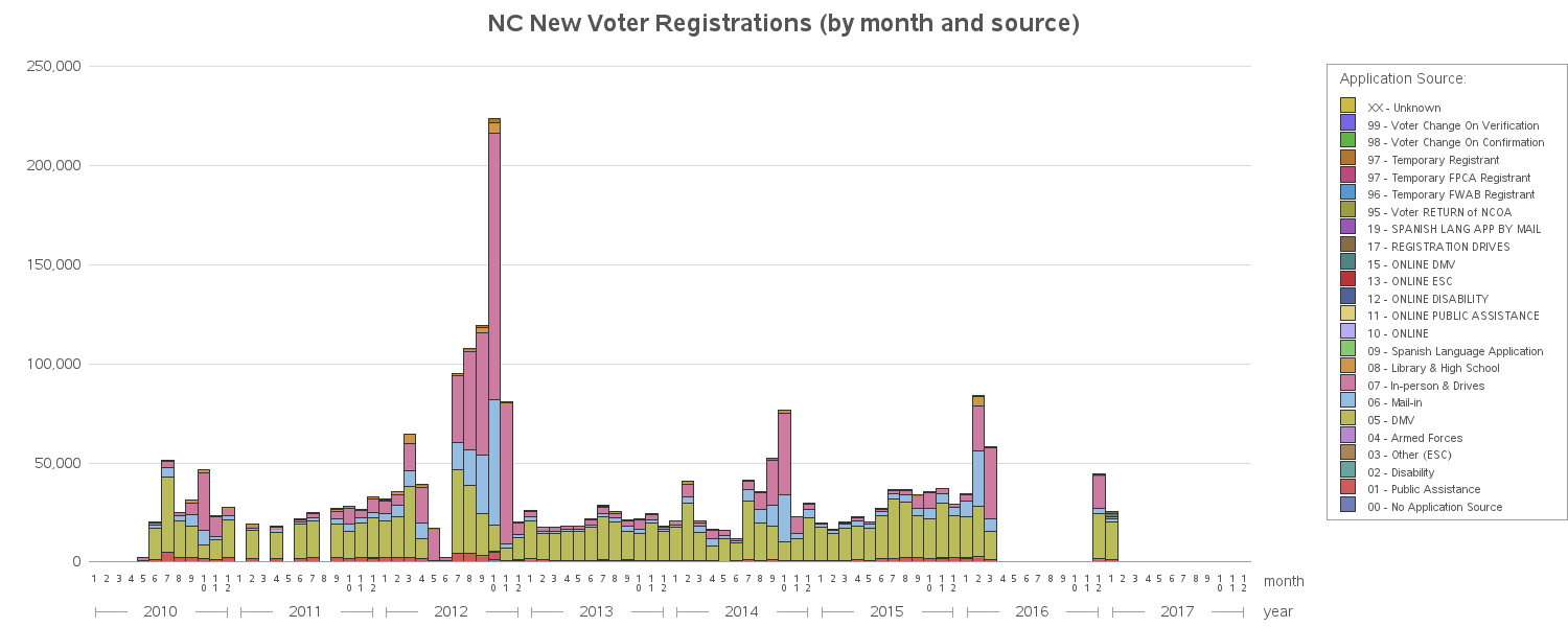
So far I've got a fine bar chart, using standard Proc Gchart options, but if you know me then you know I like to customize my graphs with data-driven annotate, to help data analysts gain more insight more quickly. Since I'm familiar with the 4 (and 2) year US election cycles, I could intuit that the peaks in the graph coincided with the elections. But I thought it would be useful to add the election date labels explicitly in the graph. Also, it was a bit difficult to distinguish between months with very low values, and months with no data - therefore I decided to add an 'x' to help explicitly identify the months with no data. And here's the final graph:
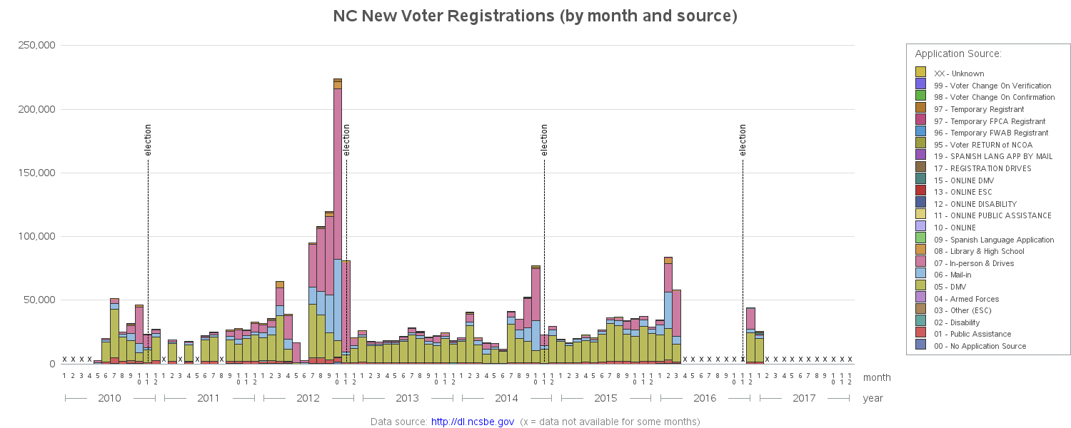
I invite you to click the above image to see the interactive version - it has mouse-over text for each colored bar segment, and also lets you click the colored segments (or the color chips in the legend) to drill-down and see a more detailed plot of just that source.
And as we emerge from the rabbit hole, I will leave you with ... another picture of a rabbit. This one was taken by my dragon boating buddy David:

Did you learn anything interesting about data-wrangling? How about voter registrations in North Carolina? Or customizing graphs with annotated labels? I look forward to hearing your comments!


7 Comments
Your tale of the data messiness was fantastic. I actually laughed several times. My bosses over the years want a silver bullet software that they can then just feed the files into and get the same output they have seen at some software demo. This code will be very helpful for me. One serious question. There is a huge gap of new voter registrations leading up the Clinton/Trump election. I would have guessed those files just had not been posted yet but Dec 2016 and Jan 2017 are included. Any thoughts about that gap?
THANKS!
Hi Robert-
As someone else who analyzes this same data in similar ways, I need to point out something-
The "New Registrations" may not be actually NEW to NC: If you move from one NC county to another, and register in the new county, your "registration date" will update to the NEWEST county. So you could live and vote your whole life in Wake county, then move to Durham county and register this year, and it will show your "registration date" as the new county only. However, moving within a county does not change your date.
Thus, "registration date" is more properly "the earliest registration in the CURRENT county".
Ahh - that's very useful to know! (especially if I try some graphs at the county level!)
Yes, county-level would be more robust. Registration is, after all, done at the County Level, although the form and procedure is at the state level. But I wish there were some kind of "absolute date" showing the first registration at all for someone--however, someone could have registered 50 years ago, moved away for 45 years and then come back to retire, and reregistered.
I was trying to do visualizations in Tableau with similar sorts of things as you, hoping it would show things like the party breakdown of first-time registrants over time...but it works ONLY at the county level, not statewide, darnit.
Maybe if you use SAS software, you'll be able to see the trends you're looking for at both the county *and* state levels! ;)
Your work consistently impresses me. It's always fun to fall "down the rabbit hole" of links in your posts, which usually end up leading me to the many graphs on your website. Thank you, Robert.
Thanks! - This is perhaps my favorite comment of all time! :)