I usually create very technical maps, to display data spatially - and they usually have a certain look. They're clear, crisp, and to the point. I typically only use color to represent the data, and I choose a font that is simple and easy to read (such as arial). But occasionally ... every so often ... you might need to create a pretty map. This example shows some tips and tricks that might help.
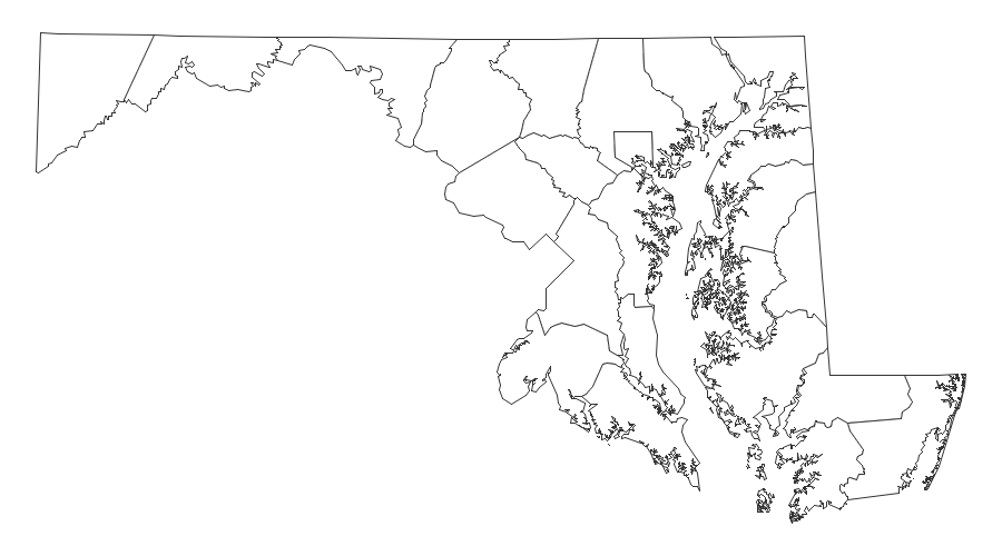
Let's start with a basic county map of Maryland. I have subset it from the mapsgfk.us_counties map, and used Proc Gproject to 'straighten' it. (When you subset a map, if you don't re-project it, it can look 'crooked,' since the original map was projected and centered more on the center of all the US states.)
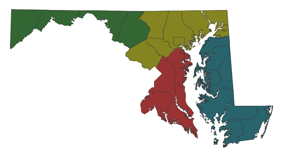
Next, I assign each county to a region, and color the counties by region. In my technical maps, I would typically use colors that are easier to distinguish ... but this time we're going for a pretty map, where all the colors look nice together.
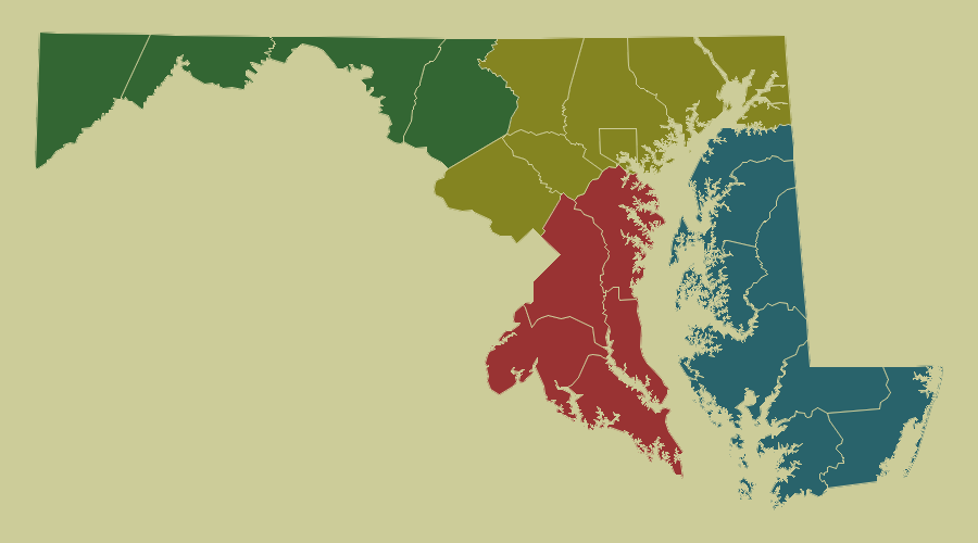
Next, let's use Goptions Cback=cxCCCC99 to assign a pleasant color to the background of the map. It's really nice to be able to use hex RGB codes to specify the exact color you want!

The map polygons still seem disjoint from the background, so let's use a little trick to get them to blend together. You can use Gmap's Coutline= option to set the outline color of the map areas to the same color as the background. Now we've got happy outlines around the map areas - I think I might be channeling Rob Ross! ;-)
Next, let's add some text. Rather than using a title statement, which would place the text at the top/north edge of the map, let's use annotate so we can place it wherever we want. For example, let's put 'Maryland' in the big open space at the bottom/left of the map. I tried to pick pretty fonts - something that's a bit curvy, but still easy to read.
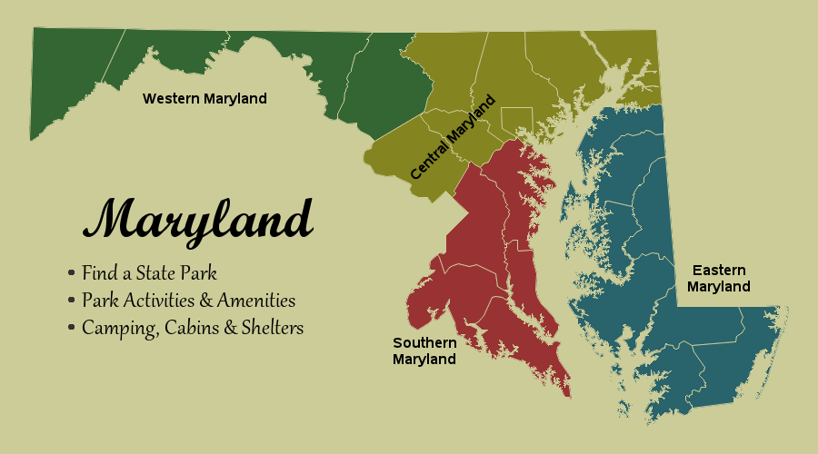
And for a finishing touch, how about a fancy 'North' arrow ... I annotate a thick line, and then an arrow head at the top, and a fancy dark letter 'N' (for north), with a lighter gray copy of the same letter slightly offset behind it to give a 3d shadow effect.
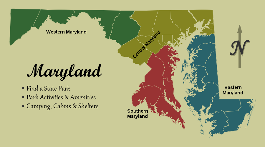
Wow - what a beautiful map! And if you click the image above, you can see the interactive version, it has html mouse-over text and drill-downs to the Maryland Department of Natural Resources page. Perhaps you can use this map to plan your next vacation in Maryland!

4 Comments
Great content! Thanks Robert.
Nice! I'm planning on doing something similar with the coast of California and contour lines as the background. This is good information!
Am I not seeing the SAS code link? How do we add the North line?
Here's a link to the code: http://robslink.com/SAS/democd1/md_map.sas
For the north arrow, look for the comment that says "N-orth Arrow" :)