Are you a visualization & graphing expert? Can you identify which tool (R, Excel, Tableau, SPSS, Matlab, JS, Python, or SAS) was used to create each of these graphs? No cheating!
I recently read Tim Matteson's blog where he presented 18 graphs, and had his readers try to guess which software was used to create each of them. I thought it was an interesting exercise, but I was a little disappointed in the graphs. My buddy Paul Kent said I should create my own new/improved version of each graph, and I thought that sounded like a splendid idea! Be sure to click the link above to see the original versions, so you can better appreciate the improvements.
Can you determine which software I used to create each of my improved versions? (leave your guesses in the comments section)
Chart 1
The biggest problem in the original graph, was that the colors and order of the bar segments didn't make sense - seems like they should be bad-to-good, but the original graph had them in alphabetical order. Also, the Xnn labels along the left-side axis were cluttered and difficult to read. In my version I spaced the labels out more, and also left-aligned them so the 'X's lined up and made them easier to read.
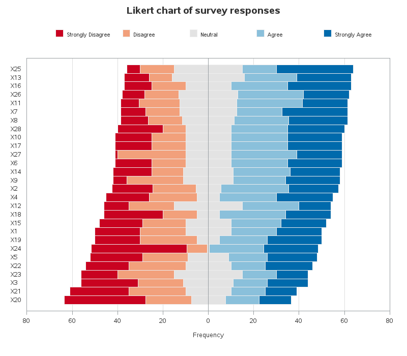
Chart 2
In the original chart, having a colored area behind the questions made it look (at first glance) like those were bars, therefore I didn't color that area in my graph. I was a bit confused by the numbers to the left and right of the bars in the original, therefore in my version I color-coded these numbers so the user would know at-a-glance that the left number represented 'disagree' and the right number represented 'agree'. In survey data like this, I think it's important to be able to see whether over 50% of the respondents agree or disagree, so I added a reference line at 50%.
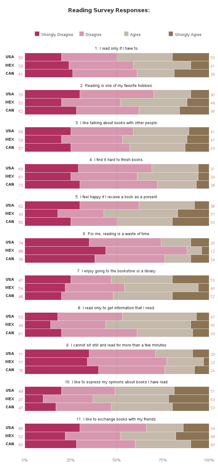
Chart 3
In the original chart, they had the axis labels along both the left and bottom, showing each label twice. In my plot, I placed the label along the diagonal boxes, allowing me to only show each label once (and also eliminating the sideways labels along the left axis). I used transparent plot markers, so you can see where markers are stacking. I also use a different color marker from the axes and text, so the markers stand out more.
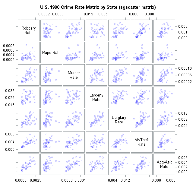
Chart 4
The original chart used so many grid lines that I found it difficult to follow a line to the axis. I used years rather than months along the x-axis, because that seemed easier to understand for such a long time period (quick - how many years is 70 months!?! see what I mean!)
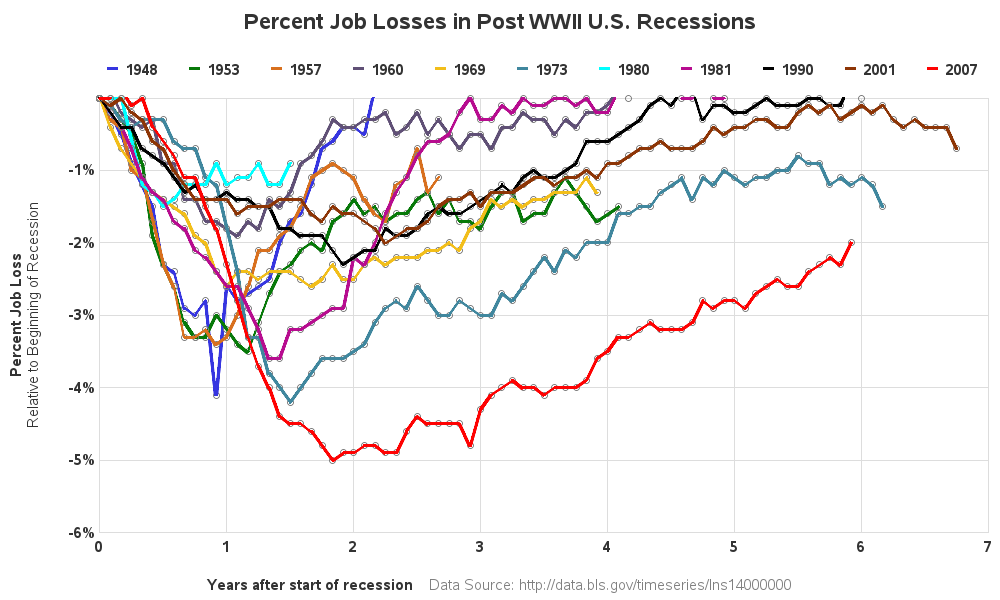
Chart 5
For this one, I left it pretty much as-is, except I placed the labels inside the longer bars (rather than outside), thereby making more room for the bars. I also explain what 'cola' is in the title, since it's an acronym most people probably aren't familiar with - wouldn't want people thinking this was a graph about soft drinks!
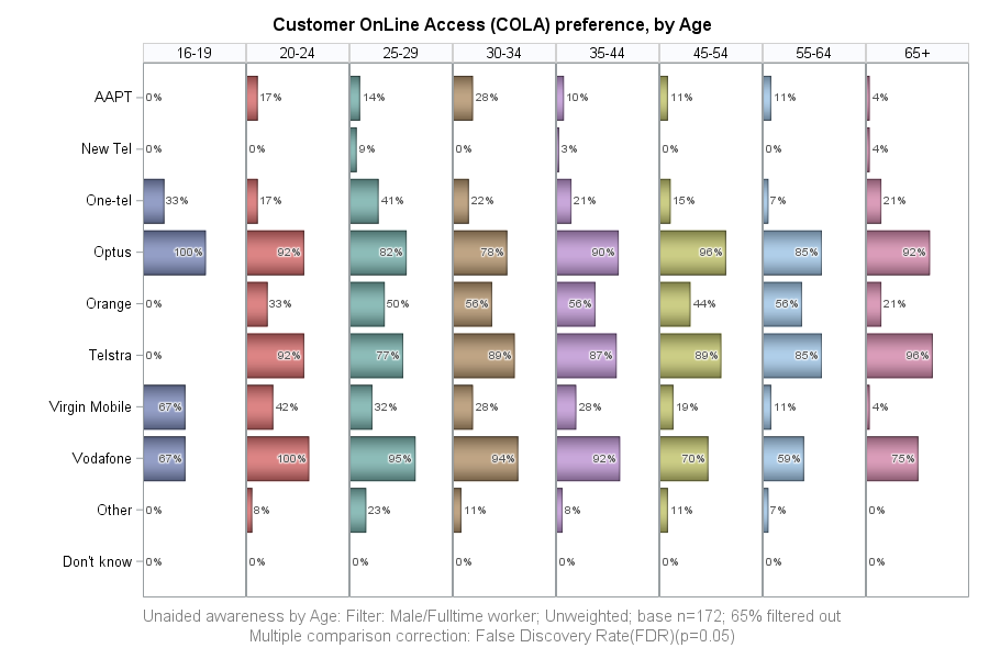
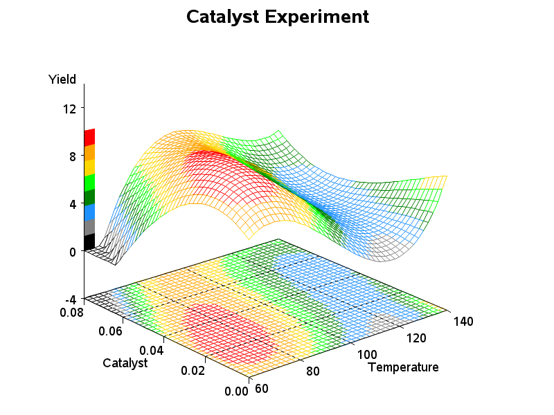
Chart 6
For this chart, I didn't have the original data, so I decided to go with some data that was similar, but less dense. I'm not sure what the original chart was trying to show, but I can't imagine it was doing a very good job of it (looked like a cluttered mess of points & lines to me).
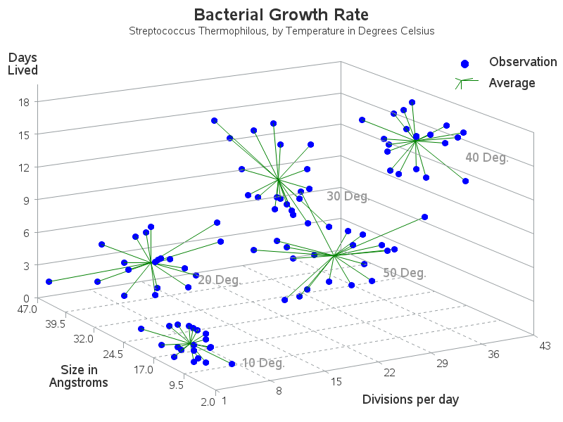
Chart 7
In the original chart, I don't think the circles showed up very well against the black background - therefore I didn't put any circles on my version (if you want to see a black map with circles, have a look at my map with animated circles). Be sure to click on this one, to see the full size map (to get the full effect)!
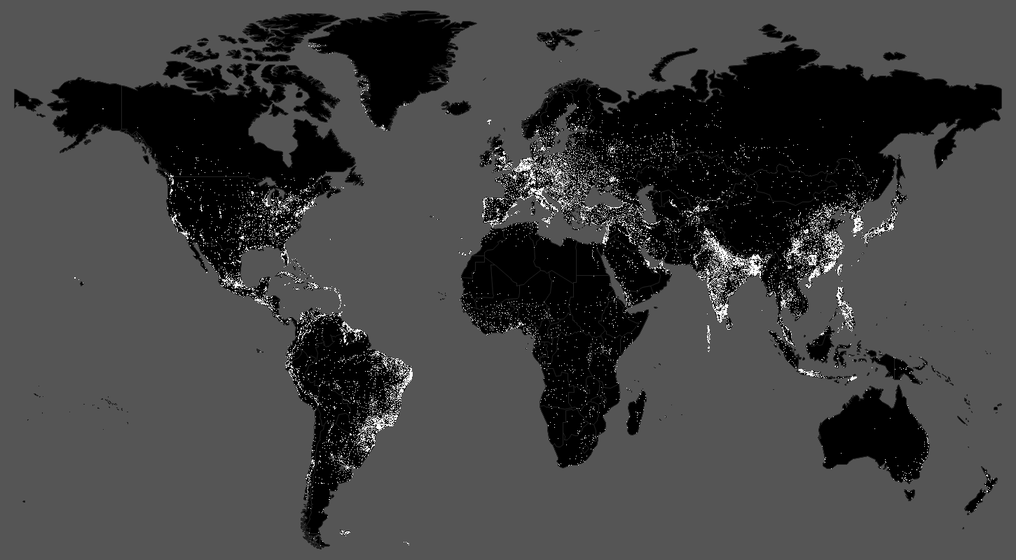
Chart 8
The original chart was a simple scatter, with '+' markers, and dark grid lines. In my version, I used transparent round markers - this way you can see when multiple markers are stacked in the same location. I also use light grid lines, so the grid doesn't compete with the markers for your attention. I also added some summary statistics in the top/left corner of the graph.
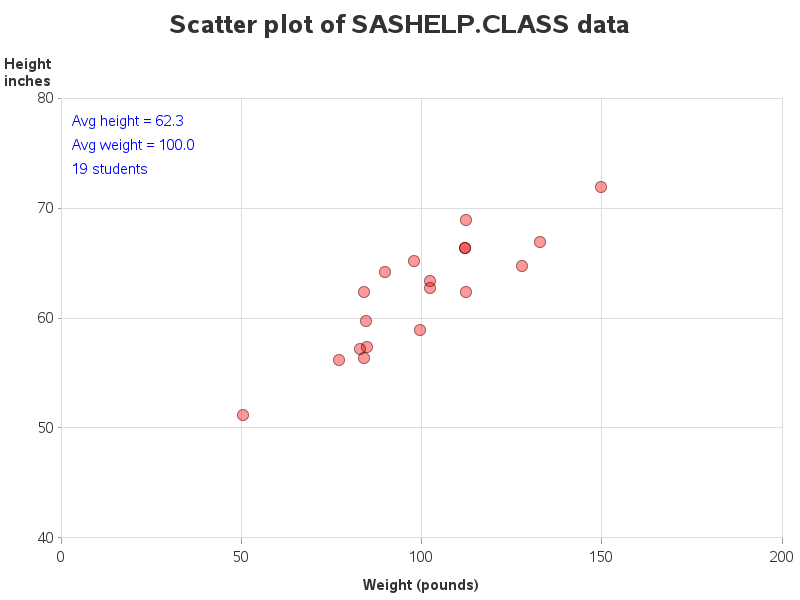
Chart 9
I'm not a big fan of using black backgrounds in a graph ... but if you're going to create any kind of graph, at least show the scales along the sides!
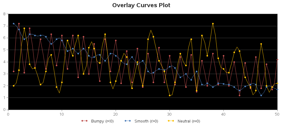
Chart 10
This is another one I didn't have the exact data for, so I used some similar data. The biggest change I made was using transparent markers so you can see where multiple markers are stacked on top of each other. I also use a grid of reference lines from both axes, rather than just one axis.
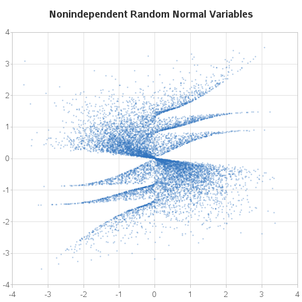
Chart 11
Although the original chart didn't have any labeling, I suspect it was some of Fisher's classic iris data set, therefore I used some of that data in my chart. The first improvement I made was labeling the graph, so you quickly know what I'm plotting. I also annotate a picture of a labeled iris flower, so you know what a petal and a sepal is.
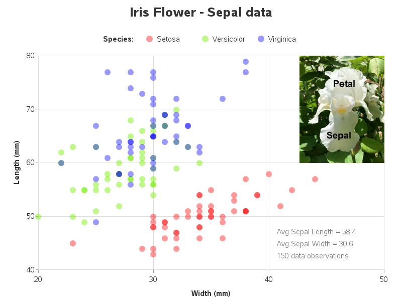
Chart 12
I'm not a big fan of using 3d bars on a 3d map to show data, like they did in the original graph - the taller/front bars inevitably obscure some of the shorter/back bars, etc. Therefore in my graph I show how to plot data as markers on a 2d street map.
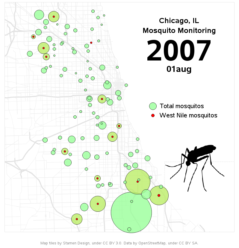
Chart 13
In the original chart, I'm not sure exactly which year(s) of earthquake data they use, since there is no title or label. In my chart, I show all the major earthquakes for a 40+ year time period, and I also center my map on the Pacific ocean (so it better shows the 'ring of fire'). I also use circles rather than filled dots, so it's easier to see almost-overlapping markers.
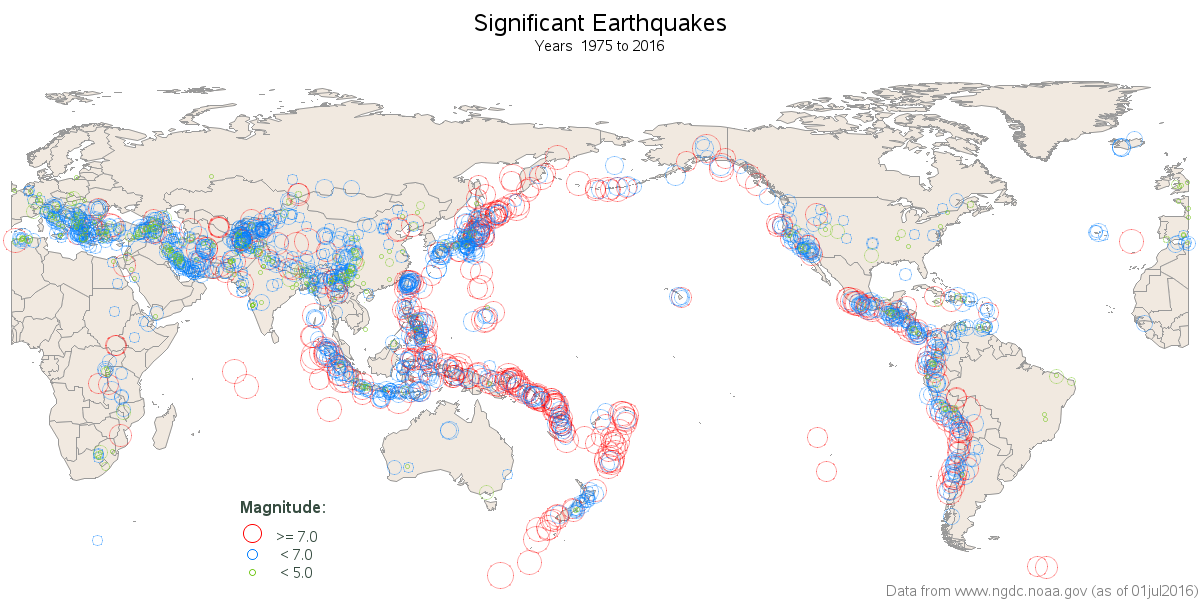
Chart 14
In charts like this, I really don't like when people use a diverging color scheme (gradient shades of 2 colors, meeting in the middle) - those should be used when the scale goes from bad-to-good, etc. In this case, where the colors represent a simple "Percent of Trials" gradient shades of a single color should be used. They left-justified their Cancer Conditions, which placed them far from the chart, and made it difficult to see which colored blocks went with which label - I right-justified them. Also, it was difficult to determine whether white boxes were light gradients, or no-data. In my chart, I use a hatched pattern for no-data, to make the distinction more obvious.
And in the bottom (bar) chart portion, I was a bit confused by the numbers on top of the bars - after a bit of scrutinizing the graph, I found that the numbers represent the difference in the Actual and Expected time. Therefore I tried to make that more obvious in my bar chart.
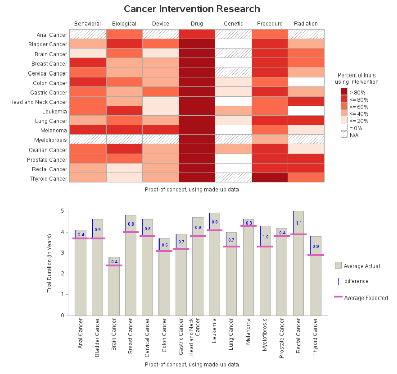
Chart 15
I don't really have access to any software to do solid-modeling, so instead of doing an animation of a solid-model of the earth (which looked pretty pitiful in the original blog), I am using a different animation. Click the image below to see it animated:
Chart 16
For this chart, my version is a little cleaner, and I've moved a few of the labels to new locations.
Chart 17
The original chart had somewhat willy-nilly axis tick marks, and I wasn't real keen on using circles in the legend to coincide with the lines in the graph. I didn't have this exact data, therefore I chose some similar time-series data that I could show three lines overlaid. Notice that in addition to the color legend, I also added a label to the end of each line.
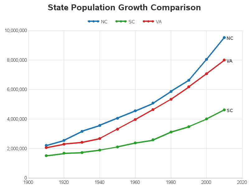
Chart 18
For this one, I used slightly different colors, and slightly larger/bolder text, but aside from that it was already a great graph. :-)
Ok - time to enter your guesses in the comments section! Which software(s) were used to create which graphs?
After making your guesses, you can scroll down to find the answer! ...
Note: I used SAS/Graph and SAS ODS Graphics to programmatically create my graphs. If you'd also like to see how similar graphs can be created using SAS Visual Analytics point-and-click interface, check out Cindy Wang's blog post!
keep scrolling ...
queue dramatic music ...
Chart 1 - SAS
Chart 2 - SAS
Chart 3 - SAS
Chart 4 - SAS
Chart 5 - SAS
Chart 6 - SAS
Chart 7 - SAS
Chart 8 - SAS
Chart 9 - SAS
Chart 10 - SAS
Chart 11 - SAS
Chart 12 - SAS
Chart 13 - SAS
Chart 14 - SAS
Chart 15 - SAS
Chart 16 - SAS
Chart 17 - SAS
Chart 18 - SAS
Yep, I used SAS to create all 18 of these charts! And if you'd like to see the SAS code, I've set up an examples page.

10 Comments
Chart 15 looks like a gapminder chart by prof Hans Rosling, happy to see that you did it using SAS.
Cheers!
So coooooooooool~_~
Well done. I thought Chart 3 was R for sure, but as I scrolled I had a suspicion based on your previous work. While it's beneficial to be able to write in multiple languages, its' great how much you are able to do with SAS graphing. As always, your work is inspiring.
Thanks Paul! - Glad to hear that I almost (but not quite!) got you on Chart 3. :)
I thought chart 3 was R for sure too. :-) It's awesome to see those pretty plots coded in SAS! Thanks Robert for sharing.
Statpedia is pretty cool! You can easily embed interactive charts into your blog! Super simple. :)
I've looked at the statpedia website several times - there are some interesting graphs there, but I'm not a big fan of the way the data is graphed. In particular, the graphing software "adapts" the graph to fit the size and proportion of the screen, and many times that produces really bad graphs, that don't communicate the data well.
As an expert graph designer, I spend a lot of time getting the size/layout/proportions/labels/etc of my graphs "just so", and if a graphing software changed all that when the user resizes their screen, then the graph is no longer the way I intended it.
SAS
Impressive!
I saw Tim's blog and thought... I wonder what Rob could do and wow... fabulous! Awesome work. Explains why there hasn't been any blog posts from you this week
Super Christmas SAS graph gift!
Thanks, super-fan!