Parents are always proud of their kids, and think their kids are better than all the other kids. I guess it might be a little bit that way with mapping software ... but I really do think I've got a pretty compelling example to show that SAS maps are better than Wikipedia's svg-derived maps.
Let me start by saying I really like Wikipedia - both the idea, and the actual entity. As far as "The Internet" goes, Wikipedia is probably my #2 most favorite useful thing (2nd only to Google ... which says a lot!).
Wikipedia has a page for just about every topic. And, being an election year, they have a page for the 2016 Presidential Election. And on that page they have a Maps section, which contains several different maps of the election results. You can click on the map thumbnails, and see a larger version of the map (the note under the map indicates it was "derived from USA Counties.svg" - it appears what they include in Wikipedia is just a png snapshot, not an svg map).
I decided to look at their red/blue county map, where each county was colored red or blue, depending on whether Trump or Hillary got the most votes. A topic of much discussion lately - Trump won much more land area than Hillary (which all the red in this map shows very well), whereas Hillary won more of the big cities with large populations. I was curious what some of the counties in the map were, but the Wikipedia map has no labels or mouse-over text, so I couldn't really determine the county names, nor how many votes each candidate got.
Next, I looked at their gradient shaded county map. This one showed not only which candidate won, but how strong was their win. But I noticed one county in California was blue in this map (indicating Hillary got more votes), whereas it was red in the other county map (indicating Trump got more votes). Unfortunately, with no mouse-over text in the Wikipedia maps, I didn't know what the county name was, and it was therefore difficult to research this discrepancy. I assumed that maybe the maps used data from different dates ... but since they didn't label the maps with the source & date for the data they used, it was difficult to be certain. Below are screen-captures of the California section of the Wikipedia maps, with the county in question circled in green:


I was a bit frustrated by the lack of "analytic tools" in the Wikipedia maps, therefore I decided to create my own SAS map. With a little help from my co-worker (John), I found a csv file containing the election county results on github. I wrote some SAS code to read the data directly from that page, and plot it on a map. I added mouse-over text that shows the county name and number of votes for Trump & Hillary, and I added a footnote at the bottom showing the source & date of the data snapshot (this is important, because the exact vote counts change as the provisional ballots are resolved, etc). You can also click the footnote to go to the github page. Here's my SAS map - click the image below to see the interactive version with the mouse-over county text and footnote drilldown:
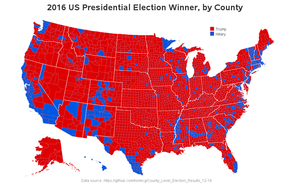
The county in question is blue in my SAS map, and you can hover your mouse over it and easily see that it is Stanislaus county. I did a Google search on Stanislaus county, and found a page with their election results, and confirmed that it does look like Hillary has more votes in that county. It appears that the Wikipedia red/blue map is either wrong, or out-of-date.
I did a bit more research on the Wikipedia maps, and looked into the push-history, and found that the red/blue map was pushed November 10 (which was only a few days after the election, and those early results likely changed since then). The gradient shaded map's history says it was pushed on November 24 (so I assume it has more up-to-date data than the other map). It would have been useful to include a date label on the Wikipedia maps, and I would recommend that all the maps shown together be generated using the same data.
So, anyway ... SAS allows you to create a png map with an html overlay, so you can have mouse-over text for each area in the map. And that provides a huge advantage for people who want to analyze the map a bit deeper (or research a value that appears curious/wrong/interesting). SAS also provides several ways of adding text to maps (titles, footnotes, notes, or annotated text anywhere you want), which can be useful in identifying exactly what data was used.
Have you found any incorrect (or confusing) election maps? - Feel free to share in the comments!


2 Comments
A link is worth a thousand words :))) This is something I have been hacking together yesterday.
https://www.mediawiki.org/wiki/Template:Graph:US_Map_state_highlight
Thanks wikipedia/wikimedia person! :)
The template seems to have some potential. Do you have a full-blown example (maybe showing some election data?)