When I was a kid, I always looked forward to Casey Kasem's American Top 40 song countdown at the end of the year. Did I listen to check whether my favorite songs had made the list, or to critique how well the people making the list had done in picking the 'right' songs? Of course, it was probably a little of both, hahaha!
This year I've written over 80 blog posts, and I decided to make a list of the 10 I think are the best! These aren't necessarily the ones that had the most views, but rather the ones I think had really good/innovative/clever graphs of interesting data. I really enjoyed writing these 10, and I hope you enjoyed (or will enjoy) reading them...
I like to include a random somewhat-related photo with my blogs, and this time I asked my friends if they had a picture of a ribbon/medal/trophy they had won. I found out that my friends are really good at a big variety of things ... and the one I decided to share is from my co-worker Mark, who was a body-builder back in the day. Here's one of the trophies he won - 1996 NPC Sacramento Bodybuilding Championship, overall winner, Masters Division (and yes, he looked exactly like the guy in the trophy!)

And now, here are my top 10 blog posts, in chronological order. You can click the blog titles or the thumbnails to go to the actual blog posts ...
Timeline of Supreme Court Justices
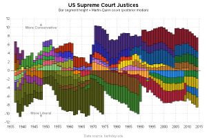
This was a timely topic, since one of the justices recently died and the president will be appointing a new one. I really like the graphical representation I came up with, because it shows the balance between the liberal and conservative justices. It will be interesting to see if the balance shifts, or stays the same, after the new justice is appointed.
How to graph NBA data with SAS
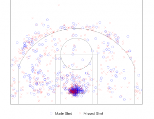 After the Moneyball movie came out a few years ago, sports teams have realized that analytics can give them a huge advantage. Historically, baseball has probably been the sport with the most data collected ... but in recent years, other sports like football and baseball have been increasing their data collection by leaps & bounds. The amount of data could be overwhelming, but a good graph can help you get a handle on thousands of data points on a single page. This post shows how to use SAS to create a custom graph that looks like a basketball court, and plot all the shots on it.
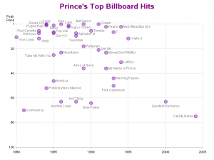 Prince's songs were really popular during my formative years, and I was sad to hear that he had died. Looking back, I was wondering when all his songs had been released, and plotting the data on a time-axis seemed like a good way to visualize the data. If you're a Prince fan, you'll want to check this one out - it's a cool discography, and also a nice tribute to Prince, The Artist!
What you see is what you get ... maybe!
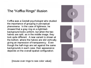 This is one of my most fun blog posts. I created several mind-bending examples, showing both the flexibility of SAS, and how the eyes and the brain don't always reach the same conclusion. The examples range from the classic Koffka rings, to a more obscure color-name test, to my own version of a viral Facebook trick graph that left a lot of people shaking their heads (literally!)
The big fat truth about the US weight problem
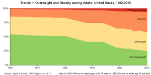 In the last couple of decades, the US has seen a dramatic increase in the number of overweight and obese people. I found a graph that tried to show this shift, but there were several problems with it. Therefore I demonstrated step-by-step how I thought it should be changed, and came up with (what I think) is a graph that shows the data really well.
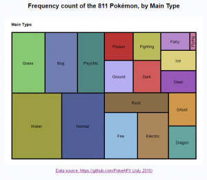 The new Pokémon game became really popular this year, after it came out as a smartphone app. Therefore when I found out that there was a huge collection of data available, I knew I had to graph it. In this post, I show several different ways to graph the various kinds of data. Much to my surprise, my Pokémon blog(s) even got a mention in the local newspaper. Even if you can't catch 'em all, you can still catch this blog post and find out how to graph 'em all!
91% of the US didn't vote for Hillary or Trump!
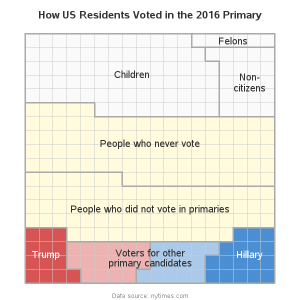 With this being a major election year, there was plenty of political data to graph. This blog post focuses on an aspect of the election that I hadn't really given much thought to before -- the Primary elections, where each party selects their presidential candidate. Many people complained that they didn't like either of the two candidates that were in the final election (Hillary & Trump) ... but according to this graph, it is quite likely that those people didn't even vote in the Primaries (and therefore it's their own fault!).
If we didn't start the fire, then who did?
 I really like graphing data that is related to pop culture, and especially when it is data from 'my generation.' This example takes a Billy Joel song (We Didn't Start the Fire) that was popular when I was in school, and plots all the events mentioned in the song on a timeline graph. But not just any old timeline graph ... this one is shaped like a combination of an old-school vinyl record, and the Tempest video game from the 1980s. I hope you enjoy this graph as much as I enjoyed creating it!
A statistical crossword puzzle to exercise your brain
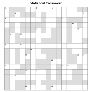 Crosswords puzzles were in the news this year, as clever analysts found that many of the puzzles were not actually unique, but copies (or partial copies) of ones already published in the past. I decided to create my own crossword puzzle, using words from statistics and analytics. It was a fun project, and also demonstrates that SAS software is flexible enough to do just about anything!
Which drinks have the most, and least, caffeine?
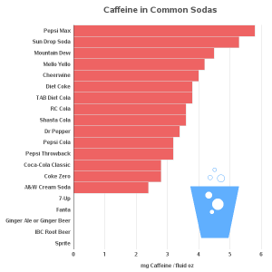 Computer people seem to have a reputation for drinking a lot of caffeine. I don't know if that reputation is totally true, but I can say that my favorite and most often used perk at SAS is the free soda machine in the break room, LOL! Therefore, when I found some caffeine data, I knew that I had to share it with my blog readers ... and what better way to do that, than in graphical form!
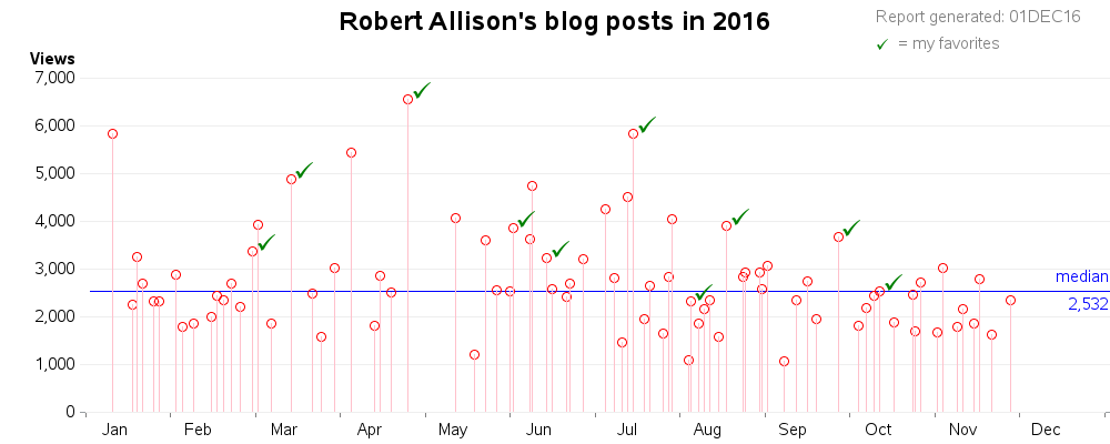
I hope you've enjoyed my 'top 10' list! If you'd like to see these 10 in the context of the other 80 blog posts I wrote in 2016, here's a graph showing them all. You can click the image below to see the interactive version of the graph, with mouse-over text (showing the titles) and drill down links (which go to the actual blog posts).
So, how well did I do picking the right blog posts for the top 10? If I left out any that you feel should have made the list, feel free to mention them in a comment!


2 Comments
With so many great posts throughout the year Robert, I'm sure it would have been a challenge to pick your top 10!
What I like with your posts are how they are about a SAS technique and/or data visualization inquiry that stimulates engagement and comments with readers. Along with the blog post, I enjoy reading the comments, questions, views and data perspectives. As such I think one of my enjoyable SAS blog reading weeks was when Rick, Chris and yourself looked at presidency age data. It was great to see each of your data perspectives and the different visualizations and SAS techniques used. Even within your own blog post there were various age perspectives and insights gained. http://blogs.sas.com/content/sastraining/2016/11/17/a-graph-for-trump-our-oldest-president/
Have a lovely festive season and I look forward to more reading and learning in 2017!
Cheers,
Michelle
Thanks Michelle!