Has anyone ever broken up with you, and left you thinking "Wow, I didn't see that coming!" In hindsight, maybe you could have seen it coming. At least from a statistical perspective. Let's dive into this topic with some lighthearted discussion, and plot some Facebook data...
When it comes to breaking up, there's a guy-talk joke that you should break up right before Thanksgiving, and then wait to start dating again until after Valentine's -- that way you don't have to go to all the family dinners with your girlfriend's family, and you get out of buying her several gifts, etc.
An interesting NPR article mentions another twist on the phenomenon of breaking up during the Thanksgiving holiday, calling it the "turkey drop season." No, a turkey drop isn't like the possum drop they do in Clay's Corner, NC for the New Year's Eve celebration! NPR explains that "The turkey drop is that holiday breakup season where all the college students return home for their first major vacation, and everyone breaks up" (this is generally freshmen who have been in college for a couple of months, and finally decide to break off the long-distance relationship with their pre-college sweetheart).
These were interesting theories (or urban legends?), but I wondered if real-world data would confirm, or refute, them? And what other breakup trends might the data show? ...
Several years ago, David McCandless teamed up with Lee Byron to create a graph of real data showing the timing of breakups throughout the year (see his book The Visual Miscellaneum, p. 179). The data came from Facebook's 2008 Lexicon service, which allowed you to specify keywords & phrases, and provided you with the frequency of those words in Facebook status updates over time. There's no explanatory text in his book (only the graph), but an article on nydailynews.com explains that the data is based on 10,000 Facebook users in 2008. Here's the graph:
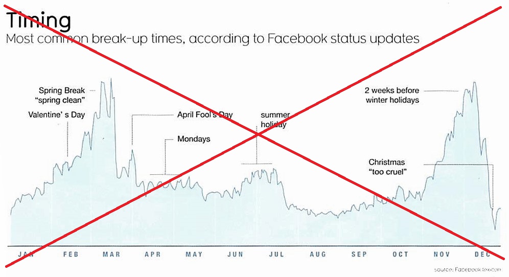
It was a decent graph, but a little difficult to determine exactly what date peaks occurred on. Also, some of the labels ran together (Spring Break & Valentine's), and I think the extra text such as "spring clean" and "too cruel" cluttered the graph, without adding any additional insight.
So I decided to create my own version, using SAS Software. I wouldn't find McCandless' raw data anywhere, and Facebook no longer offers the free Lexicon service therefore I couldn't generate fresh data for the current year. Therefore I painstakingly went through his graph one point at a time, and estimated & transcribed a data value for each day of the year (yes, it was very tedious!) I then created the following graph:
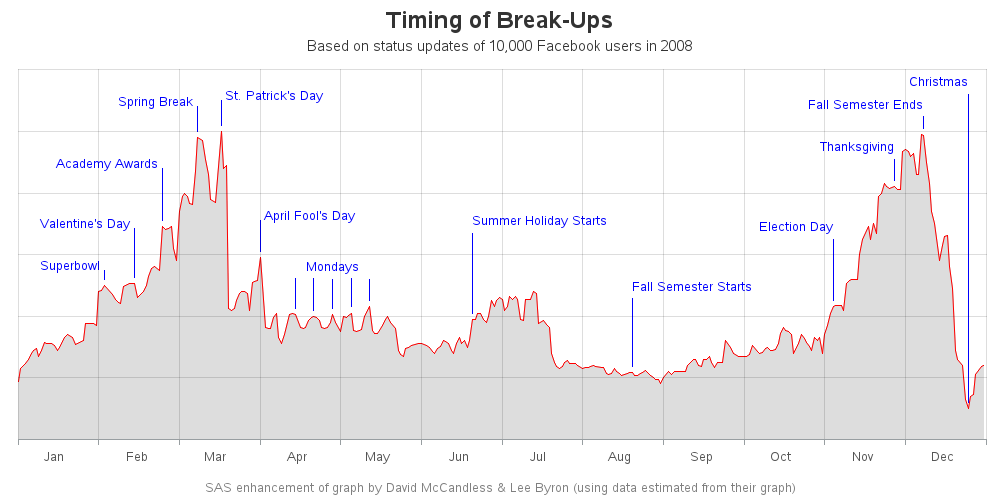
Here are some of my changes & improvements:
- I added a better title, that better explains the data.
- I added grid lines at the beginning & end of each month, so it's easier to estimate the dates.
- I added grid lines along the y-axis, so you can more easily see if the data line is increasing or decreasing.
- I shortened the label text, and simplified the lines connecting the text to the graph.
- I labeled a few extra points along the graph, such as 'Superbowl' and 'Election Day'.
- I added mouse-over text at each point along the plot, so you can easily determine the date at the peaks and valleys of the data line (click the image/snapshot above to see the interactive version with mouse-over text).
The graph does seem to concur that there are a lot of breakups between Thanksgiving and Christmas ... but it also shows a lot of breakups in February & March. It's an interesting graph, but for me it raises more questions than it answers. For example:
- What age group were the Facebook users? I assume that in 2008, Facebook would have tended to have more younger users than today.
- It would be interesting to see separate graphs for high school students, college students, and adults not in school.
- What countries were the Facebook users in? I assume it was probably mostly US, but that might not be a valid assumption.
- Is it possible that some of these were "false positives" where someone made a post about a celebrity breakup?
- I assume the Lexicon keyword search was based on text posted to the users' wall, but it would have also been interesting to graph the Relationship Status (single, in a relationship, etc). In particular, it would be interesting to see what % of the users are single on each day throughout the year.
What other questions or suggestions do you have, for analyzing breakup data? Feel free to leave a comment!


3 Comments
Would be interesting to know if there are any correlations btwn the Lexicon keyword search and Facebook's relationship status change data.
Indeed!
I'm not sure the early March spike you show is strictly spring break. Different schools have spring breaks on different weeks, e.g. quarter vs semester. When I attended UCLA decades ago, spring break was towards the end of March.