Does it seem like there just aren't enough daylight hours to get things done these days? It might not be that you've got more to do - it might be that we actually have fewer daylight hours in the winter (here in the northern hemisphere). And since "seeing is believing," let's graph the data to see what's actually going on!
First, I looked around and found a website where I could get the sunrise & sunset times for various cities, and generated a URL to get the data for Raleigh, NC. Here's what the text data looks like:
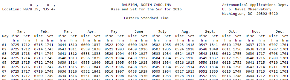
Next I wrote some SAS code to read the data (directly from the website, by the way!), and manipulate it into a form that I could easily use to create my graph - for example, rather than having a separate variable/column for each month, I wanted all the dates to be values of a single variable. What I wanted to do was sort of like transposing the data, but rather than using Proc Transpose, I used a data step with multiple output statements for each line of data.
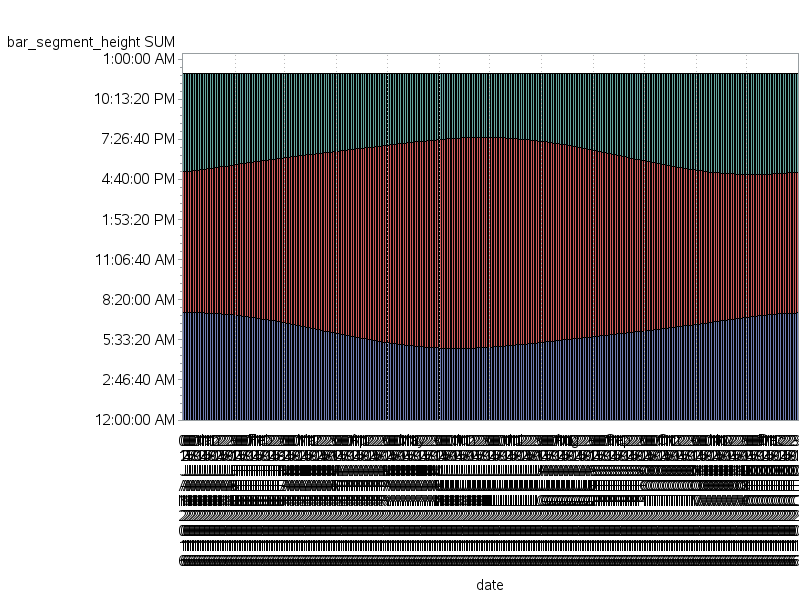
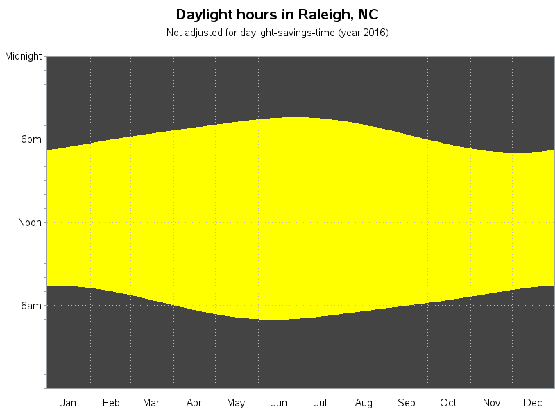
Once I had my data ready, I was able to create a simple stacked bar chart with a separate (very narrow) bar for each day of the year, showing the hours before sunrise, the daylight hours, and the hours after sunset. It's not a pretty graph (yet), but it showed me that I was on the right track:
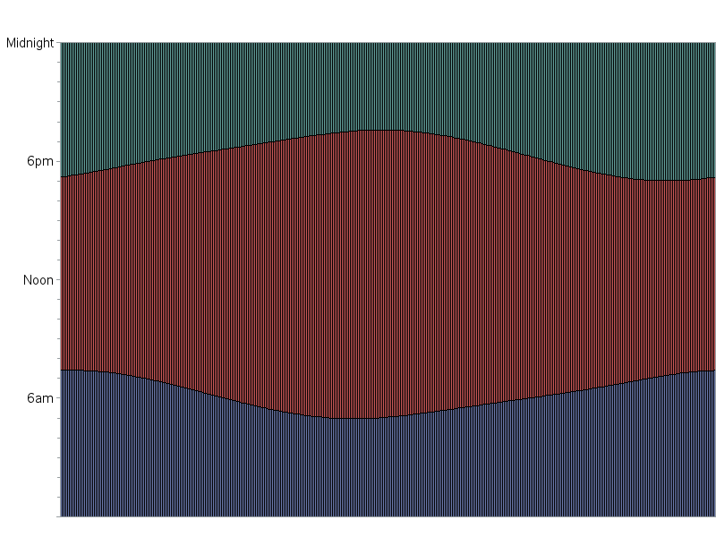
Now, let's make the graph pretty... I started by cleaning up the axes. Bar charts typically label each bar, but in this case 365 bar labels showing the date just won't fit. So I use an axis statement to suppress those bar value labels (using the value=none option). The left/time axis auto-scaled and picked reasonable times to show along the axis, but I thought something a little simpler might be better. Therefore I used the order= option to specify which tick marks I wanted, and I used the value= option to specify some custom text for those tick marks (for example, '6 am' rather than '6:00:00 AM'). This graph is cleaning-up nicely, eh!
By default, each bar has an outline drawn around it. Outlines are usually desirable, but with 365 tiny bars the dark outlines are a bit overpowering - therefore I get rid of them using the coutline=same option. Also, rather than using the default colors (blue, red, and green) I specify colors that will be more intuitive and meaningful (black and yellow). Now, the time periods before sunrise and after sunset will be dark, and the daylight hours will be yellow (sunshine-colored). This graph is really starting to look a lot nicer - you can clearly see that the summer months have more daylight hours than the winter months!
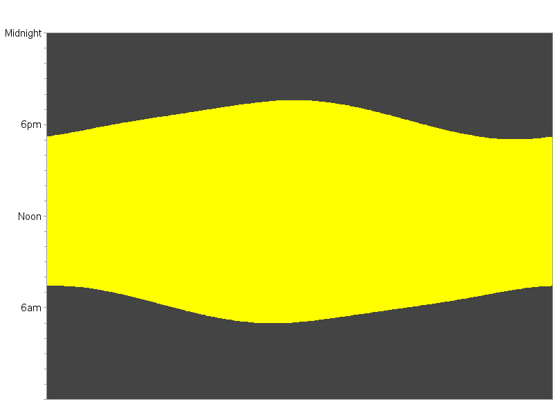
And for a few finishing touches, I annotated some custom month labels along the bottom of the graph, added some dotted reference lines, and placed a title at the top to describe what's in the graph. I think this is a fine representation of the data, and much easier to understand than the text table!
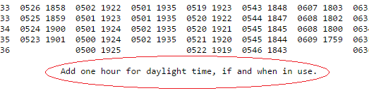
But when analyzing data, sometimes "the devil is in the details" ... Did you notice the footnote at the bottom of the text data file (I've circled it in red below)? This means we're not quite finished. We need to figure out how to represent the time shift of daylight saving time in the graph!
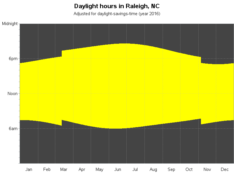
Here in the Eastern time zone of the US, we use daylight saving time (dst). This is where we all turn our clocks forward an hour in the summer months, to trick everyone into waking up an hour earlier and take advantage of the earlier sunrise. In order to represent that in the graph, I did a Web search and found the dates that dst started & stopped in 2016, and added a 1-hour offset to the sunrise and sunset times for all the days between those dates. The following graph shows what we actually experience, with the artificial dst shift.
I hope you had fun and maybe even learned a little something!
Now for a side-question ... what's your opinion on daylight saving time? Do you like it or dislike it? Did you prefer the old dst we used to have, or the new dst we've had since 2007 (where they added a few extra weeks)?
And what better way to end a blog about sunrise/sunset, than a picture of someone waving goodbye in a beautiful sunset in Naples, Florida. (This picture is from my friend Eva, and this is her man Todd waving.)


6 Comments
I find it interesting on some liveaboard dive trips that I've been on that they turn the clock ahead at the beginning of the trip and turn it back when they return to port. It's probably because divers have to follow the sun, and it's easy getting the guests up at 7 am instead of 6 am.
Interesting!
My granddad was in the Navy, and he said that they would cross the international date line at 'convenient' times, to cut the weekend short and make everybody get back to work. (of course, there were a few stories he told that I'm not sure were 100% true!) :)
What a bright and shifty graph! ;-)
In Queensland where I live, there is no daylight savings so in the height of summer the sun is up around 4am. Some Queenslanders like to start the day earlier to align with the other eastern Australian states that are on daylight savings. A contentious issue every summer.
Interesting!
Great!
But could you mark 4 special days on your picture?
1: Earliest sunset: appears to be in late November, aka Real Soon Now™
2: Latest sunrise: looks to be early January
3: Earliest sunrise: I'd guess late May
4: Latest sunset: awfully close to 4July. Let's delay those fireworks!
Oh, and I guess the solstices (solstae? solsti?) and equinoxen would be four more days of interest. :-)
I don't have those marked (at least, not yet), but if you click on the graph you can see the interactive version, with html mouse-over text on each day, showing the sunrise/sunset times - you might can figure most of those out using that! :)