Since this is an election year, I've been scrutinizing the voter registration data. One thing that surprised me is there are more female voters registered in NC than males. I wondered if this was consistent across all 100 counties, and created some charts to help visualize the data...
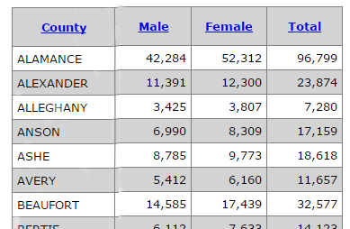
First I went to the NC State Board of Elections website, found the latest voter registration data, and wrote some SAS code to scrape the data out of the html of their web page. They have totals by county of several different categories of voters, but the ones I'm interested in are the number of male and female voters:
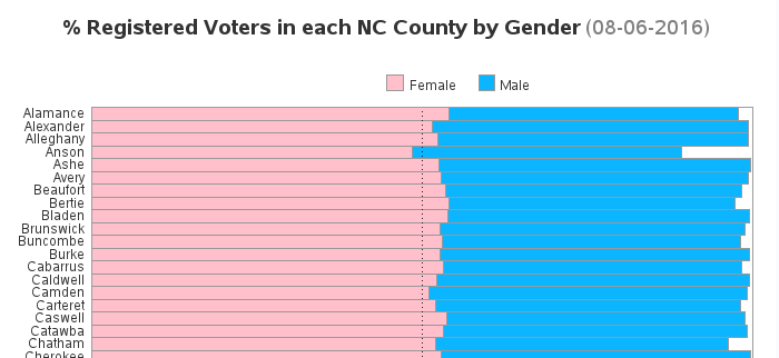
Next I calculated male and female voters as a percent of total voters, and plotted them in a bar chart. This chart was a nice visual representation of what was in the table, and it was easy to find a specific county since the county names are alphabetical. The graph is fairly large, therefore in this intermediate version I've only included the top section of it in the blog - click it to see the full graph of all 100 counties:
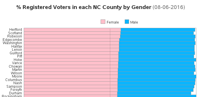
But I was more interested in analyzing and comparing the % female voters across all counties, rather than looking up the value for a specific county - therefore I created a second version of the bar chart sorted by the % female voters. I think this gives me a lot more insight into how consistent (or not) the % female voters are, and gives me an easy way to see how many counties have less than 50% female voters. (Same as before, click to see all 100 counties.)
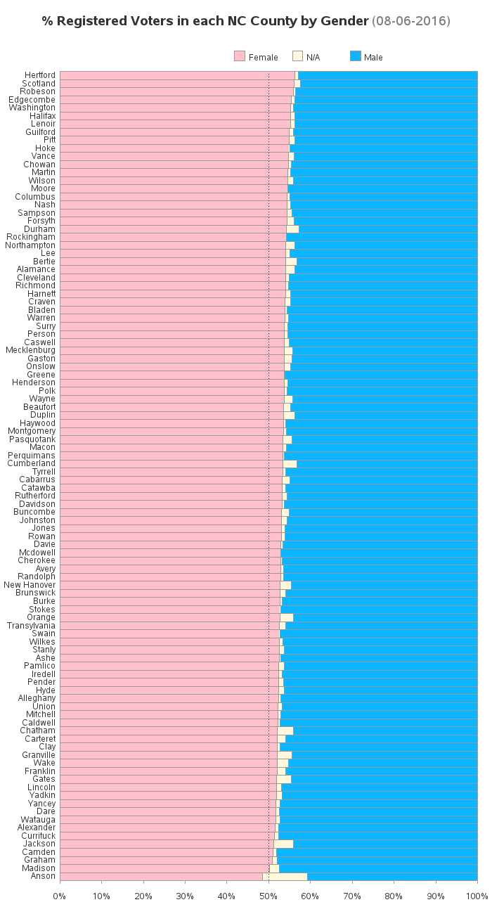
Then I noticed that the number of male+female voters didn't add up to the total number of voters in their data! (This was shown by the white space to the right of the blue bars.) I thought this could be important, therefore I made the 'gap' a colored bar segment, and moved it to the middle between the male and female voters. This way the female voter bars all line up on the left, and the male voter bars all line up from the right, and it is easier to see if they are consistent from county to county.
Here's the final chart. Notice that over 50% of the voters are female in all but one county (Anson), and even in that county there are more females registered than males ... with the 'N/A' being 10.8%.
What are your theories for why there are more female registered voters than male? And do you think this will make a difference in the upcoming elections? (feel free to leave a comment)


2 Comments
My first instinct is that this must be a reflection of the fact that women tend to live longer than men - I don't know if you can add age into this analysis but it seems to me the most likely reason.
Good idea!