What would it be like if the US was in the EU? I don't know how that would work out politically, but this map shows how it might look geographically (if the US was literally picked up and moved to Europe!)
My buddy Rick Langston is a bit of a map guy, and occasionally sends me cool examples. He recently sent me one he had seen on twitter (attributed to Randy Olson), that shows the continental United States overlaid on Europe at the geographically correct latitude. I was a bit surprised to see that the entire UK, and several other countries, were farther north than the US!
I'm not sure of any practical purpose for such a map, but I immediately knew I had to create one with SAS software! :)
First, I used Proc Gproject to clip the rectangular region of Europe out of the world map. Then I subset the continental US out of the world map, added an offset of 114 degrees to the longitude, and combined it with the Europe map. I plotted the combined map, and used a transparent color for the US.
I always try to make a few improvements when I imitate a graph, and here are the things I (hopefully) improved in this one:
- First, and most importantly, I added a title explaining what's in the map - this way people can interpret the map on its own, without needing to read an article.
- I also added lines of latitude, so you will have a point of reference, and you can easily verify that the two maps are indeed lined-up at the correct latitude.
- The original map showed the country borders and also some internal lines (roads & rivers?), which was a little confusing. I only show the country borders in my map, to keep it simple.
- The original map showed labels for the country names and major cities, but the text was very small, crowded, and difficult to read. In my map, I use html hover-text, so you can hover your mouse over the country areas and see the names of the countries (click the snapshot image below to see my interactive version with hover-text).
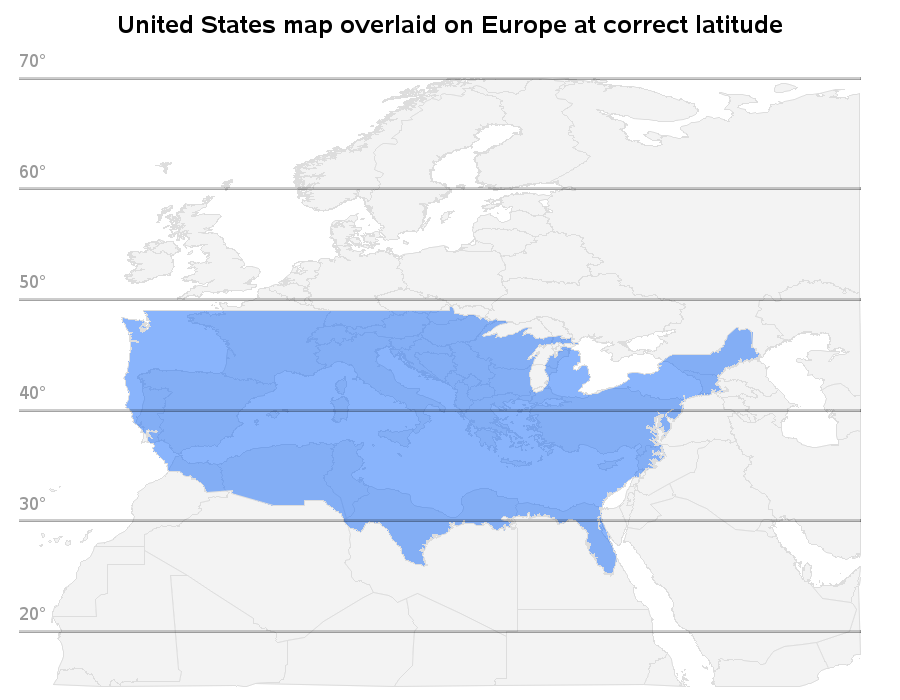
I have some friends that moved from Europe to NC, and I was curious to know whether they had moved to a higher or lower latitude, and how the weather differed. Eva moved from Budapest Hungary at latitude 47.5° (which lines up with Minnesota on the combined map) to central North Carolina at latitude 35.8° -- she says that Budapest has cooler winters and drier summers (hot & dry afternoons, but very comfy evenings). Eniko moved here from Cluj Romania at latitude 46.8° - she says Cluj is a little farther south than Budapest, but higher elevation, thus cooler.
I'm sure they're both enjoying the 90-degree North Carolina summers, where we have expressions like "It's not the heat, it's the humidity!" ;-)
Here's a picture of Eva, getting used to the NC weather at the beach ...

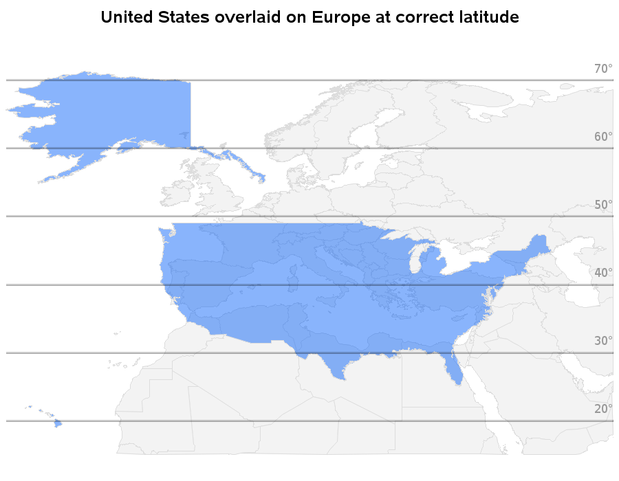
Update: Due to several requests, I am adding a 2nd version of the map, that includes Alaska and Hawaii:

12 Comments
What GOPTIONS are you using for your Europe map - so it allows hover text to display and the HTML page consists of tags? I'm using Base SAS for Windows 9.4 M2, and when I write code similar to this I get a nearly-empty HTML file that just points to a .png file.
I use SAS/Graph, where most of the procs (such as Proc GMap) have an html= option, and you can use that option to point to a variable in the dataset that has html tags (such as title= and href=) encoded into it.
Never mind. I think I understand what I did wrong.
Excellent!
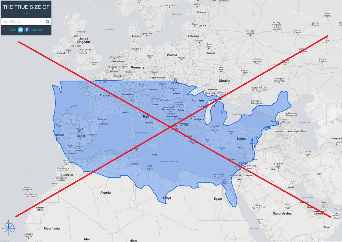
I just stumbled across thetruesize.com which allows you to do this interactively by choosing any country and dragging it across a map of the world. It also accounts for distortion caused by the curvature of the earth - to see how this works choose Greenland and drag it down towards the equator.
Third vote for Alaska - and one more for Hawaii. I married an Alaskan and have good friends in Hawaii. Neither would be happy with you ;)
Hahaha! Umm ... I'm feeling a little outnumbered here! ;)
As an Alaskan, I too felt a little left out. I'm not sure what the purpose of the map was either, but by leaving out Alaska, the US is missing almost 18% (about 1/6th) of its total area.
Hmm ... 2 votes to include Alaska. This peer pressure might just get the best of me!
(Note that I have been recording & watching a lot of shows about Alaska lately - they one where people are buying houses, and the one about the people living in the remote northeast corner. With all that 'Alaska' going into my brain, seems like I would have included it in my map!)
Like the graph but feel a bit sad that Alaska and Hawaii got missed out. As a Briton, I'm sure we must be warmer than Alaska and bigger than Hawaii!
Colin
Hmm ... perhaps I will add them, one of these days! :)
Ok - I've created a 2nd version of the map, with Alaska & Hawaii added! :)
http://robslink.com/SAS/democd87/us_and_europe_alaska_hawaii.htm