So, how many different Pokémon have you caught - and more importantly, how many different kinds are still out there that you haven't caught yet? I've created some graphs that might help you figure it out!
I think my previous blog post might have irritated some of the hardcore Pokémon players out there (based on their comments), by claiming that the only important Pokémon data is Nintendo's stock price. I enjoyed poking my Pokémon-obsessed friends ... but I'll try to make up for it. This time I'm plotting actual Pokémon data, which players might actually find interesting and useful!
To get you in the mood for a blog with real Pokémon data, here's a picture of my friend Jenni with a Spearow on her shoulder:

When the most recent Pokémon game went viral, I started searching the Web to see what it was all about. One of the articles I found had some graphs in it, which of course caught my attention.
Below are two of the graphs from the article. Their tile chart seemed too crowded and busy, and I had to closely examine the raw data to figure out that they had sub-divided the Main Type, to show whether it was a Pokémon's only Type, or whether it also had a secondary Type. They tried to use shades of the Main Type color for the secondary Types ... but some of the shades almost look like they go with another color group.
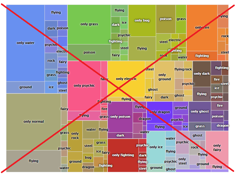
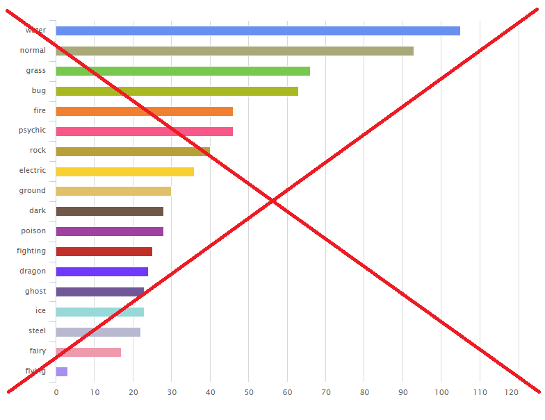
Their bar chart of the same data was a little more straightforward, and made it easier to compare how many Pokémon were of each Type, but with a little tweaking I was sure I could make it easier to read and more useful. Another biggie - neither graph had a title, so you needed to read the text of the article to figure out what they represented.
If you can't catch 'em -- graph 'em #pokemon #analytics Click To TweetNow for my graphs!...
The first step was to find the data, and get it into SAS. Luckily, Chris Hemedinger had recently written a blog about some Pokémon data being available in GitHub. So I went there and found all the data I needed in various csv files. I used code like the following to read in the csv files, and import them into SAS:
%let baseurl=https://raw.githubusercontent.com/PokeAPI/pokeapi/master/data/v2/csv; filename pk_csv url "&baseurl/pokemon.csv"; proc import file=pk_csv out=pokemon_names dbms=csv replace; guessingrows=max; run; |
As is customary in laying out data in tables, they associated a numeric id with each Pokémon name, and then in the other tables they just used the id number, rather than repeating the entire text name. To be able to use the text names with the other tables, database experts would typically merge the tables together with an SQL join. But SAS provides a way to cheat - you can create a user-defined-format (udf), so that the numeric ids will print as the text values (without merging the datasets together)! Here's the code I used to create the udf for the Pokémon names:
proc sql noprint; create table foo as select unique id as start, propcase(identifier) as label from pokemon_names; quit; run; data control; set foo; fmtname = 'name_fmt'; type = 'N'; end = START; run; proc format lib=work cntlin=control; run; |
But enough about the coding details ... let's get on with the graphs!
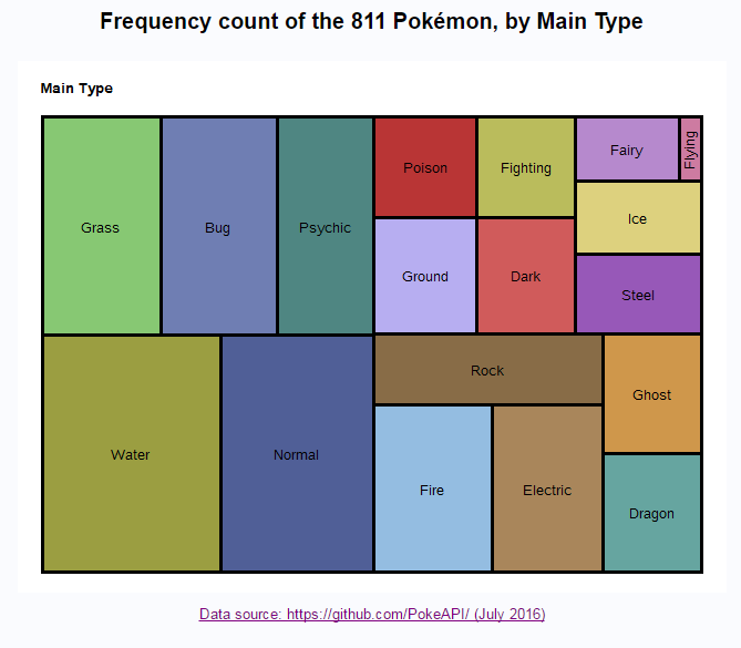
Here is my SAS tile chart. I decided to simplify it a bit, and only show one level of grouping. There is a box for each Main Type, and the size of the box represents how many Pokémon have that Main Type. I think it's much easier to read (physically), and much easier to grok than the original chart.
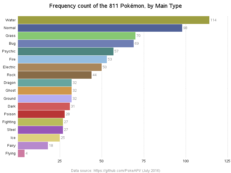
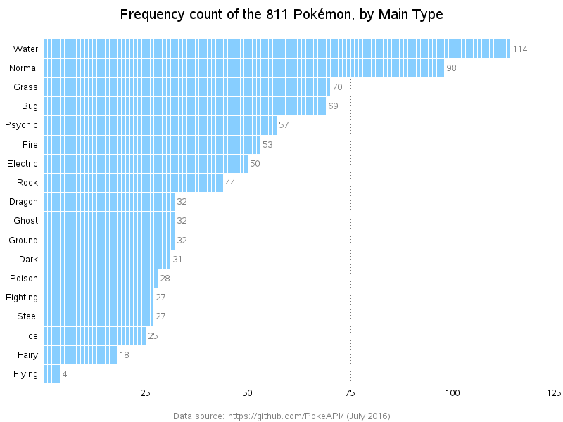
And here is my version of the bar chart. Similar to the original chart, I made the bar colors match the tile chart, and I sorted the bars in descending order. But, I eliminated the big gaps between the bars, and I added a frequency count to the end of each bar. I think my version is much easier to read, and provides more information.
Next, I tried creating a souped-up version of the bar chart. I show a small bar segment for each of the individual Pokémon. If you click the chart image below, and view the interactive version, you can hover your mouse over each bar segment to see the Pokémon name, and click each segment to launch a Google image search for images of that Pokémon.
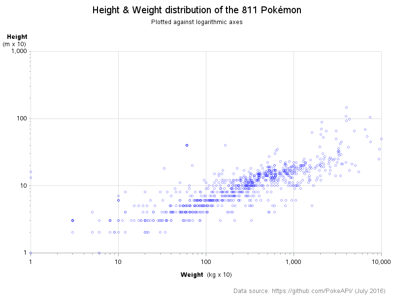
Now that we're plotting the Pokémon data down to the individual level, I thought it might be useful to create a scatter plot by the height and weight.
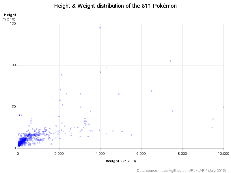
Because a few of the Pokémon were very tall and/or very heavy, most of the Pokémon ended up being plotted in the bottom corner of the scatter plot. One technique that's often used to spread out the data in plots like this is to use a logarithmic scale on the axes. Now that the markers are spread out, you can hover your mouse over each plot marker to see the Pokémon name, and click each marker to launch a Google image search for images of that Pokémon.
Hopefully you've learned something about SAS and/or Pokémon ... and remember, if you can't catch 'em all, at least now you can graph 'em all!

13 Comments
You did a great job with the graphs, but the colors you chose are a bit confusing.
The ones that your "colleagues" who did the previous graphs used, are the official Pokémon Types colors that match the element represented by each single Type. That's really more easily readable for us Pokémon players, since we mentally link those colors to the Types.
I'm saying that because i think it looks a bit too weird for the words "Fire" being represented by a light blue color, or "Water" with a green.
Ahh - very good info to know! Thanks!
Pingback: My top 10 graph blog posts of 2016! - SAS Learning Post
Pingback: Most efficient way to find rare Pokémon - SAS Learning Post
Great article! Thanks!
Thank you! Wanted to introduce my daughter to SAS and using Pokemon data is the best attention grabber
This seems to be one of those topics that appeals to young & old!
A great work! Thanks for sharing it with us.
I always love your blog posts! Great techniques and timely topics.
Great!
Great read! Thanks for giving me a big smile.
Awesome graphs! What SAS version do you use to create them? Do you mind sharing your SAS code?
Thanks.
Thanks Ethan! ... I used SAS 9.4m3 on a PC to create these. I think any version of SAS released in the past few years will probably work. Here's a link to the SAS code I used: http://robslink.com/SAS/democd87/pokemon_info.htm