They say age is a relative thing. With this graph, you can tell how old (or young) you are, relative to everyone else. (I'll let you decide whether this is a good thing, or a bad thing, hahaha!)
Nathan Yau recently posted a graph on flowingdata.com that allows you to see what percentage of the people are older and younger than you (see snapshot below). You first find your age along the bottom/x-axis, and then hover your mouse over the graph approximately above that age. In his interactive version, he shows you the percent of people older & younger than that age, in hover-text.
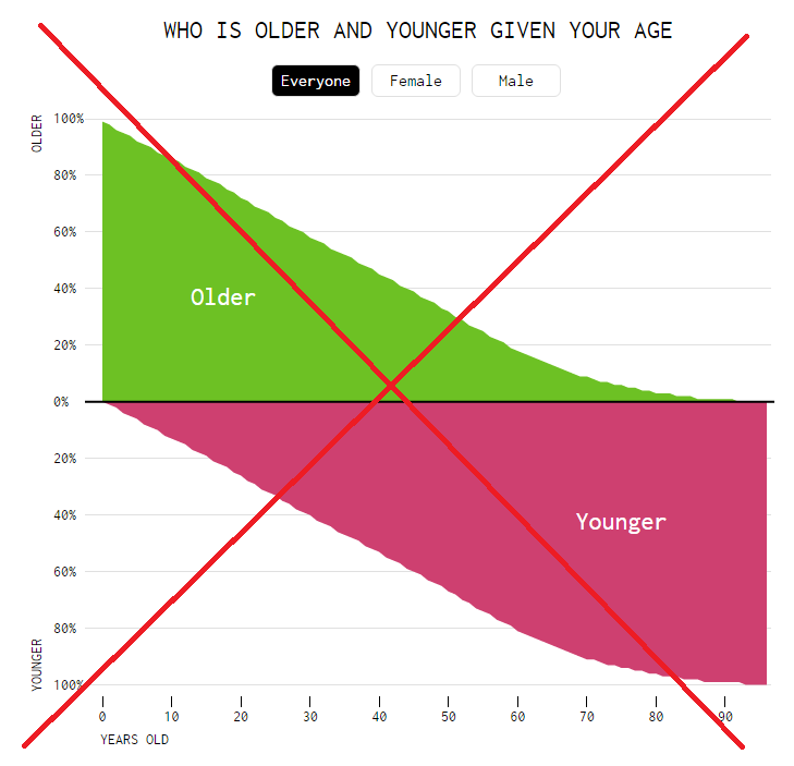
It was an interesting graph, but I thought a few things could be improved. There was nothing in the graph letting you know whether it represented the world population, the US population, or other (you had to read the text of the article to find it is the US population). Similarly, the graph didn't mention what year the data represented (if someone looks at the graph 20 or 50 years from now, that could be a problem). And he used a 'pink' color in the graph, which I at first (incorrectly) thought might represent the female 1/2 of the population. It was also difficult to know if you were hovering your mouse over your exact age, since the graph was a continuous area and hover-text didn't include the age.
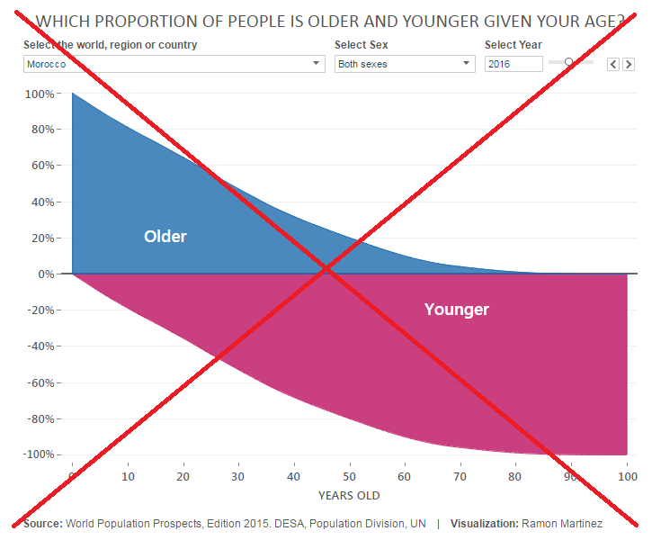
I found another version of the graph that Ramon Martinez created. His version did show which country or region was graphed (yay!) It also include the age in the hover-text (yay again!). But he used pink & blue for the colors (which really made me think it represented female & male when I first glanced at it). And his y-axis showed negative values in the bottom half, which could cause confusion.
As you probably know, I seldom complain about a graph without creating my own version to demonstrate how I would have done it differently. So, here's my version...
I show the country and year in the title, I have detailed explanatory text on the graph, and I included reference lines to help your eyes visually follow from the axes to the graph. Since the data is for discrete ages, I used discrete bars (rather than a continuous area chart), and I chose neutral colors (not pink & blue that people might think represent gender). Click the chart below to see the interactive version with hover-text. Note that the hover-text contains very detailed descriptions with carefully-worded text to let you know exactly what the data represents.
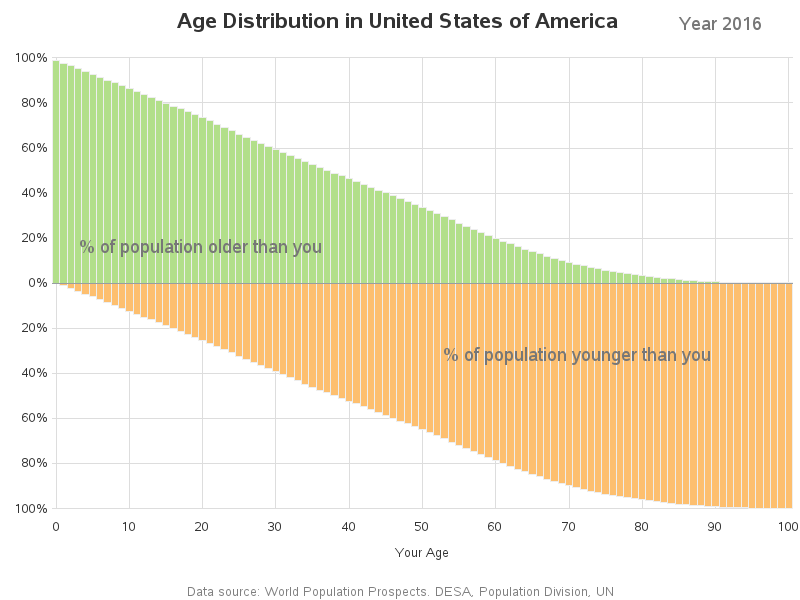
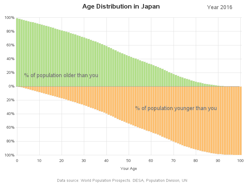
Here are the graphs for a couple of other countries that might be interesting to compare to the US graph. Note that Japan has a somewhat older population than the US, and Qatar has a much younger population:
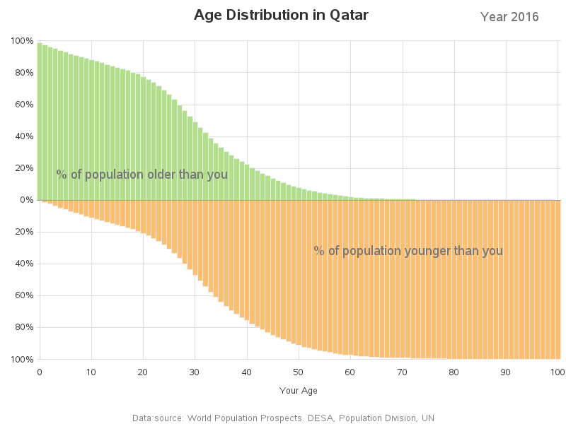
Feel free to download my code, and experiment with creating your own population plots, for your country!
And now for the 'random' photos section! A lot of my friends are "very well preserved" and look (and act) much younger than they really are. My buddy Will is a great example - I first met him on a volunteer day helping build the North Carolina Mountain to Sea trail. I could barely keep up with the guy, even though he was about 30 years older than me!
How old is Will? ... I'll give you a hint ... only 3.0% of the US population is older than him (bring up the interactive version of my graph, and look at the hover-text for the various bars until you find out his age). Here are a few pictures of Will, having fun at the beach, and doing a 'little' gardening:


5 Comments
We're older than we've ever been, as They Might Be Giants tells us.
Good point about using bars as age is discrete. A good reminder to think about the data and to keep in mind how people will interact with the visual.
Hi Robert, I love your work and I have learned so much from your examples. I have a question: is there any way to change the font size and/or bold the text in your hover text? Thank you!
For HTML hover-text, I don't think there is a way to control the text from the programmer side (I think that would only be controllable on the browser side of things). Most of the hover-text you see with custom font/size/color/etc is probably created using java, flash, or something like that.
Thank you!