I recently read an article that claims 35% of men, and 40% of women in the US are now obese. Yikes! I wondered when this happened, and whether it had been a gradual or sudden change. If I only had some graphs ... which the article didn't provide.
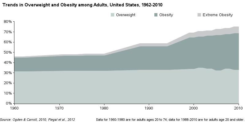
I did some searching, and found a paper on Overweight and Obesity Statistics that seemed to have what I was looking for. Specifically, it had the following graph on p. 4:

But after studying the graph a bit, I was surprised to notice that the time axis was not proportionally spaced - say what!?! The evenly spaced tick marks represented year spans of 12, 6, 14, 6, 2, 2, 4, and 2 years. This stretches some sections of the graph, and compresses other sections - the end result is that you really can't trust what you see.
So I dug up the data from the two sources (Ogden, Flegal), entered it into a SAS dataset, and created my own version of their plot. In this first iteration, I created my plot like theirs - even with the same deceptive time axis scale. I did this to make sure I had the same data, and found one oddity ... it appears that where the papers listed a range of years for the data, they had only graphed one of the two end-points (I'm graphing the data the same way they did, for now, but will use all the data points in my new/improved version).

In my first iteration of improvements, I change the time axis to be proportionally spaced, and I used data points for both ends of the range of years reported in the data tables. Note that changing the axis scale makes it much more obvious that the increase in obesity is a fairly recent change.
As I worked with the graph, I started noticing that the empty/white area above the shaded areas represented the Not Overweight people - so why not actually show that as a category, and make this a stacked 100% graph? And since the shaded areas are stacked in a certain order (less-bad to more-bad), it would make more sense for the Not Overweight people to be at the bottom of the graph, rather than the top. Here's the graph with those changes:

I used a bright/happy greenish color for the Not Overweight category, but I don't really like the colors used in the original graph. When you're representing ranges in a certain order, it is customary to go from a lighter to darker shade ... but in the original graph they used a medium grayish shade for both the bottom and top category. I decided to change it, and use colors such that the more overweight you are, the darker the shade of red. Here's my final graph - notice that I also got rid of the color legend, and added simple labels to each weight category.
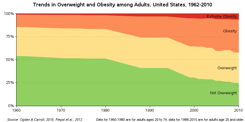
So, it looks like this trend towards obesity started in the 1980s. Some blame it on fast-food and sodas. But I wonder if maybe it has more to do with the proliferation of PCs and cable TV, and people spending more time sitting in front of them and less time doing something active outdoors(?)
What's your theory on why the US population has put on so much weight in the past 3 decades?


16 Comments
Pingback: My top 10 graph blog posts of 2016! - SAS Learning Post
Pingback: Where does Girl Scout cookie money go? - SAS Learning Post
What do they use to determine whether you are fit, overweight, obese, or extremely obese? Is it BMI? If so this can lead to false-positives of obesity.
See:
http://pediatrics.aappublications.org/content/124/Supplement_1/S23
Yes - these data use BMI as their measure.
Thought you may find this animated visualization that I came across today on BMI from 1984 to 2014 interesting: Americans are Growing Bigger - http://flowingdata.com/2016/06/14/growing-to-obesity/
Interesting visualization! (although I would prefer to create the animation without the 'bounce') :)
An alternative graph that might be more enlightening is to look at the rate of increase in obesity categories rather than just the proportion of the population.
Yep! - Might be interesting to plot the data several different ways - each one targeted to answer various questions more easily/directly.
This is a very complicated issue and you could come up with many factors. Such as what an overlay of a graph showing the introduction of 'lite' foods and/or diet drinks or an overlay showing the use of remote controls.
Ah yes - I always wonder whether the 'lite' and 'diet' stuff is really doing what they claim!
Wasn't there a change in definition of overweight, obese, extremely obese somewhere in the late 70's or 80's?
Yes - I believe these have changed a bit over the years.
Two more possible theories (other than fast food, encouragement to be sedentary, and rise in depression):
- Rise in overprotective parents who don't want their children to play unsupervised limits childhood exercising
- Rise in extremely thin beauty ideals leads to increase in dieting among people in the normal weight range - and dieting often leads to weight gain, by causing bounce back weight, ill controlled hunger, and consumption of lowfat/high starch and artificially sweetened foods
Hmm ... and if we can't meet those too-high ideals of the perfect body, then maybe we just give up(?)
Recent research on Facebook found a vicious cycle in which depressed people spent more time on Facebook, which made them more depressed.
Similarly, maybe obesity works the other way too: obesity can cause people to spend more time with televisions and computers because of the physical, emotional, and social consequences of obesity.
Hmm ... wasn't that from one of the Austin Powers movies?!? ;)