Teacher salaries have been a hotly debated issue in our state for the past few years. In this blog post, I examine a graph that recently appeared in our local news, point out some deficiencies, and create an alternate graph.
But before we get started, here's a picture of my friend Jennifer teaching her students how to make biodiesel. If we had had teachers like Jenni when I was in school, I would have probably paid more attention! ;-)

So, here's the graph I saw in our local NC news recently. The graph caught my attention for two reasons ... it contained data about a topic I was interested in (teacher salaries), and it was a simple and 'pretty' graph.
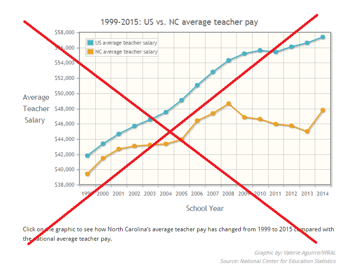
But after examining the graph for a while, I noticed a few problems. A good graph often makes you ask questions ... but this particular graph didn't provide a way to answer those questions. Here are a few questions this graph brought to my mind:
- Were the salary numbers in current dollar, or constant dollar?
- Was the average US salary weighted by the number of teachers in each state?
- What were the salaries before 1999?
- Were the salary numbers for calendar year, or for school year?
- Did they choose a y-axis scale that spread (or squished) the values?
- Did 'Source' mean the data source, or also the graph source?
- Could I see the actual data?
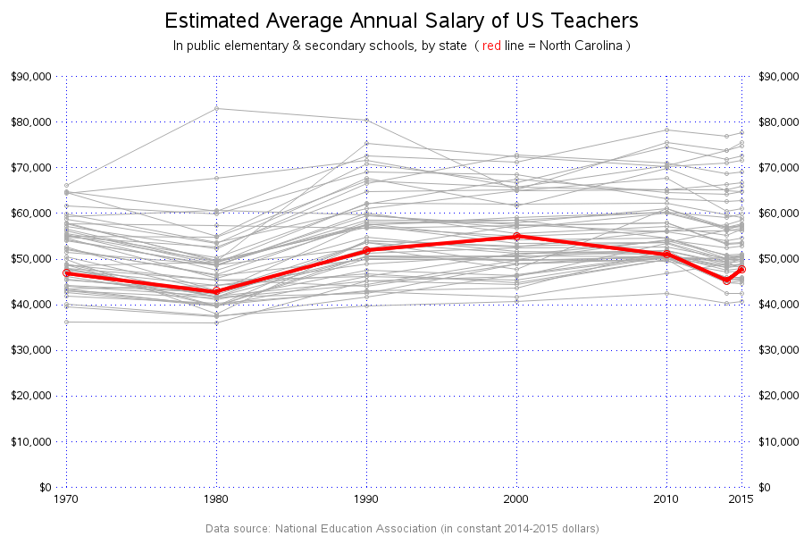
Since my blog is about creating graphs, I'm sure you guessed my next move ... creating my own version of the graph. I searched for quite a while, but was unable to find the exact yearly data that was used in WRAL's graph. I was, however, able to find some similar data on the National Center for Education Statistics website - it was more geared toward 10-year increments, and went back farther in time. I downloaded their Excel spreadsheet, imported it into SAS, transposed the data to convert the yearly columns into values (so they could more easily be plotted), and created the following graph using SAS/Graph's Proc Gplot:
Here are some features of my graph:
- It shows the all values in constant (2014-2015) dollars, and documents that in a footnote.
- It starts y-axis at zero, so all values can be visually compared on a percentage basis.
- It shows all 50 states' salaries, since I'm not sure how best to calculate an average.
- It spells out 'North Carolina' since some people might not know what 'NC' means.
- It shows the salaries on both the left & right axes, to make it easier to see.
- It indicates that the National Education Association is the data source.
My graph is also somewhat interactive - if you click the snapshot of the graph (above), it will take you to the interactive version, and each plot marker has mouse-over text showing the school year, state, and salary. Also, you can click the footnote to download & view the actual data in an Excel spreadsheet.
There are several other factors I would like to include into my visual analysis ... if I could find all the data. For example:
- Years of experience - perhaps some states have more 'new' teachers than others, and newer teachers would have lower salaries. For example, a state that's growing quickly might hire a lot of new teachers ... or perhaps a state that's been in the news for having low teacher salaries might lose some of its more experienced teachers.
- Cost of living - if a teacher makes a higher salary in an area that has a much-higher cost of living, they might actually be worse off than a teacher making a lower salary in North Carolina.
- Salary source - did the NEA get the salary data from the Bureau of Labor Statistics, or from unions?
- Union fees - do the teachers in all states have to pay the same fees & dues to unions?
- Days worked - do all of the states have the same length school year?
- Other benefits - do all of the states offer the same benefits such as health care and retirement?
What other factors might be important to consider when comparing teacher salaries?


5 Comments
Job Location, economic growth of the State, the number of educational institutes, and population can also affect the salary of a teacher. Also, thank you for your Salary Graph. It is more genuine and reliable.
I click on your graph, I get no response. Which lines are which states?
Hmm ... perhaps there was a temporary glitch? I checked just now, and I'm able to click on the graph and view the full-size interactive version:
http://robslink.com/SAS/democd86/teacher_salary.htm
When viewing the interactive version, you should be able to hover your mouse over the plot markers, and see the state name (and amount) in the html hover-text.
Wow - do I ever have an application for just this graph! Would you be willing to share the code? Thanks - Austin
Here's a link to the SAS code...
http://robslink.com/SAS/democd86/teacher_salary_info.htm