Have you ever found a graph of some interesting information, but the graph was difficult to understand (or even misleading). I strive to fix those graphs - this time it's a graph of US immigration data...
I found the following immigration graph on the flowingdata website - it's a screen-capture of an animated slideshow that (I believe) was created by Alvin Chang.
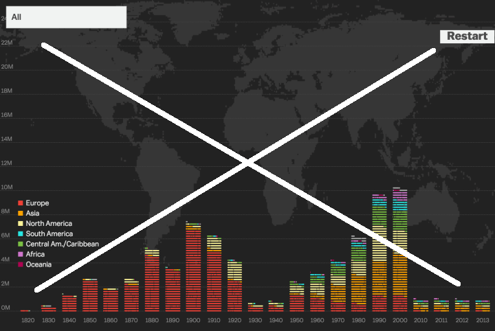
It was an interesting topic, but I found the graph a bit difficult to understand, and even a bit misleading. Here are a few of the problems I see with the graph (in no particular order):
- It is difficult to read the text on the axes, since it is graph text on a black background.
- The colors in the bars do not match the colors in the legend (the bars seem darker). For example, I first thought the reddish color predominant in the bars before 1920 matched 'Oceania' in the legend (and I thought that very strange). I later found that matched Europe.
- The bar heights only go to about 10 million, but the vertical axis goes to 24 million (I assume this is to make room for the map in the background?).
- There is a world map in the background, but it doesn't add to the data analysis - it's just a decoration and a distraction.
- When I first looked at the graph, I thought it odd that immigration had dropped off after 2010, but upon closer examination I found that the 2010/11/12/13 bars represented single-year values, whereas all the other bars represented decades.
- And I'm not a big fan of creating the bars out of small 'building blocks' instead of using the traditional stacked bar.A different view of US immigration #dataviz Click To Tweet
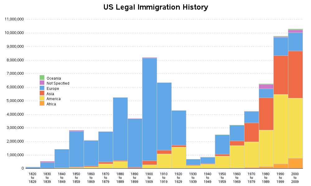
I think this data is interesting and important, and it deserves a better graph - therefore I set about creating one. First I located the data (Table 2) on the US Homeland Security website. I wrote some SAS code to import the Excel Spreadsheet, transpose it, and create a more standard bar chart that is easy to read, and avoids things that could cause the user to misinterpret the data.
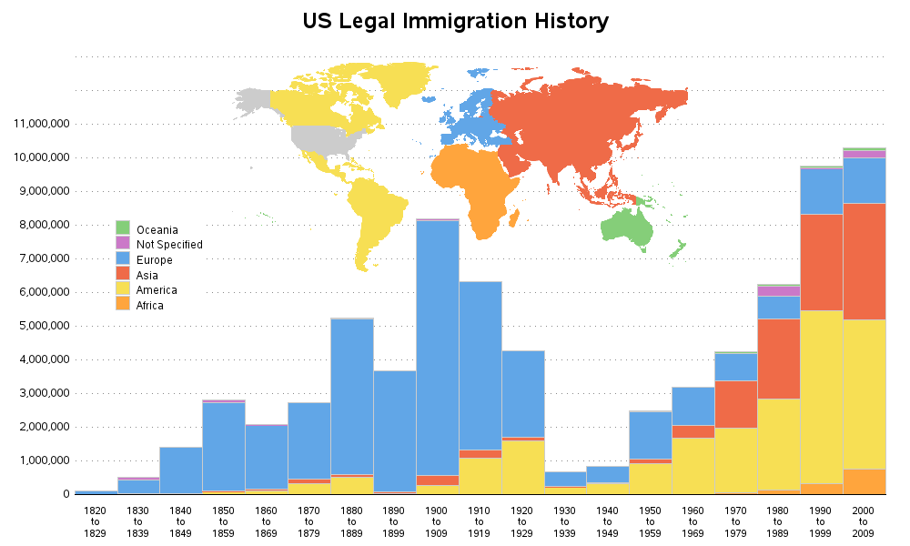
I'm not a big fan of showing the world map in the background, but I decided to add that in order to show how it could be done in a way that might actually help visualize the data. Notice that the regions in my map are color-coded to match the bars and legend. I created the map separately with Proc Gmap, and then annotated it into the Proc Gchart bar chart. Click the image below to see the full size graph, with html hover-text.
What other ways might you visualize this data? Feel free to share your ideas in the comments section!


13 Comments
Robert -
BRAVO - I'm so excited to see this graph. As a personal challenge, I have been studying US immigration for two years and I've created a powerpoint presentation "US Immigration - The Basics" which I am not giving in both Charlottesville, Virginia and Green Valley, Arizona (where we spend the winters).
I would like permission to transport this graph into my presentation.
Can I attribute it to you "Robert Allison - DHS data" in my presentation?
THANK YOU.
Alyson
Glad you liked my graph - yes, feel free to use it in your presentation. :)
Is it possible to split a sub group of a region? For example since the hot topic now is immigration from the Arab regions I'm curious of that region's immigration over time but it's lumped in with Asia as a whole. South America vs Mexico. Europe vs. The Americas etc.
The data table has many of the major countries split out separately:
https://www.dhs.gov/sites/default/files/publications/table2_4.xls
This recent news article discusses the huge drop from the 1920s to the 1930s and 1940s.
http://usatoday30.usatoday.com/news/nation/2006-04-04-1930s-deportees-cover_x.htm
Robert,
Great post. A few suggestions in response to your question:
- Show a 2010-2019 forecast of immigration using the 4 years of data already provided as an input into the forecast model (I know a tool you can use for this!)
- Overlay "US Emigration" to better show the net population flows due to moves for a given decade
- Overlay overall population stats for same time periods so you can show to what extent immigration is contributing to our overall numbers
- Don't show it as a bar graph at all, and consider stealing a concept from digital marketers by creating a citizen journey map from one region to the next
Have a great day!
Excellent graph/map/legend presentation mix! I did not get though why the regions in the legend are shown in reverse alphabetical order. Also, could the legend instead of being a separate color pallet be overlaid on the map itself?
The bar segments are stacked in alphabetical order from bottom to top (this is the only SAS/Graph does it), therefore I ordered the legend the same way. I like having the legend and the bar segments stacked in the same order - I think this makes it easier to relate the legend to the bars. :)
Thank you, that explains it. Can we suggest to the SAS/Graph developers to provide more control over the order for stacked bars. Would it make sense?
It would be a useful enhancement, imho. :)
Hi Leonid, post your idea on the in the SAS Support Communities so we can consider it!
Fantastic data visualization improvement!
I like how you've improved the bar chart and incorporated geography as a type of legend rather than as a background image. I did notice my eye was going between the text-based legend and the map and was wondering if you placed the text partially over the continents, the map could be used as the legend with an on-the-side purple box for Not Specified.
I find it strange the original chart didn't have a consistent x-axis interval. Goes to show how data visualizations can be easily misinterpreted or maybe that was the intention to display a decline in the last decade?
Excellent graph. It will give people who want to build walls something to think about.