I was reading through Deloitte University Press' 2015 Holiday Spending survey - the results were interesting, but their graph made you jump through mental hoops to understand the data. So of course I used SAS to create a simpler version of the graph, so you'll have more time for holiday shopping!
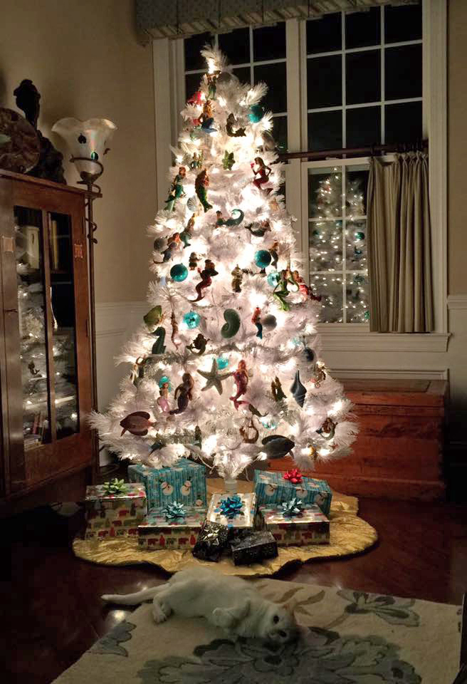
But before we get to the nitty-gritty graphics, I wanted to share a picture of my friend Joy's tree. Notice that she decorates it with a "mermaid motif" which I think is quite unique and beautiful. (And speaking of holiday shopping, aren't those some nicely wrapped presents under the tree!?!)
And now, back to the analytics...
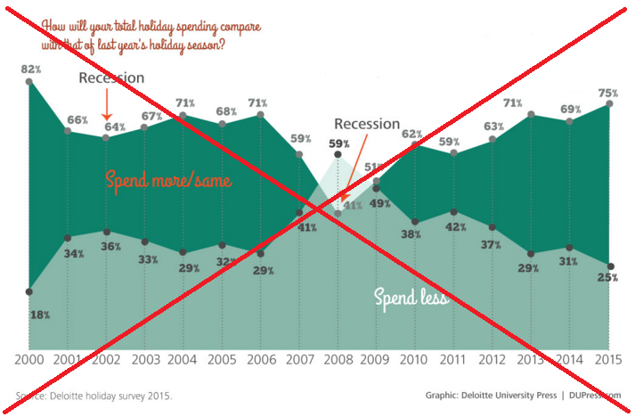
Here's Deloitte's graph. Notice that the title and area labels are not easy to read, and the graph seems a bit cluttered (both with the text labels on every data point, and the intersecting graphs). Also, I always discourage showing multiple area-under-line charts together, because it's difficult for the user to quickly know whether the charts are overlaid, or stacked. Also, it's not evident which color is 'good' and which is 'bad'.
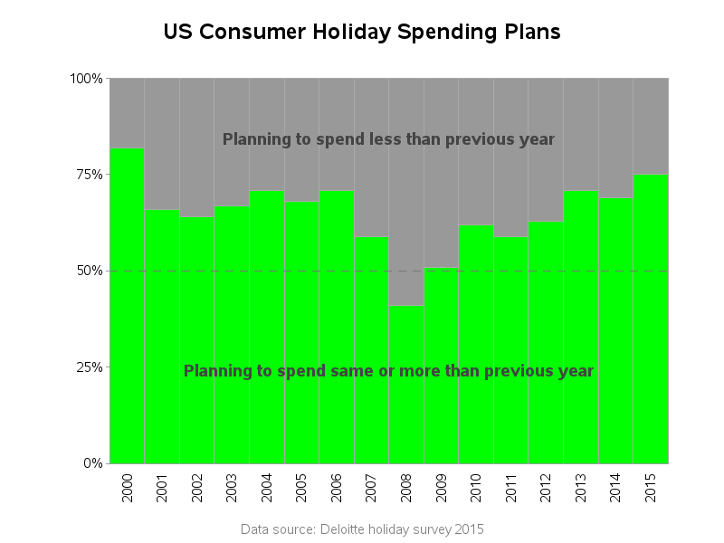
After a bit of studying, it appeared that the "spend more/same" and "spend less" should always add up to 100%, therefore a stacked 100% bar chart seemed to be a much more intuitive way to graph this data. I added a reference line to make it clear where 50% is, because that's an important number. Here's my SAS graph, which is much easier to understand quickly:
So, do you plan to spend more this year than last year? What gift are you most excited about buying (or receiving)? :-)


