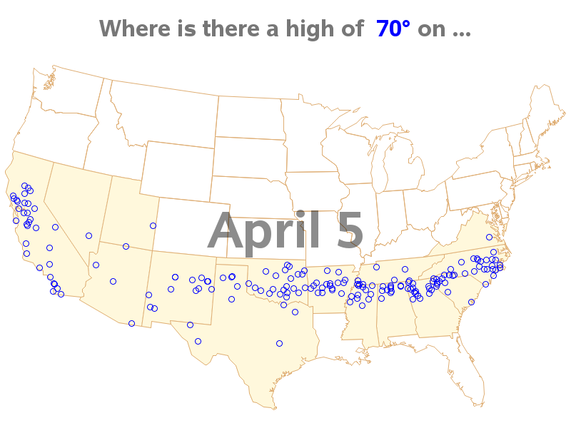
Endless Summer is both a surfing movie, and the idea that "if one had enough time and money it would be possible to follow the summer around the world, making it endless." Summer temperatures are fine if you're swimming & surfing, but I prefer slightly cooler temperatures - perhaps an Endless Spring(?) Assuming the perfect springtime day is 70 degrees, this SAS example shows where you could travel each day in the US, to have an Endless Spring ...
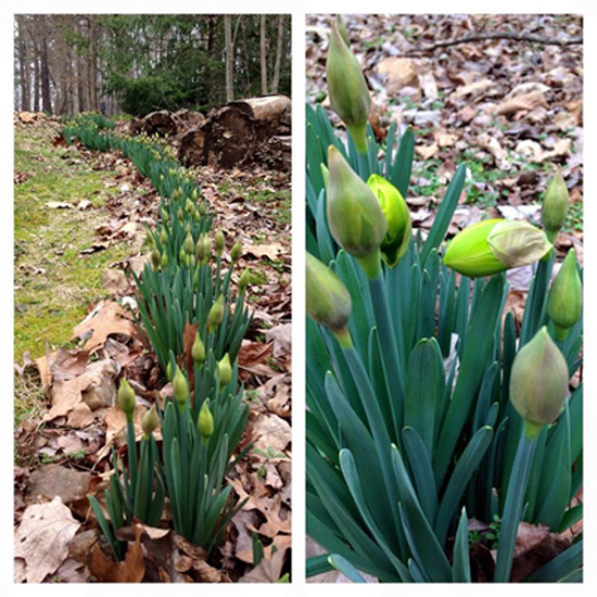
To get you in the mood for springtime temperatures, here's a picture from my friend David's backyard showing some of the first flowers peeking out in the spring (can you name these flowers?):
I first saw the idea for this map on justinweather.com, and then found more details on the map author's blog. He set up his animated map as a YouTube video, and I think he did a great job. You can definitely see the trends in the data. Click the screen-capture below to see Brian's animation:
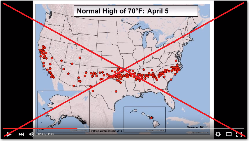
But like any data geek, when I see a cool graph, I just can't help but try to create my own version! So I found the temperature data, and the weather station location data, and set about creating my own SAS map. I wrote some code to read the data directly from the URLs into SAS datasets (so I wouldn't have to download and store the files). I rounded the 30-year average temperatures to integers, and then filtered/subsetted the data to only contain the observations with a temperature of 70 degrees. I then wrote some code to annotate those stations on a US map, and used "by month day" to produce a separate map for each day of the year. I then added one line of SAS options to combine the separate maps into a gif animation.
There are several differences in my map and Brian's. I used circular plot markers instead of solid ones, because it's easier to discern when several are in the same area. I color the states that have at least 1 weather station in the day's map. And I overlap the date in the middle of the map, so you can watch the date and the data markers at the same time (without having to move your eyes up to the title and back down to the map).
Here is a snapshot of 1 frame of the animation - click the image to see the animated version. It's about 11 MB, so it might take a few seconds to download, depending on your network speed.
And here are a few more springtime pictures. First some flowers from my friend Becky. This picture was taken at the Snow Camp outdoor theater/museum - do you know what kind of flower it is?
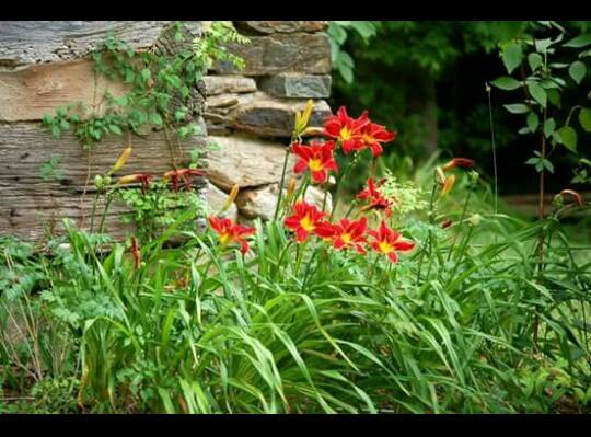
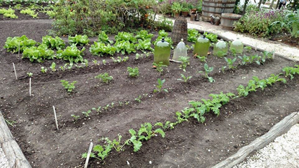
And last, but not least, here's a picture of my friend Trisha's garden. Can you identify any of her plants? I don't know which is happier to see the first 70-degree days ... Trisha or her garden! :)


3 Comments
I agree that circular plot markers are better for showing partly overlapping data, but I would have kept the red colour. To me, red is associated with heat, blue with cold. Norwegian TV weather forecasts show temperatures above 0 degrees Celsius (32 degrees Fahrenheit) in red, those below in blue.
I accept that 0 is a "natural" breaking point and 32 is not, so I guess Americans will not have the same intuitive feelings about red/blue in relation to temperatures that some of us (basically: the rest of the world(?)) have.
Ahh - interesting! I guess each of us has our pre-programmed interpretation of colors, to some extent. I typically think of red as the bad/outlier color :)
OK, I'll bite. At first glance I thought the flowers at the top of your post were daffodils, but I'm guessing that would be too obvious and besides the buds are too big and rather flattish. Are they amarillys (or amarillyses, whatever the plural is)? The red flowers are easy: Daylilies are one of my favorite types of flowers, especially red ones with "eyes" like those. Other than the lettuce in the background, the seedlings in the vegetable garden could be almost anything. I love your Endless Spring chart except for one thing. I'm pretty sure that the place where I live (CA Central Valley) never appeared. That's pretty sad when you consider how close we are to all those dots on the coast. But, hey, we have tule fog! :-)