It's that time of year again - time to choose what Halloween candy to buy for the trick-or-treaters! This is always a tough decision that has me angsting in the candy aisle. And if selecting the perfect candy wasn't enough pressure, my city (Cary, NC) was recently recognized as #1 on the list of the Top 10 cities in the US for Halloween treats! With all that in mind, this year I decided to use data & analytics to help select the perfect candy ...
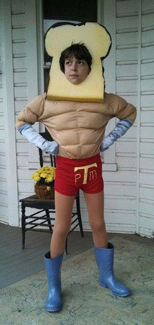
Random picture #1 (Kara's son, ready for Halloween):
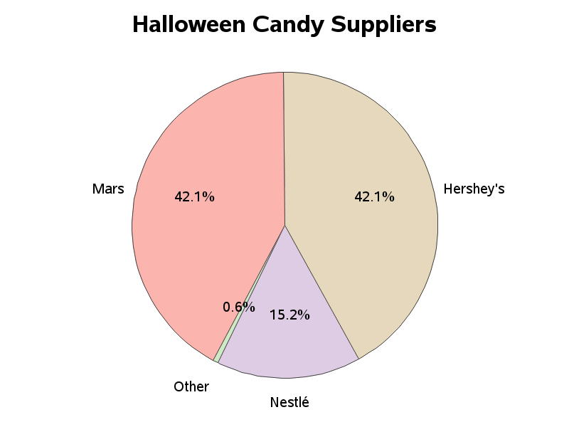
After a bit of research on the candy topic, I was somewhat surprised to find that there are basically 3 companies supplying almost all of the Halloween candy. I found a graph of the supplier data on foodandwaterwatch.org, but it had a few problems. The biggest no-no is that they used a 3d pie chart - this distorts the relative sizes of the pie slices. I made my version two dimensional, and also rotated the pie so that the equal-sized Mars & Hershey's slices are symmetrical about the middle of the pie (that makes it easier to see that they are the same size). Here's my simpler/improved pie chart:
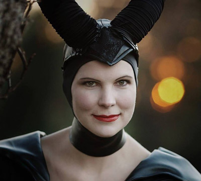
Random picture #2 (my friend Mary has some fabulous costumes - I don't stand a chance of out-costuming her ... but perhaps I can give out better candy!)
Now , let's decide which specific candy treats to buy... The main selection criteria I use is that I want to have popular candy (and with a secondary criteria being that I want it to be candy I like, in case there is some left over that I am forced to eat!)
I did several searches, and found many lists of the most popular Halloween candy. But most of them were just rankings, with no quantitative/numeric data. I finally found a nice list on ranker.com with the number of "thumbs up" and "thumbs down" votes for each candy. Here's a screen-capture of the top part of their list:
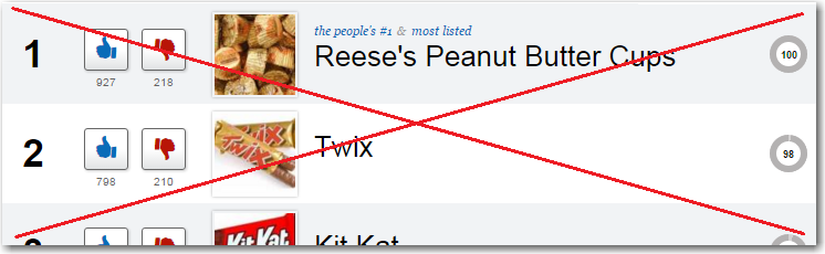
I liked their list - it was visually captivating, and somewhat interactive. I liked that it had images of each candy, and links to buy that candy on Amazon.com. But it didn't give a visual way for me to easily compare the number of 'thumbs' votes each candy had received. So I got the data into a SAS dataset, and came up with the following graph to visualize the numbers:
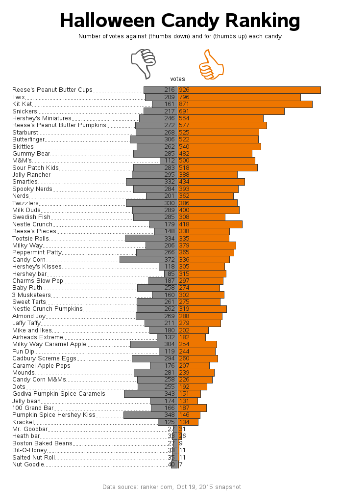
How did your favorite candy do in this ranking? Was there anything you found surprising or interesting in the graph? Did the graph influence your candy selection this year? :-)
Random picture #3: (Jennifer's daughter after trick-or-treating in Cary)

7 Comments
Pingback: How to scare up a few good graphs for Halloween - SAS Learning Post
But, the burning question for me is: "What is Kara's son's costume?"
P? M? Toast??
? Toast Man?
Powdered Toast Man from Ren And Stimpy!
What! No Tootsie Pops?! Nice charting - now I know what to buy so I won't be stuck eating the leftovers.
So many candy bars! Nice reable chart - a great data visualization
I don't understand how the candies are ranked. Why isn't KitKat second (more "likes" than Twix) or even first (highest percentage of likes)?
In the ranker.com table, there is a number to the right - I believe that is what they use to rank them. When you click on this number, they show three measures (voted up, listed it, and ranked high) - I'm not sure how they combine/weight/etc the numbers to get the final single-number that they're ranking by, though :)