I get several requests and recommendations for analyzing sports data. I'm not a big sports fan ... but when did I ever let that stop me! When I find interesting data, I like to graph it!
Before we get into the nitty-gritty data analysis, here is a picture of my friend Jennifer's daughter playing basketball. Perhaps a future NBA star?!? Aww!!!...

I recently found an interesting article on FiveThirtyEight.com that analyzed all the NBA (basketball) games going back for several decades. They calculated each team's Elo rating after each game, and then plotted the scores as a time series. Below is an example of their graph for the Warriors:
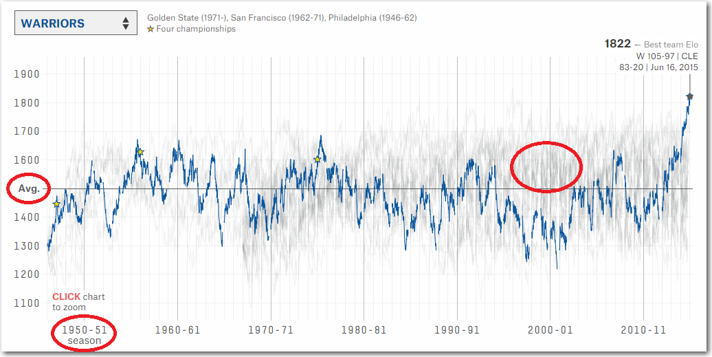
Their graph was interesting, but a few things raised questions in my mind, instead of answers (I have circled some of these areas of concern in red). There was a blue line, and a mass of gray/squiggley line in the graph - and it wasn't clear to me at first that only the blue line was the Warriors, and the gray squiggles represented all the other teams. It also wasn't clear that the 'Avg' line was the average for all teams (not the average for the Warriors). And the x-axis was labeled as 'seasons' but it wasn't clear whether the line represented the beginning/middle/end of the season, or why they had just labeled tick marks at each ~10 year increments?
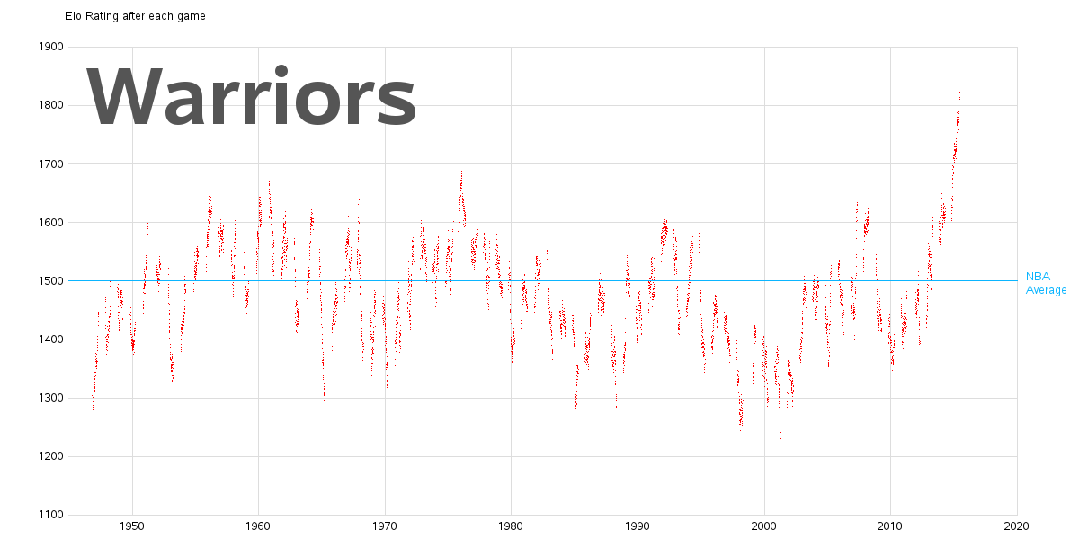
I found the raw csv data, imported it into SAS, and started working on my own graph. I decided to go with something a bit simpler with more clear labeling, and used the year on the x-axis rather than season. I plotted the individual games as dots, instead of connecting them with lines - I think this provides more visual information. I also added the team name in large letters as part of the graph (rather than just showing it in a selection box). Below is my graph for the Warriors, and you can click this link to scroll through all 50+ team graphs.
And for the code-geeks out there, below is the code I used to create all the graphs (click here to see the full code). It is a surprisingly small amount of code, and cleverly leverages the by statement:
proc gplot data=nba_data anno=anno_avg; by fran_id; note move=(8,77) font="albany amt/bold" height=15pct color=gray55 "#byval(fran_id)"; format date_game year4.; plot elo_n*date_game / vaxis=axis1 haxis=axis2 noframe autovref cvref=graydd href=('01jan1950'd to '01jan2020'd by year10) chref=graydd des='' name="&name._#byval(fran_id)"; |
How does your favorite team's graph look? Are the on an upward, or downward, trend? Does the Elo correctly represent your team's success (or lack thereof)?


