These days many devices (such as smart phone apps, Fitbits, Apple watches, dog tracking collars, car gps, hiking gps, teen/car trackers, etc) can track your location, and provide you with standard/canned ways to analyze the data. This blog post shows how I created a custom SAS map of the tracking data for my recent trip to Cuba. Hopefully this will inspire and help teach you to create your own custom maps!
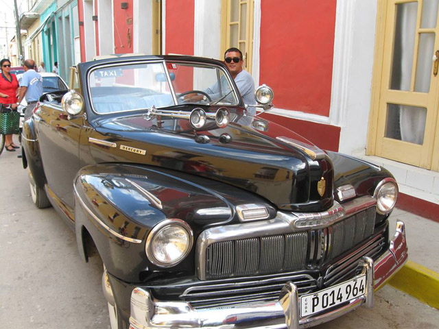
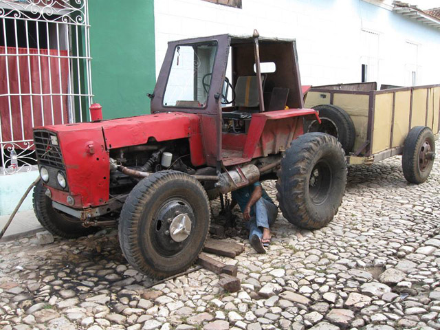
Before we get into the nitty gritty data analysis, here are a few pictures I took in Cuba...


And now, back to the data analysis!...
For our trip (kayaking the 100+ miles from Cuba to the US), we used a special tracking device called a SPOT (on loan from my good buddy Mark - thanks Mark!). This device tracked our position, and relayed the coordinates directly to a satellite every ~10 minutes, so our friends, family, and fans could monitor our progress on SPOT's Web page. Here's a screen capture of their map:
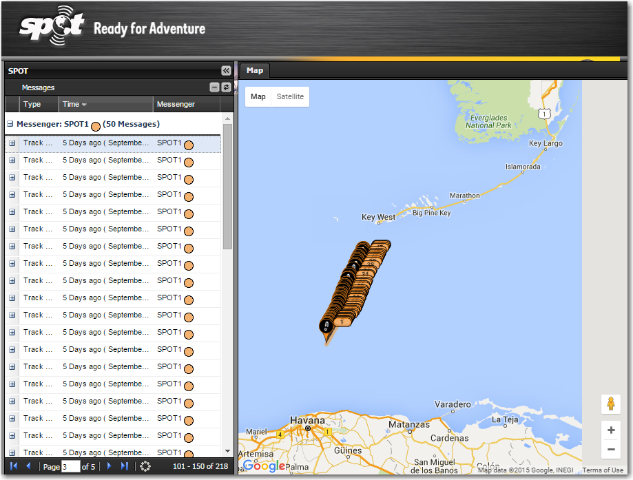
The SPOT map was very useful for interactive/instantaneous tracking - it lets you pan & zoom, and view the map or a satellite image, and you can view the data points 50 at a time. But I wanted something a little different...
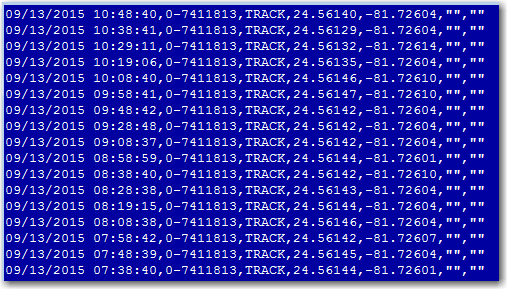
So I had my buddy Mark download the data in csv format, so I could do my own analysis. Here's how the csv data was structured:
And here is the code I used to import the data into SAS:
PROC IMPORT DATAFILE="cuba_crossing_spot_data.csv" OUT=anno_path (rename=(var1=date_time var4=lat var5=long)) DBMS=CSV REPLACE; GETNAMES=NO; RUN; |
I used the lag() function in combination with the geodist() function to calculate the distance between each successive data location reading, and I used a data step to calculate the running total miles. I added some extra variables to the dataset so it could be used to annotate markers on the map, and added html hover-text so you can the timestamp and distance for each marker. Below is a snapshot of the map - click it to see the interactive version with html hover-text:
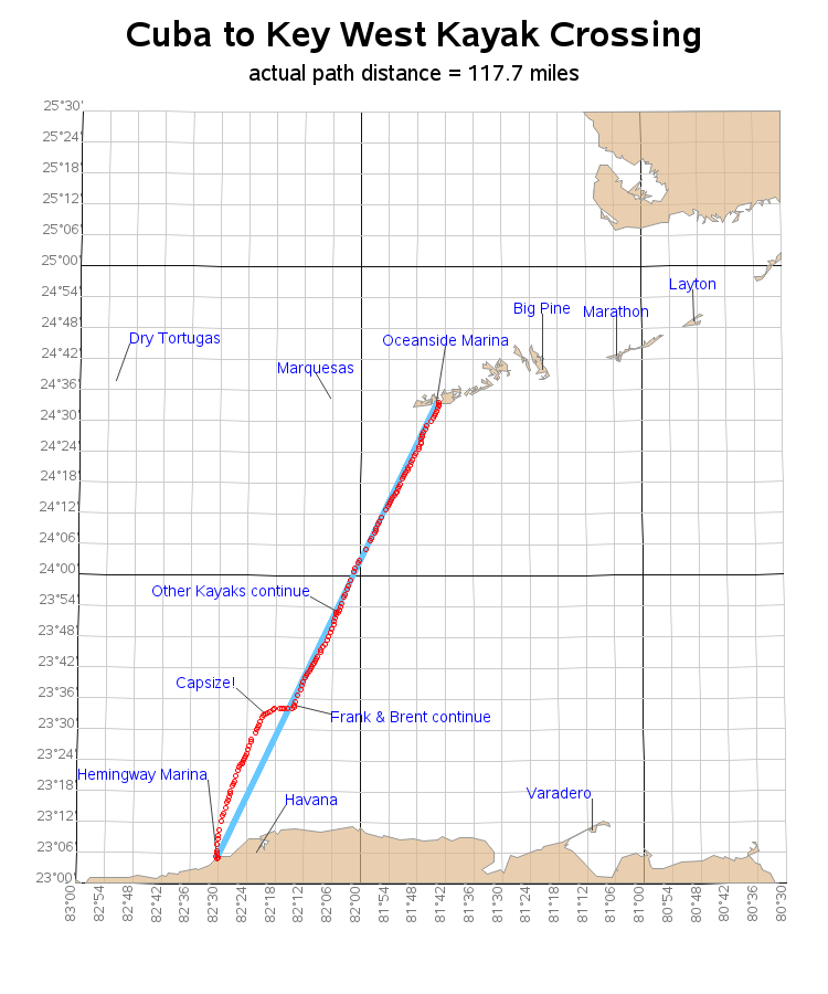
There are a few other things I added that are also worth mentioning. The lat/long grid lines are created programmatically in a data step, and annotated on the map. I have labeled certain cities and landmarks based on their lat/long values, with the location of the label determined by an x/y offset. The landmark labels have html drill down links to the google map zoomed in to that location. And I use Proc Sql to grab the maximum distance (117.7 miles) and stuff it into a macro variable, so I can use it in the title.
It's a nice little example that shows how to add a lot of things to a map. Here's the code, if you'd like to download it and try running & modifying it.
So ... what sort of tracking data might you have, and what kind of custom analysis would you like to do with it using SAS?!?

8 Comments
this great example.
how i can apply in thailand gps tracking map
thank you for suggest me.
You would need to change several things in the code. Rather than mapsgfk.namerica, you could use mapsgfk.oceania or mapsgfk.thailand. And there are a couple of places where I specify the rectangular area (when I draw the lat/long gridlines, and where I clip the maps in Proc Gproject - you would need to select a good lat/long range for the area around Thailand you want to show. Here's how I specify the coordinate range for the annotated gridlines:
%let min_long=-80.5;
%let max_long=-83;
%let min_lat=23;
%let max_lat=25.50;
And here's how I specify it for the gproject area:
proc gproject data=combined out=combined dupok latlong eastlong degrees
longmax=-80.5
longmin=-83.0
latmax=25.5
latmin=23.0
;
Nice trip. Great example.
Maybe you could do something like this for the SAS Dragon Boat practice and completion. I would think something could be learned for improvement.
Wow, 36 hours at sea in a kayak. Must have felt great to stand up in Key West. I plotted out your incremental miles and noticed a big spike just before noon on Sep-12 where you traveled almost 3 miles in ten minutes. Were you trying to catch up to the catamaran for lunch or trying to avoid becoming something else's lunch?
Are you talking about the 2.971 miles traveled between the 2 data points 10:22 & 11:12am? (note that most of the data points are about 10 minutes apart, but these two are much more than 10 minutes!) :)
Yep, I missed that. But I look forward to reading more about your adventure.
Hi Robert - great blog!
I set myself a target of cycling 1000 off-road miles this year.
I download my STRAVA .gpx files and use a piece of Python code to create a CSV file (I could have used SAS for this but the Python code was already out there).
I then read the data into SAS and created both a basic forecast of where I’m going to be at year end and one using a custom model in Forecast Studio. The data from Forecast Studio I then plot
using SGPLOT as you can see in the link - https://flic.kr/p/yWc243
Nice!