I recently saw an article on washingtonpost.com showing what methods are used to generate electricity in each state. The data was interesting enough that I decided to try my hand at graphing and mapping it with our SAS software. Read along to see what I kept the same, and what I changed...
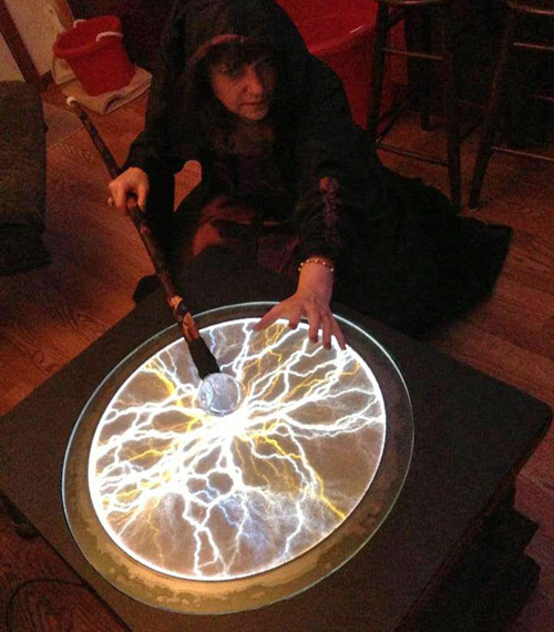
But before we get started, here's a fun picture of my friend "Magic Wanda" at my Halloween party. I'm sure it was just an oversight that the article did not include witchcraft & sorcery as methods used to generate electricity! ;)
And now, on to the graphs!...
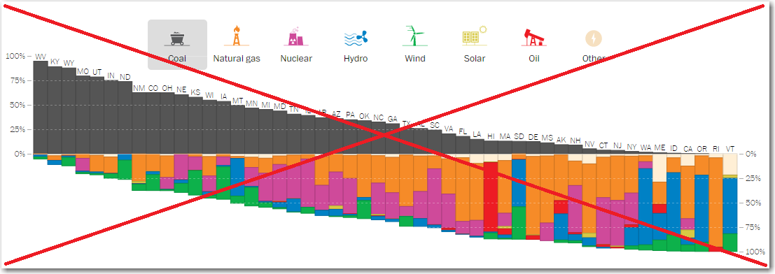
Here's a screen capture of the main graph in the washingtonpost.com (wp) article. It's a pretty cool interactive graph, and when you click on the colored bar segments or the legend, it brings the selected electricity source to the top and sorts the bars by the selected source.
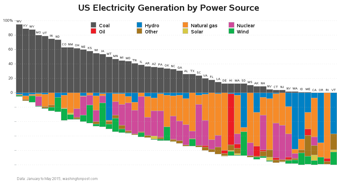
In my SAS version, I used the same general design layout and colors, but made a few somewhat subtle changes. Rather than using image glyphs for the color legend, I went with a more traditional legend (with a big swatch of color, and the text description - this way there's no ambiguity/guessing). I also allowed the legend to share the top/right area of the graph (which was always vacant), and that freed up space for the graph to be taller (and therefore easier to read). I also made my reference lines a bit darker, so they would be more visible against the white background. Here's my bar chart - click on it to see the full size interactive version - similar to the wp graph, you can click on either the bars or the legends to sort the chart:
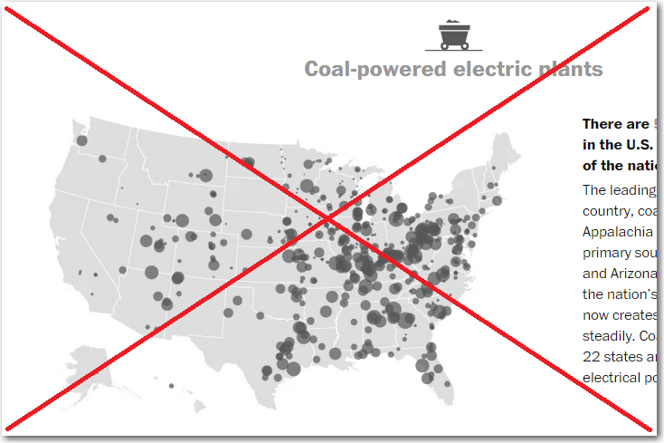
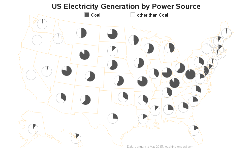
I found the bar chart enlightening, but I also wanted to analyze the data spatially. The wp article had a map for each of the power sources (such as the screen capture below), but these maps didn't show the same information as the bar chart. The map showed a dot for every power-generating facility and the size of the dots represented the amount of power each facility generated, but this didn't allow me to easily compare the states.
So in my SAS version, I created a single pie chart for each state, and used a single colored slice in the pie to represent the percent of electricity generated by the selected source. I placed a map below each bar chart - when viewing any of the bar charts, you can simply scroll down 1 screen to see the corresponding map. Here's my coal map, for example:
Were there any surprises in this data? If you're from another country, how does the US' electricity generation differ from yours? Feel free to leave a comment with your thoughts!
Other technical details:
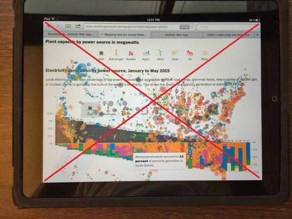
One thing you might have noticed about the interactive wp graph is that it was created with svg. This makes for some very nice interactivity, and it's fun to watch the bars dynamically move around the screen when you click on the graph ... but this comes at a cost. Not all browsers support svg. For example, I tried viewing the wp article on my iPad (which is a couple of years old) using the Safari browser, and it displayed all scrambled up with the bar chart overlapping the map. Here's a photograph of my iPad's screen:
By comparison, the SAS output (which is just simple png graphs being displayed in an html page, with html anchors) worked great!
I also tried using Apple's VoiceOver feature on the iPad, to see if it could read the hover-text over the bar segments (this is a feature that blind or visually-impaired people can use to help them 'see' the graph). VoiceOver worked fine with my SAS bar charts, but was a big-ole-mess when I tried using it on wp's svg bar chart. Sometimes simpler is better!


3 Comments
The universal access of electricity is something that some years ago is being done in my classes we have discussed and electrical engineering student at https://www.ups.edu.ec/ and we said that in part of America and Europe until 2020 you can share this energy in some countries and is expected to advance much in other countries until 2030 good post
That was some very interesting data.
I bet you could do something with this BLS data.
http://www.bls.gov/spotlight/2015/a-look-at-pay-at-the-top-the-bottom-and-in-between/home.htm
Thanks for the heads-up ... I'll have to have a look at that data!