I recently saw a cool graph showing the US import/export trade deficit. But after studying it a bit, I realized I was perceiving it wrong. Follow along in this blog, to find out what the problem was, and how I redesigned the graph to avoid it.
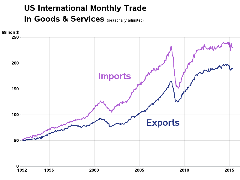
I was looking through dadaviz.com and happened upon a cool graph showing the US imports & exports over time, and the deficit between the two. I didn't like that they used an animation to alternate between the two graphs, but I did like what the data was showing.
I decided to create my own version of their graph, and make a few little changes to improve it. I found the data on the US Census website, saved it in Excel spreadsheet format, and imported it into SAS. I then used PROC SQL to merge the import and export data into a single dataset, so I could graph them together.
Rather than packaging the two graphs as a gif animation, I created them separately. The biggest change I made was in cleaning up the time axis a bit, and extending some reference lines from it. I also made it clear (in the title) that it is a plot of monthly data (which wasn't 100% clear in the original graph). Here are my two graphs:
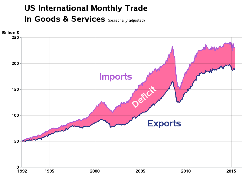
I thought smugly to myself, "Now those are some nice looking graphs!" ... But then it jumped out at me - I was misperceiving the data! (And most likely other people would too!)
The problem is that the deficit for any given month is the vertical distance between the two lines. Measured like the red lines I've added to this graph, for example:
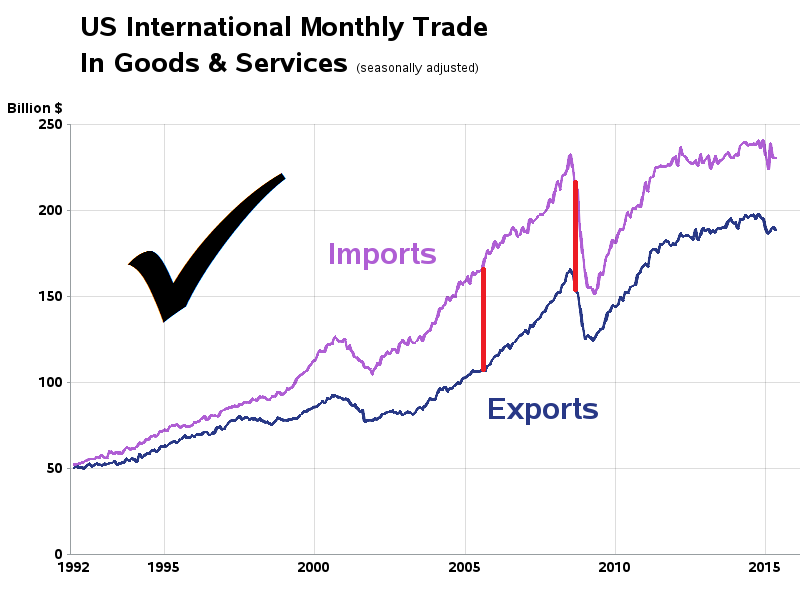
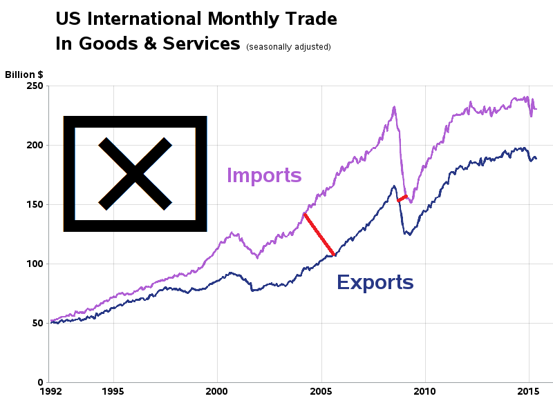
But instead of the vertical distance between the lines, my brain had been perceiving the deficit as the ~perpendicular distance between the lines (something more like the red lines I added to the graph below). During the big recession of ~2008, for example, when there was a big drop in both imports and exports, I was visually misperceiving that the trade deficit was very small (the perpendicular distance between the lines). And I bet many other people were making the same mistake!
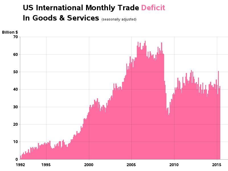
So I set about creating a better graph, which shows the trade deficit without any visually misleading traps the viewer can fall into. I chose a simple bar chart, showing just the deficit - the graph is not nearly as 'sexy' but it is very unlikely that anyone will misperceive the data! :-)
As always, I recommend plotting the data in several different ways, to get a better understanding of it. What other ideas do you have that might improve the graph? Perhaps it would be good to show the deficit as a percent of the total trade(?)


7 Comments
A friend of mine told me about your blog, very interesting.
About this article now.
Since a deficit means some kind of a loss, maybe you should put it in negative values. That way, if the deficit becomes a surplus, wich is mathematically and economically possible, your graph will be logical in the long run.
For that same reason, i don't recommend putting the deficit/surplus as a percentage of total trade.
As for the idea that a graph should be simple for everyone to understand, i couldn't agree more. But it makes analysis easier when you examine more than one indicator at a time. In fact, that's what data mining is all about, and it prevents you from making prezis/powerpoints of 100 slides... :)
Of course, too much indicators in the same graph isn't viable either. But let's have faith in the reader's intellect and ability to understand less simple things... :)
Keep up your good work !
Best regards
Phil
Thanks for the interesting points & suggestions!
Given that both imports and exports increase considerably over the time period, it might also be informative to plot the ratio of imports to exports (import cost per export dollar).
I wonder how the final plot would work as a 3rd element added beneath line graphs?
I'm not a big fan of combining/overlaying 2 different types of graphs like that, because it becomes more difficult to read.
If you use a single axis for the 2 different things, it is sub-optimal for one of them.
And if you use two different axes (left & right) then the user has to figure out which line goes with which axis, etc.
I like the final result -- much clearer. Your technique reminds me of a similar example shared by Sanjay in Differences can be misleading. Sanjay used SGPLOT for his example to improve a 2-series plot.
I like your blog very much and it is so useful for me .Thank you for sharing !