In my quest for interesting data to graph, I found some Drug Enforcement Administration (DEA) data on US domestic cannabis eradication. Does the data say anything interesting? Read on to find out! ...
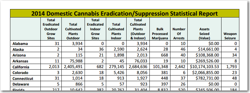
While doing some searches for other data, I happened across a table on the DEA website titled 2014 Domestic Cannabis Eradication/Suppression Statistical Report. Here's a screen-capture showing a bit of the report:
It seemed like some very interesting data, but I found it very difficult to read the individual values of all the states, and compare them in my head. Therefore I imported the data into SAS, and started exploring it. I tried graphing the data several ways, and here is my favorite visualization (click the image below to see the full-size map, with hover-text):
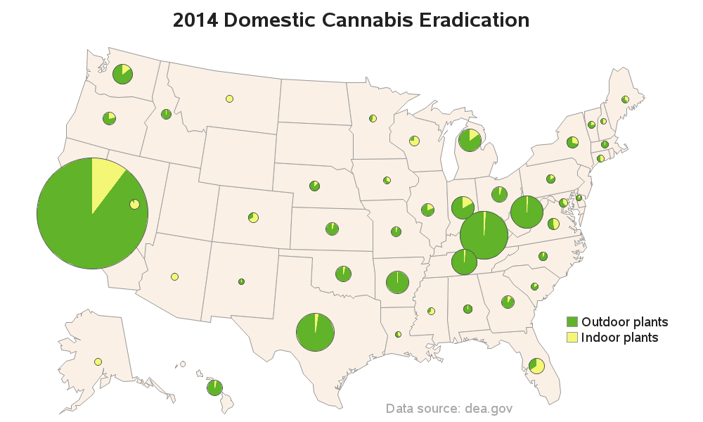
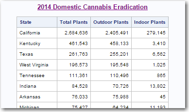
At a glance, you can tell which states have large & small values (size of the bubbles), and you can easily see if more indoor or outdoor plants were eradicated (by the colored pie slices). It is also more obvious that some states (such as Wyoming, and North & South Dakota) don't have any data values - which was not obvious in the table of numbers. I also created my own table of the values, sorted by the total number of cannabis plants eradicated. Here's a snapshot of the top of the table (click it to see the whole table):
So, what does this data mean? Can you say anything definitive based on the graph? What questions come to mind, that the data does not answer? Feel free to leave a comment!
Technical Details:
I used the %centroid macro to calculate an approximate x/y center for each state in the US map, and then used annotate to draw the pie/bubble charts. I calculated the radius (size) of each pie so that the areas are proportional to the data values. And I calculated the angle for each pie slice based on the percentage of indoor or outdoor plants to the total number in that state (and then multiplied that times 360). Annotated pie charts normally start their slices at the 3 o'clock position - I wanted mine to start at the 12 o'clock position, therefore I added 90 degrees to all my angle values. I then added the html hover-text to the pies, using the annotate html variable.

5 Comments
Can this algorithm be run in Java by using a (bambu) wrapper?
I haven't used java/bamu before, so I'm not sure what its exact capabilities are.
But I suppose a similar map could be created with any software that has mapping capabilities.
... if you use SAS though, you get the benefit of me providing you with the code! :)
It would be interesting to color code the states where Cannabis is legal.
Not by personal experience, but from growing up in KY, I'd believe it. You often heard about busts where it was growing in between rows of corn or tobacco.
I would not have guessed Kentucky would be #2. And I think Hawaii isn't trying hard enough. Thanks for sharing some interesting mapping techniques!