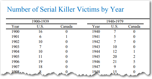
I recently came across some very interesting data on serial killings ... but it was in tabular/text form. This seemed like an invitation for me to create some graphs that make it easier to understand the data.
It seems many people have a morbid curiosity about serial killers. For example, some of the most popular shows on TV (such as Dexter, and Criminal Minds) focus on them. So when I found this data table on serial killings, I thought it would be interesting to 'bring it to life' with a graphical analysis.
Let's start with something simple - the number of victims per year, since 1900:
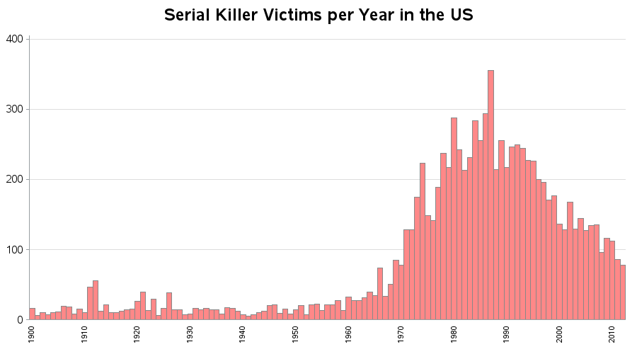
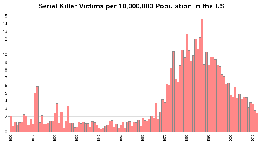
It was an interesting graph, but I was a bit suspicious about the number of victims appearing to increase since 1970. Of course, we know that the US population was much higher in the last 1/4 of the century than in the first part, so all other things equal, it makes sense that as population increases the number of serial killings would also increase. So I found some population data, and combined it with the serial killings data, and came up with the victims per capita. And that graph pretty much follows the same trends as the previous graph (which I found a bit surprising!).
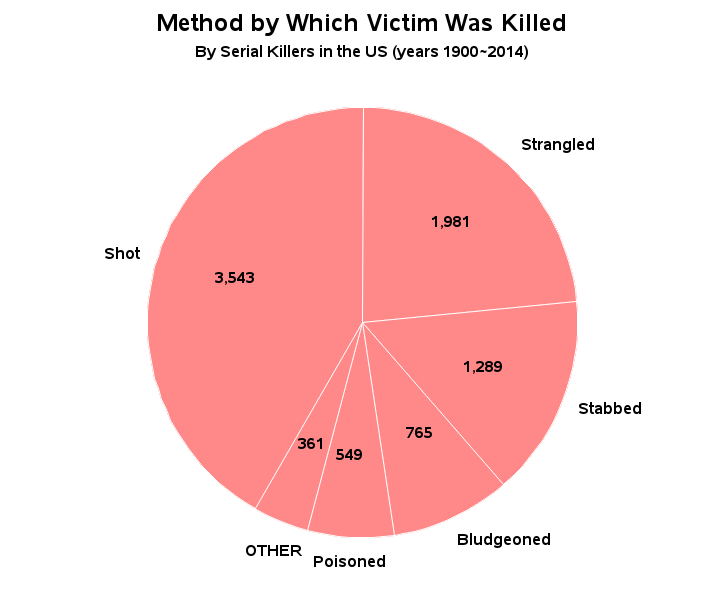
Next, I thought it would be interesting to see how the victims were killed. I know that a lot of people like to 'bash' pie charts, but I think a pie chart is a fairly intuitive graphic to show this data in a way people can quickly understand. Looks like shoot, strangle, and stab (in that order) are the preferred methods of serial killers.
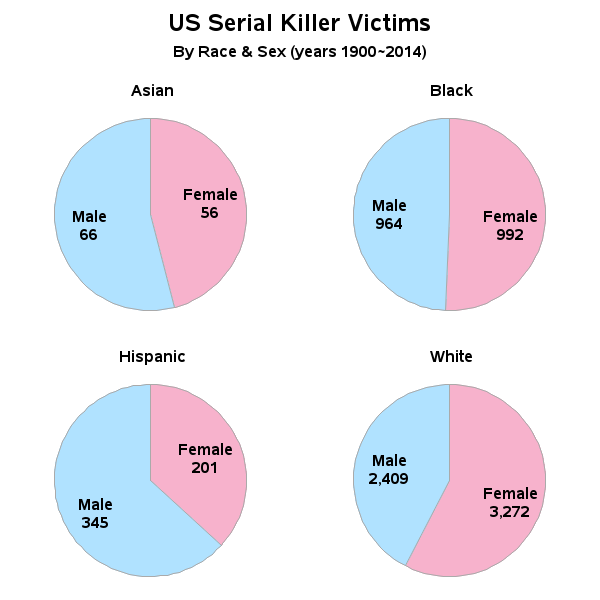
And what about some demographics of the victims? ... Were males or females more frequently victims, and does this vary by race? How about some more pie charts!
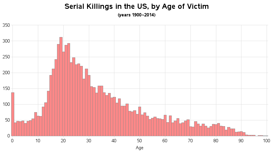
What about the ages of the victims? I think a histogram shows this very well:
And the geographical distribution? ... How about a map showing the number of victims in each state:
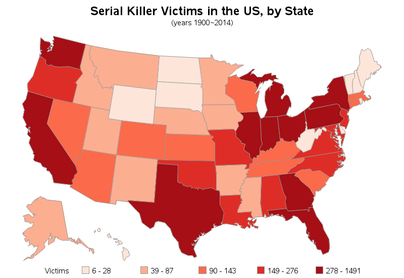
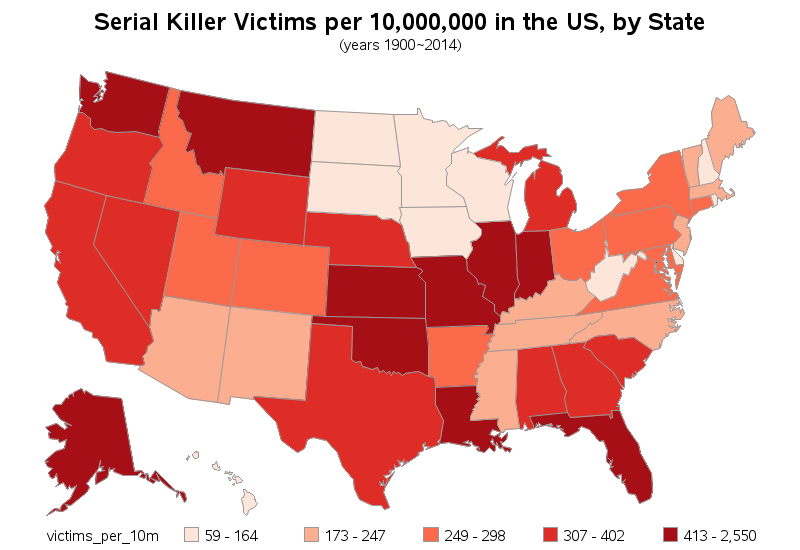
And, of course, it makes sense that states with larger populations (such as NY, FL, CA, TX) have larger number of serial killer victims ... so let's combine this with some population data and show the per capita victims in each state. This map provides quite a different picture, eh?!?
Question: Could we use this data to calculate the likelihood of being a victim of a serial killer, based on age/race/sex/location? What other factors might need to be considered?


9 Comments
I came here on accident searching for correlation data on serial killers and MKULTRA. I found the overlap to match my assumptions exactly. I find it odd that the serial killer graph is a bell curve trend, since population in the western world almost always trends upwards. I'm curious if the intelligence community got all of their real world testing for these various operations and sub-projects finished, so they could move on to other strategies of tension.
I guess one time killers, like Columbine and the Denver theater, are not included? The one time mass killers get a lot of press. I am curios about a longitudinal study over the same period.
Correct - one thing I read classified those as a "killing spree" rather than serial killing.
Exact definitions vary, but Wikipedia currently defines "serial killer" as ...
"A serial killer is a person who murders three or more people, usually due to abnormal psychological gratification, with the murders taking place over more than a month and including a significant break (a 'cooling off period') between them."
Stylistic point. I got a crick in my neck turning my head and getting closer to my screen to look at the dates on x-axis. Rotate or larger font or both? With ticks.
Yes it would be a great dataset at a case level but no doubt the FBI have already tortured it in full?
Yes - I think you're right. Custom labeling bars is a bit tricky, and I demonstrate 2 ways in the Serial Killer charts. In this chart you're talking about, I use the axis statement, which allows me to blank out certain bar labels, and rotate the ones that are left. But the standard bar chart axis statement doesn't allow me to add tickmarks to the bars, and if I didn't rotate the bar labels to line up with an exact bar then it would be difficult to see exactly which bar it went with (without a tickmark).
By comparison, in this other bar chart (http://robslink.com/SAS/democd80/us_serial_killings_by_age.htm), I completely suppress the built-in axis labels, and custom annotate the labels and tickmarks I want. Most people would rather avoid using annotate, but I think this is a good example showing a reason why it's worthwhile to learn annotate. With annotate, I can 'draw' the axis any way I want (even adding tickmarks where I want, which allows the unrotated labels to be easily associated with a specific bar).
Thanks for pointing this out - hopefully it will encourage more people to learn annotate! :)
As Jim mentioned, database connectivity probably leads to more accurate tracking. Did you try trending the different modes of killing (shot, strangled etc.) over the years? Would easy accessibility of guns possibly explain the increase in killings between 1980-2000?
And is sophisticated use of technology (DNA sampling etc.) helping nab these serial killers and/or stopping them in the bud, possibly explaining the dip over the last decade?
thanks
biswan
Biswan - unfortunately I'm just working with the pre-summarized published data. It would be really neat to have the individual/detailed data about each killing, so that we could analyze things like you mentioned (such as modes of killing over time).
The increase in 'reported' serial killings is probably due to the use of computers to create crime databases and link with them other databases. In 1910, if a serial killer operated in different cities, there was probably no way for anyone to link the crimes.
Good point!